Websites
Eduarda Estilo Feminino: shop website
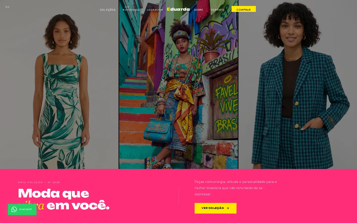
A shop website for a women's fashion shop in Brazil in a loud pop palette of hot pink, electric yellow and near-black: three tall photo panels above a pink headline band, and new arrivals in a horizontal rail with square-edged cards.
- Context
- Eduarda Estilo Feminino, a women's fashion shop in Mogi das Cruzes, São Paulo, Brazil.
- My role
- Design and frontend development
- Year
- 2026
Overview
Eduarda Estilo Feminino sells women's clothing and accessories. The website gives the shop a bold, high-energy look in Brazilian Portuguese.
The problem
A women's fashion shop needed a website in Brazilian Portuguese with a bold, colourful look that puts its newest pieces up front.
The solution
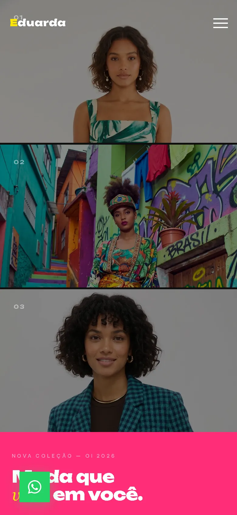
Hot pink, electric yellow and near-black, with the heavy Unbounded display face and DM Sans body text. The hero splits into three tall numbered photo panels above a pink band with the headline "Moda que vibra em você", followed by a promo ticker, collections by category, a horizontal new-arrivals rail with arrow buttons, a lookbook, an about section, a newsletter and the contact footer. A floating WhatsApp button stays in view, and phones get a full-screen pink menu.
Screenshots
Captured from the real, live website.
My contribution
Designed and built the website and published it on the client's domain.
What it does
- Hero of three numbered photo panels above a hot-pink headline band
- Promo ticker and collections by category
- New arrivals in a drag-to-scroll rail with arrow buttons
- Floating WhatsApp button
- Full-screen hot-pink menu on phones
Technical challenges
Loud colour, readable products
A palette this bright can overwhelm the products. Pink and yellow are kept to bands, badges and buttons, while the product rail sits on white with square-edged cards.
Verified stack
- HTML
- CSS
- JavaScript
Facts from the code
- Language
- Brazilian Portuguese
- Products in the catalogue
- 6
- Ordering
- WhatsApp and contact section
Outcomes
- Live at eduardaestilo.online.
Lessons
- Bold colour works best when it frames the products instead of covering them.
About this case study
Client website, shown by name and live on its own domain. Screenshots were taken on the live site. Images are shown as published on the site; they are not necessarily photos of the shop or its products.
Planning a new website, or is yours too slow?
Describe it in a few sentences. You'll get a reply within two business days with questions, a rough approach, and a price range in CHF.