Websites
Karinasa Souza Beleza: shop website
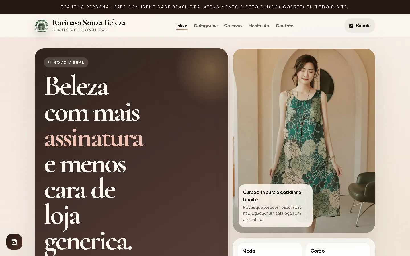
A shop website for a beauty and personal care shop in Brazil: a dark chocolate hero with cream serif headlines and a blush accent, soft cream cards and pill buttons, and a cart with a separate order page.
- Context
- Karinasa Souza Beleza, a beauty and personal care shop in Porto Alegre, Rio Grande do Sul, Brazil.
- My role
- Design and frontend development
- Year
- 2026
Overview
Karinasa Souza Beleza sells beauty and personal care products. The website pairs a warm, upscale look with a cart and an order page priced in reais.
The problem
A beauty shop needed a website in Brazilian Portuguese where customers can browse products, build an order and fill in their details.
The solution
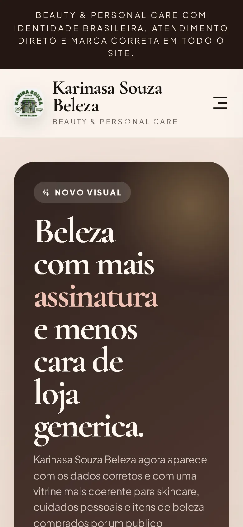
A dark chocolate hero panel with cream Cormorant Garamond headlines and a blush accent word, next to a large rounded photo card, with Plus Jakarta Sans body text, soft cream cards and pill-shaped buttons. The page continues with a ticker, categories, a product grid, a manifesto and contact. Products go into a slide-in "Sua sacola" drawer, and checkout continues to a separate order page with an order table and a short form.
Screenshots
Captured from the real, live website.
My contribution
Designed and built the website and published it on the client's domain.
What it does
- Product grid with category labels and prices in reais
- Slide-in cart drawer with quantity controls and a running total
- Separate checkout page with an order table and a short form
- Scrolling ticker and fade-up reveals
- Slide-in menu on phones
Technical challenges
Warm look, clear checkout
The soft, upscale styling must not hide the order flow. A cart button stays in the corner, the drawer shows the running total, and the checkout page repeats the order before the form.
Verified stack
- HTML
- CSS
- JavaScript
Facts from the code
- Language
- Brazilian Portuguese
- Products in the catalogue
- 6
- Ordering
- Cart and order summary
Outcomes
- Live at karina-souza.shop.
Lessons
- Showing the order again on the checkout page helps customers check it before they send it.
About this case study
Client website, shown by name and live on its own domain. Screenshots were taken on the live site. Images are shown as published on the site; they are not necessarily photos of the shop or its products. Two product screenshots are left out because they showed a third-party logo.
Planning a new website, or is yours too slow?
Describe it in a few sentences. You'll get a reply within two business days with questions, a rough approach, and a price range in CHF.