Websites
Dexrovia Regal Atelier: tailoring atelier redesign
A full redesign for a tailoring atelier in the Philippines, set on a tailor's bench: charcoal-green wool, chalk underlines that draw themselves in, a yellow measuring tape down the edge that tracks the scroll, and services shown as paper pattern pieces. The new homepage also loads 0.47 MB instead of 73.66 MB.
- Context
- Dexrovia Regal Atelier, a tailoring atelier for suits, coats and jackets in Sucat, Muntinlupa City, Philippines.
- My role
- Design, frontend development, and image production
- Year
- 2026
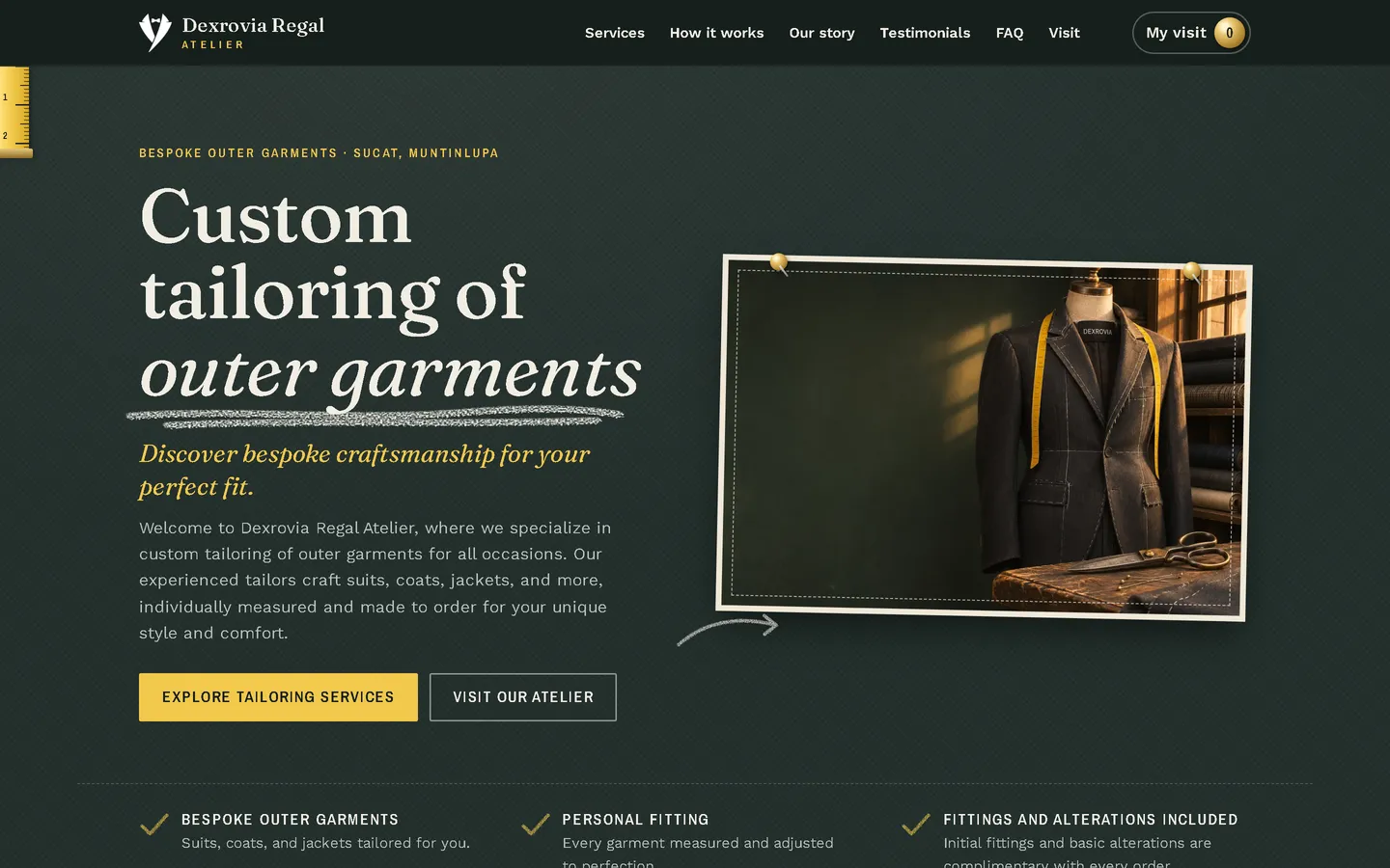

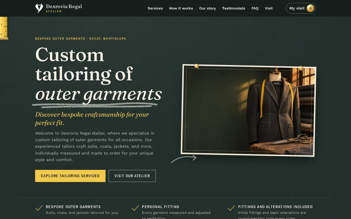
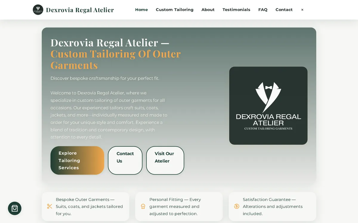
My redesign: before and after
The old site next to my design, at the same screen size.
Homepage
A grey-green gradient card with the logo became a tailor's bench: a serif headline with a chalk underline beside a jacket on a dress form, with a yellow measuring tape along the left edge.
On a phone
The old phone layout was 780 px wide on a 390 px screen, with the headline and buttons cut off at the side. Now the headline, two buttons and the dress form fit the screen.


Overview
Dexrovia Regal Atelier makes suits, coats, jackets and formalwear to measure in Sucat, Muntinlupa. The new website looks like the place the work happens: a tailor's bench with wool, chalk and a measuring tape.
The problem
The old homepage downloaded 73.66 MB on every visit, which took 59.4 seconds to load on a simulated 10 Mbps connection. On a 390 px phone screen its layout was 780 px wide, it requested images that didn't exist, and it loaded fonts and icons from three outside hosts. Its footer also showed two different tax numbers, one of them wrong, and its badges and "satisfaction guarantee" promised more than the atelier had confirmed.
The solution
A rebuild with no framework, in charcoal-green wool, chalk white and tape yellow, with a soft serif, a clean sans-serif and a narrow label face. Chalk underlines draw in as the visitor scrolls, and a yellow measuring tape down the left edge shows how far down the page they are. Services are paper pattern pieces with notches, a grainline and "Piece 01 · Cut 1", and a strip explains how a commission works: consult, measure, fittings, finish. Visitors add garments to "My visit", pick a preferred fitting time, see starting prices, and pay at the atelier once the order is confirmed. Images are compressed WebP files that load as the visitor scrolls, and the fonts ship with the site, so the homepage makes no third-party requests.
Screenshots
Captured from the real, live website.
My contribution
Designed and built the new site, produced the image set and compressed it for the web, built the chalk and tape animations, rebuilt the flow as a fitting request, corrected the tax number and the guarantee wording, and measured the old and new versions with the same script.
What it does
- Chalk underlines that draw in on scroll
- Yellow measuring tape down the left edge as a scroll indicator
- Services as paper pattern pieces with notches, grainline and cut marks
- "How a commission works" strip: consult, measure, fittings, finish
- Fitting request with a preferred day and time, starting prices, and payment at the atelier on confirmation
- Only the correct tax number kept; the second, wrong one removed
- "Best seller" and "Promo" badges removed, and "satisfaction guarantee" replaced by the factual "fittings and alterations included"
- Request sent as a pre-filled email that the customer sends
- The original customer quotes kept word for word
Technical challenges
A concept that does something
The measuring tape isn't only decoration. It runs down the edge of the page as a scroll indicator, so the tailor's tool doubles as a sense of how far along you are.
Selling time, not parcels
Made-to-measure clothing can't be bought in one click. The flow became a fitting request with starting prices, a preferred time and payment at the atelier, which is how the business actually works.
Verified stack
- HTML
- CSS
- JavaScript
- SVG
- WebP
- JSON-LD structured data
Facts from the code
- Homepage weight on load
- 73.66 → 0.47 MB
- On load, on a phone
- 73.65 → 0.34 MB
- After scrolling the whole page
- 73.66 → 0.78 MB
- Fully loaded, simulated 10 Mbps
- 59.4 → 0.55 s
- Phone layout width (390 px screen)
- 780 → 390 px
- Services on the site
- 15
Outcomes
- Live at dexroviaregal.site.
- Measured with the same script: homepage on load down from 73.66 MB to 0.47 MB on desktop and 0.34 MB on phones.
- No failed requests, console errors or third-party requests on the new site during the capture run.
Lessons
- The best concept is one that also works as an interface.
- A service business needs a booking flow, not a shop checkout.
- Check every number a site presents as official.
About this case study
Client website, shown by name. Screenshots and measurements come from one capture script run on the old and new site, on a local server. The 10 Mbps figure is a simulated connection, not data from real visitors. The images are generated illustrations of garments on dress forms, with no people and a label drawn from the atelier's own name, not photos of its work, and the site says so. Service descriptions, starting prices and the customer quotes are carried over from the old site; the refund policy and terms use only facts from the old site.
Planning a new website, or is yours too slow?
Describe it in a few sentences. You'll get a reply within two business days with questions, a rough approach, and a price range in CHF.