Websites
Gracira Daily Avenue: supermarket redesign
A full redesign for a neighbourhood supermarket in the Philippines, styled as a daily newspaper with a dated masthead, a market report, and letters from the neighbours. The new homepage also loads 1.10 MB instead of 73.42 MB.
- Context
- Gracira Daily Avenue, a neighbourhood supermarket in Las Piñas, Philippines.
- My role
- Design, frontend development, and image production
- Year
- 2026
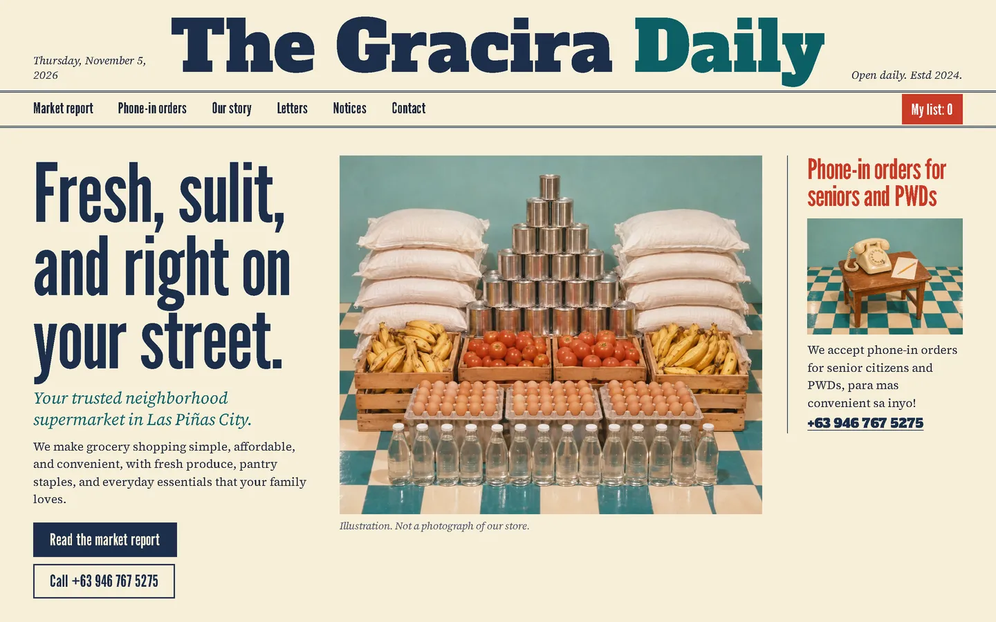

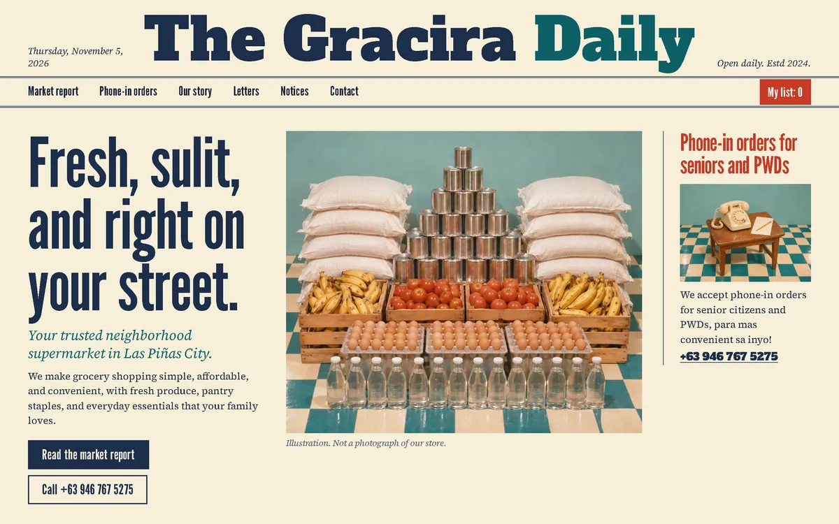
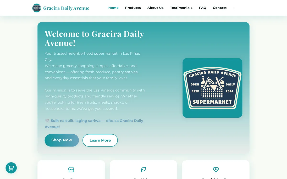
My redesign: before and after
The old site next to my design, at the same screen size.
Homepage
A teal welcome card became a front page: a masthead with today's date, a condensed headline, a pyramid of groceries on a checkered floor, and a side column like a newspaper notice.
Products
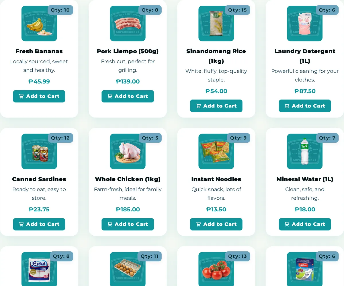
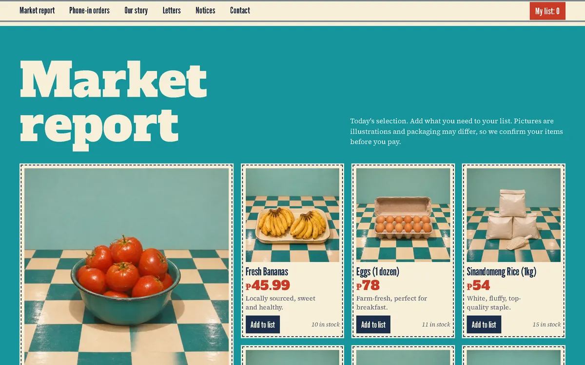
Rows of small cards became the "Market report": dashed-border clippings on teal, each with a big red price, stock count, and an add button.
Policy section
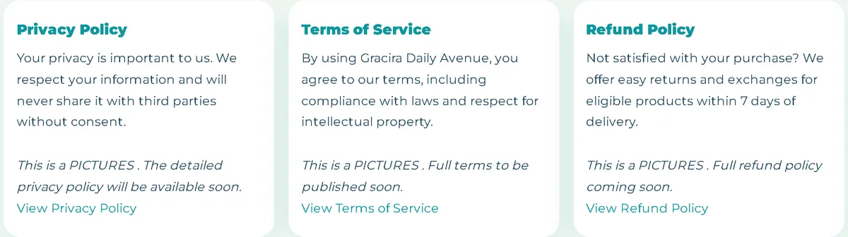
Light cards became columns on newsprint, divided by thin rules, with a clear link to each full policy.

On a phone
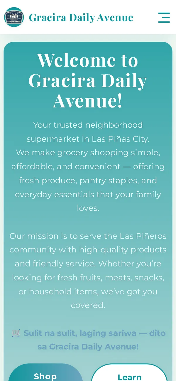
The masthead shrinks to fit, and the headline and two full-width buttons follow, as on the front page of a pocket edition.

Overview
Gracira Daily Avenue is a neighbourhood supermarket in Las Piñas. The name already contained the idea: the new website reads like a local daily paper, with the day's offers as the news.
The problem
The old homepage downloaded 73.42 MB on every visit, 73.05 MB of it images, which took 59.2 seconds to load on a simulated 10 Mbps connection. On a 390 px phone screen its layout was 780 px wide, and its card template didn't use the character already in the shop's name.
The solution
A rebuild with no framework, laid out as a newspaper: a masthead that shows today's date, condensed headlines, a market report for the catalogue, letters from the neighbours, and notices for the FAQ. Images are compressed WebP files that load as the visitor scrolls, and the fonts ship with the site, so the homepage makes no third-party requests.
Screenshots
Captured from the real, live website.
My contribution
Designed and built the new site, produced the image set and compressed it for the web, rebuilt the shopping list and order page, and measured the old and new versions with the same script.
What it does
- Masthead that shows the current date on every visit
- Fifteen products in a "Market report" of dashed-border clippings
- Cart renamed "My shopping list", with quantity controls and a reminder that nothing is paid yet
- Sections named like a paper: Letters from the neighbours, Notices, and a side column for phone-in orders
- Order sent as a pre-filled email that the customer sends, with the team confirming items and delivery first
- Field checks on the order page, including Philippine mobile number formats
- Caption on the hero image stating that it's an illustration, not a photo of the store
- Keyboard support in the cart, reduced-motion support, and GroceryStore structured data
Technical challenges
A newspaper that's still a shop
The paper metaphor had to help shopping, not slow it down. Each clipping in the market report keeps the price, stock, and add button in the same place, so the catalogue scans as easily as a regular grid.
Ordering with no backend
The site is static, so it can't place an order by itself. The order page checks the details and opens a complete pre-filled email for the customer to send, and it explains that the team confirms first.
A busy layout that stays light
Newspaper layouts are dense, with many images. Compressed images, a separate hero for phones, and lazy loading keep the phone homepage at 0.68 MB on load and 1.18 MB after a full scroll.
Verified stack
- HTML
- CSS
- JavaScript
- WebP
- JSON-LD structured data
Facts from the code
- Homepage weight on load
- 73.42 → 1.10 MB
- On load, on a phone
- 73.42 → 0.68 MB
- After scrolling the whole page
- 73.42 → 1.26 MB
- Fully loaded, simulated 10 Mbps
- 59.2 → 0.69 s
- Phone layout width (390 px screen)
- 780 → 390 px
- Products in the catalogue
- 15
Outcomes
- Live at graciradaily.shop.
- Measured with the same script: homepage on load down from 73.42 MB to 1.10 MB on desktop and 0.68 MB on phones.
- No failed requests or console errors on the new homepage during the capture run.
Lessons
- Sometimes the client's name already holds the design idea.
- Renaming the cart to fit the concept is a small detail visitors notice.
- If images are illustrations, say so on the page.
About this case study
Client website, shown by name. Screenshots and measurements come from one capture script run on the old and new site, on a local server. The 10 Mbps figure is a simulated connection, not data from real visitors. The product and scene images are generated illustrations with blank packaging, and the site says so. Customer quotes on the site are carried over from the old site.
Planning a new website, or is yours too slow?
Describe it in a few sentences. You'll get a reply within two business days with questions, a rough approach, and a price range in CHF.