Websites
Jobira Apparel House: clothing shop redesign
A full redesign for a clothing shop in the Philippines, built on the idea "sketch to rack": ink, paper and lilac, a hero slider that drags from a pencil sketch of the rack to the real rack, and product cards that turn from sketch into photo. The new homepage also loads 1.02 MB instead of 31.44 MB.
- Context
- Jobira Apparel House, a clothing shop in Talon Tres, Las Piñas City, Philippines.
- My role
- Design, frontend development, and image production
- Year
- 2026
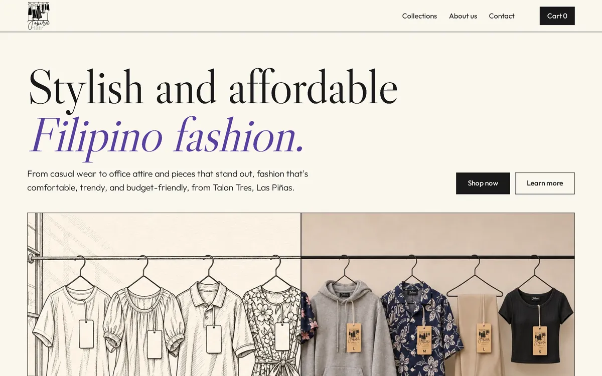
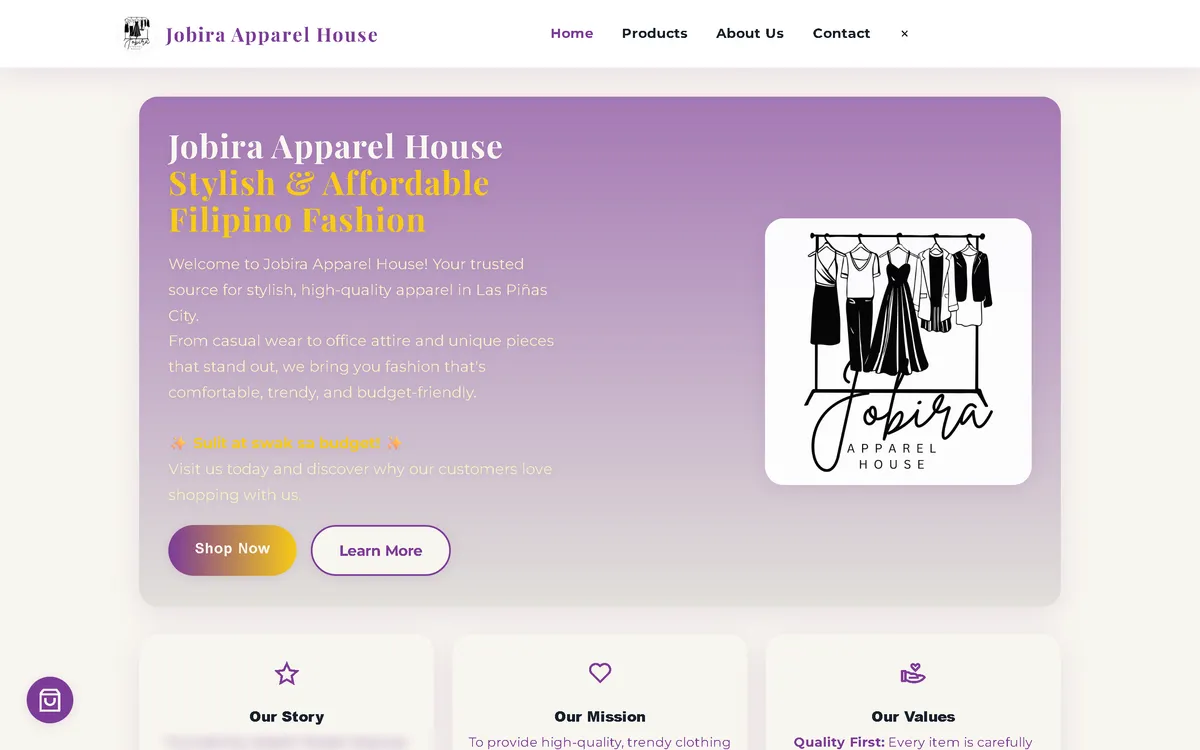
My redesign: before and after
The old site next to my design, at the same screen size.
Homepage
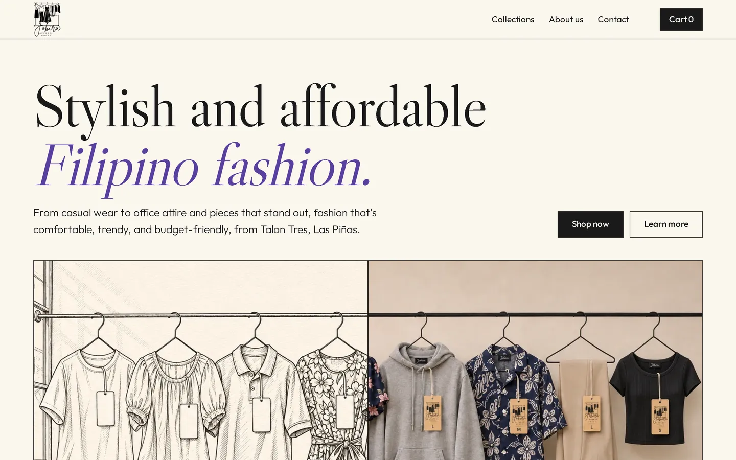
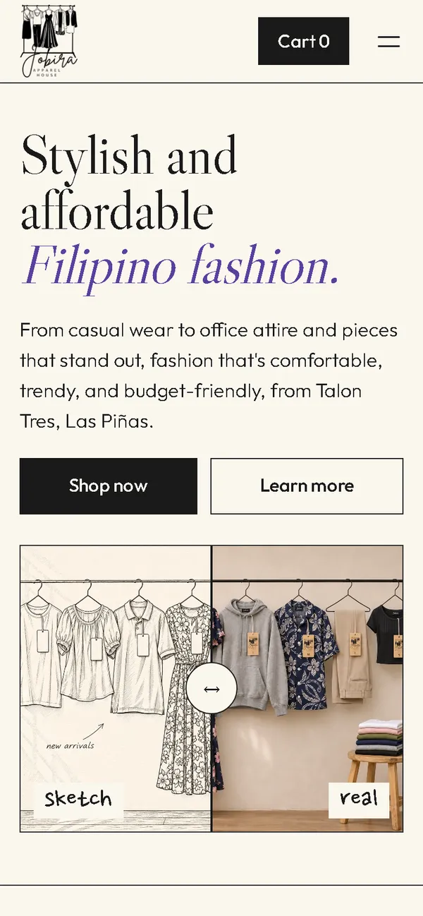
A lilac gradient card with the logo became an ink-on-paper first screen: a large serif headline with "Filipino fashion" in lilac italics, above a slider from a pencil sketch of the rack to the real rack.
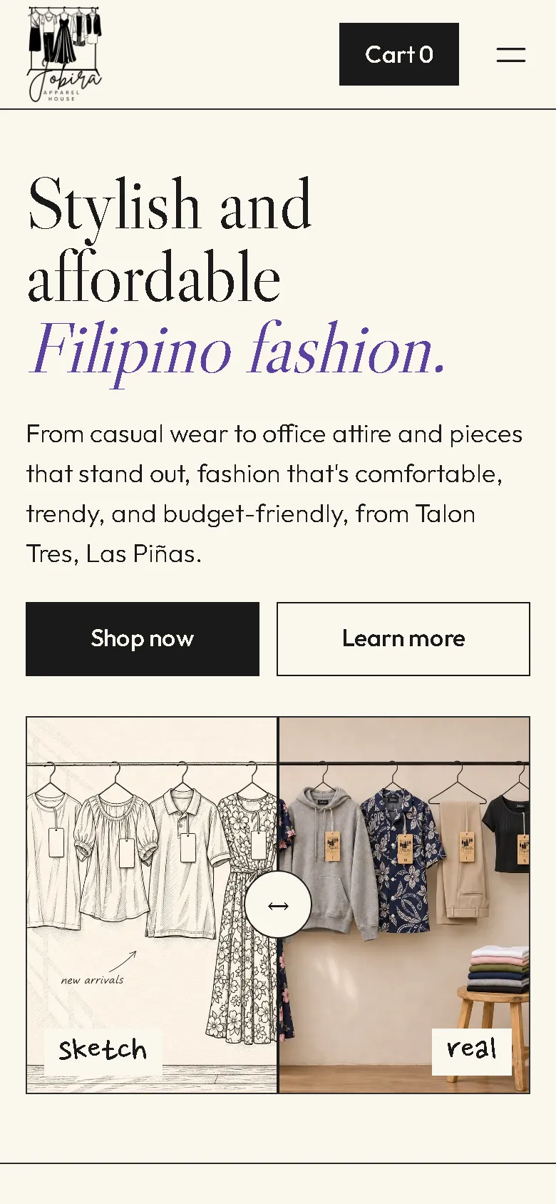
On a phone
The old phone layout was 780 px wide on a 390 px screen, with a tall gradient card of centred text. Now the headline, two buttons and the sketch-to-rack slider fit the screen, with the cart always in the header.

Overview
Jobira Apparel House sells casual wear, office attire and statement pieces from Talon Tres, Las Piñas. The new website tells the story of how clothes come to the rack: from sketch to the real thing.
The problem
The old homepage downloaded 31.44 MB on every visit, almost all of it large PNG images, which took 25.5 seconds to load on a simulated 10 Mbps connection. On a 390 px phone screen its layout was 780 px wide. The logo was the only picture of the brand, and the design looked like a generic template.
The solution
A rebuild with no framework, in ink, warm paper and lilac, with a Caslon display face and a handwritten accent font. In the hero, visitors drag a slider from a pencil sketch of the rack to the photo of the same rack. Each product card starts as a sketch, turns into the photo when it scrolls into view, and shows the sketch again on hover. Garments carry a neck label and hang tag drawn from the shop's own logo. Images are compressed WebP files that load as the visitor scrolls, and the fonts ship with the site, so the homepage makes no third-party requests.
Screenshots
Captured from the real, live website.
My contribution
Designed and built the new site, produced the sketch and photo pairs and compressed them for the web, built the sketch slider and card reveal, rebuilt the cart and order page, and measured the old and new versions.
What it does
- Drag slider in the hero from a pencil sketch of the rack to the real rack
- Product cards that turn from sketch to photo as they scroll into view, and back to the sketch on hover
- Fifteen products in sketch and photo pairs, grouped into collections such as For her
- Neck label and kraft hang tag drawn from the shop's own logo, no third-party brands
- Cart with quantity controls and a reminder that nothing is paid yet
- Order sent as a pre-filled email that the customer sends, with the team confirming size, colour, availability and delivery first
- Field checks on the order page, including Philippine mobile number formats
- Note in the shop that the photos are illustrations and may differ from the piece
- No invented reviews: the old site had none, so the new one has none
Technical challenges
A concept that does something
Sketch to rack isn't only a theme. The hero slider and the cards that change from sketch to photo let visitors play with it, and the effect costs little because the images are small WebP files.
A brand from a single logo
The shop had a logo and nothing else visual. The neck label, the hang tag and the sketch style all grow out of that logo, so the garments look like they belong to the shop without borrowing other brands.
Verified stack
- HTML
- CSS
- JavaScript
- WebP
- JSON-LD structured data
Facts from the code
- Homepage weight on load
- 31.44 → 1.02 MB
- On load, on a phone
- 31.44 → 1.02 MB
- After scrolling the whole page
- 31.44 → 1.20 MB
- Fully loaded, simulated 10 Mbps
- 25.5 → 0.83 s
- Phone layout width (390 px screen)
- 780 → 390 px
- Products in the shop
- 15
Outcomes
- Live at jobirafashion.shop.
- Homepage on load down from 31.44 MB to 1.02 MB, fully loaded in 0.83 s on a simulated 10 Mbps connection.
- No failed requests, console errors or third-party requests on the new site during the capture run.
Lessons
- The best concept is one that also works as an interface.
- Don't invent reviews to fill a section.
- If images are illustrations, say so on the page.
About this case study
Client website, shown by name. After launch, the images were trimmed without changing the design; the new-site figures are measured on that trimmed version. Screenshots of the new site come from a capture script on a local server; the old site was measured separately on a local server with the same settings. The 10 Mbps figure is a simulated connection, not data from real visitors. The sketches and product photos are generated illustrations with no people; the neck label and hang tag on the garments are drawn from the shop's own logo, with no third-party brands, and the shop says the photos are illustrations. Product descriptions and store hours are carried over from the old site. The old site had no customer reviews, and none were added. In the old homepage screenshot, the founder's name is blurred.
Planning a new website, or is yours too slow?
Describe it in a few sentences. You'll get a reply within two business days with questions, a rough approach, and a price range in CHF.