Websites
Katrelle Nova Haven: beauty salon redesign
A full redesign for a neighbourhood beauty salon in the Philippines, built around the bees in its logo: mint and butter colours, services and products in hexagon honeycomb cells, a honey-drip divider, and a line-drawn bee that flies to the visit counter when something is added. The new homepage also loads 0.69 MB instead of 64.51 MB.
- Context
- Katrelle Nova Haven, a beauty and personal care salon with a small beauty shop in Pinagbuhatan, Pasig City, Philippines.
- My role
- Design, frontend development, and image production
- Year
- 2026
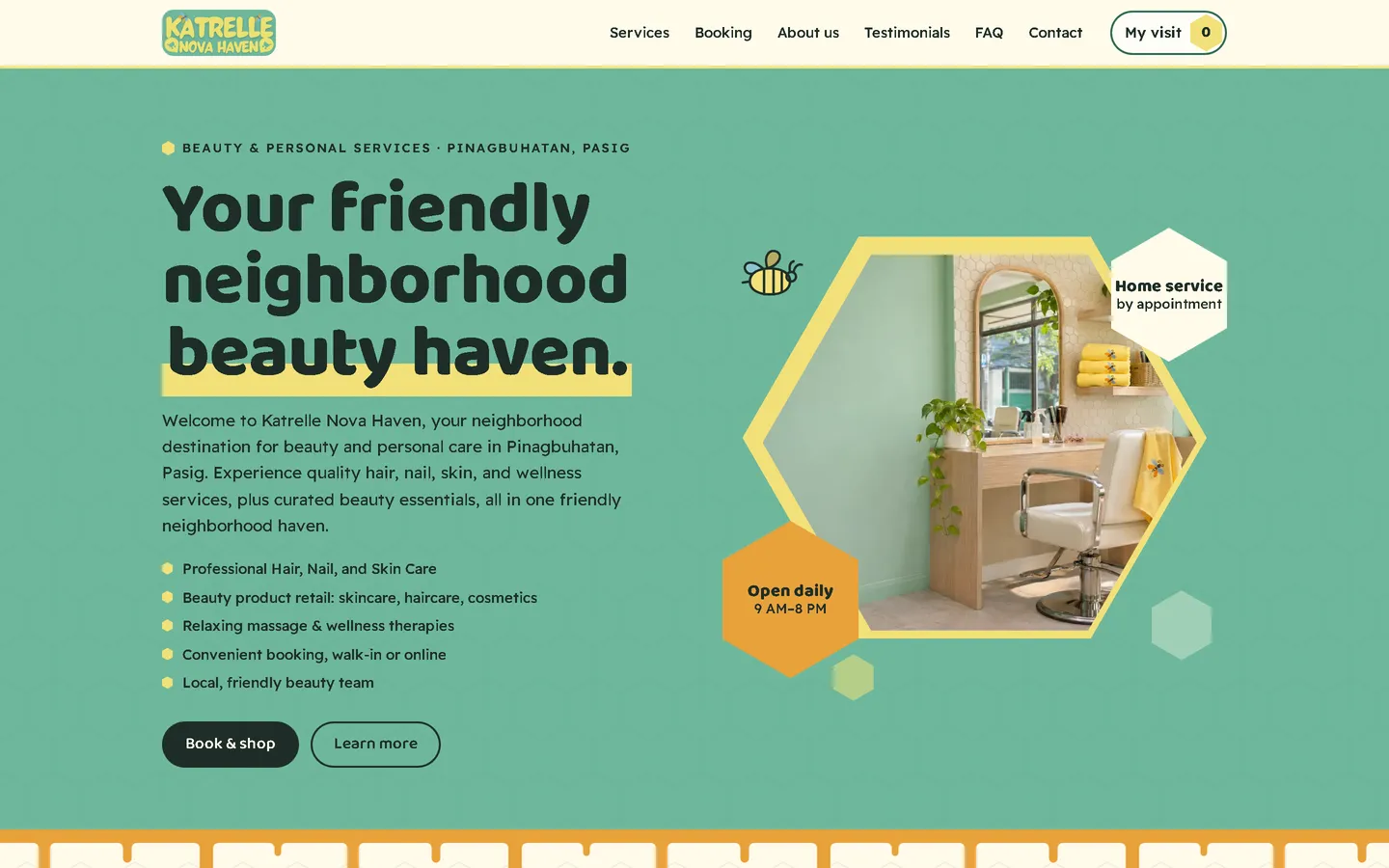
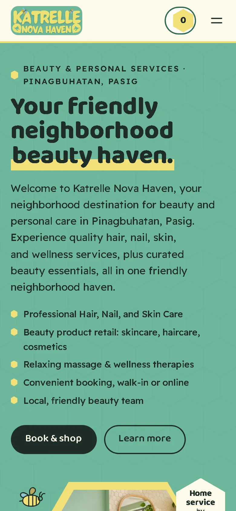
My redesign: before and after
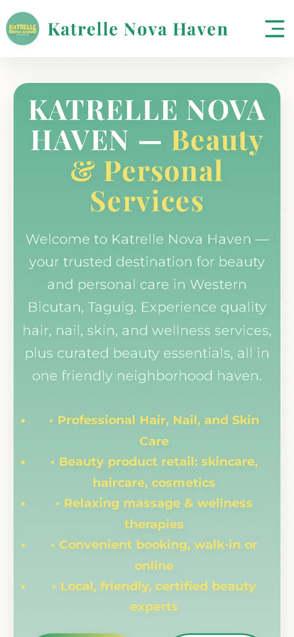
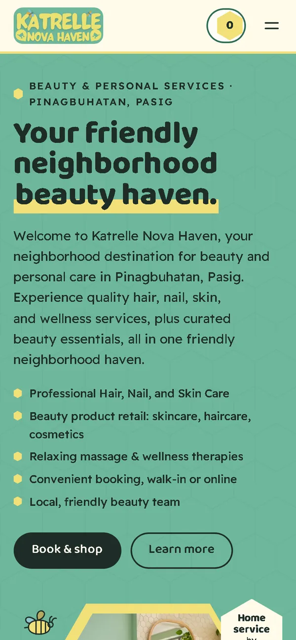
The old site next to my design, at the same screen size.
Homepage
A mint gradient card that placed the salon in Western Bicutan, Taguig, with a yellow list that almost vanished, became a mint and butter first screen: a bold headline with a butter underline, a salon photo in a hexagon frame and a bee, and a honey-drip edge below.
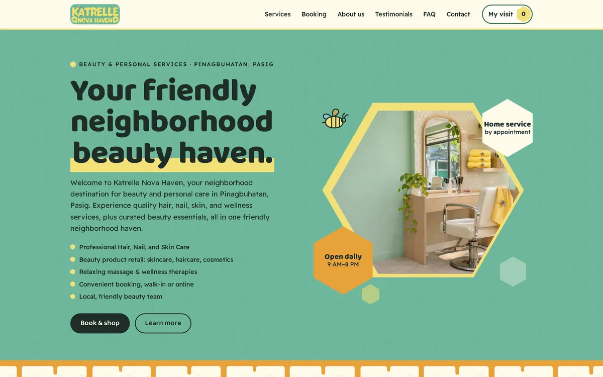
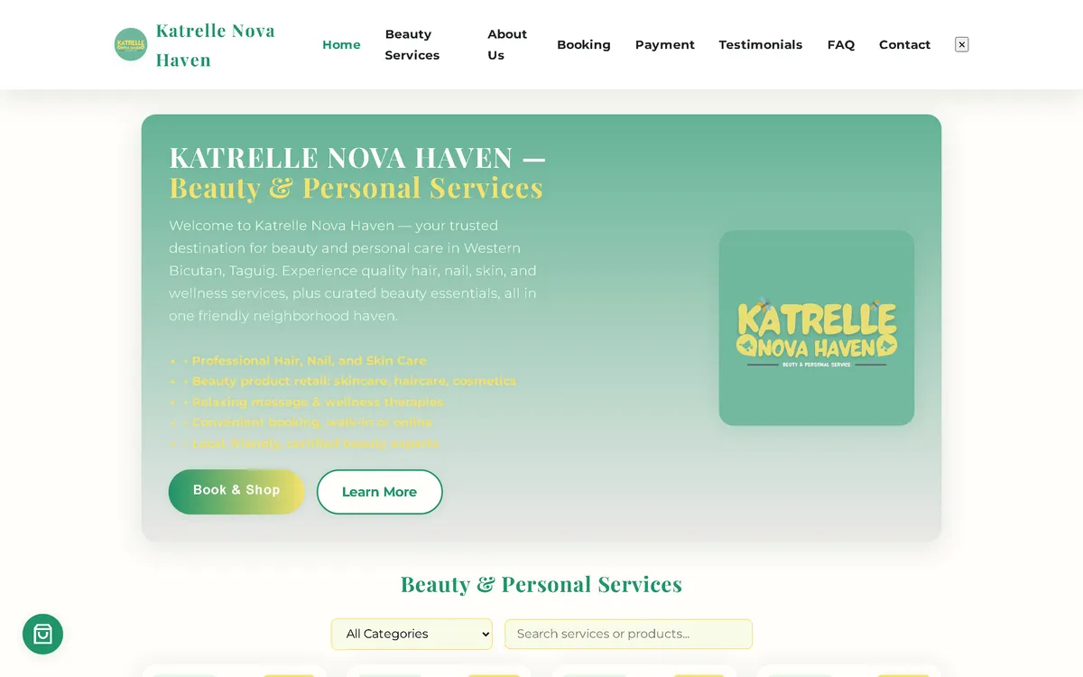
On a phone
The old phone layout was 780 px wide on a 390 px screen, with a long block of centred text. Now the headline, the short list and two buttons fit the screen, with the hexagon visit counter always in the header.
Overview
Katrelle Nova Haven offers hair, nail, skin and massage services, home service by appointment, and a small range of beauty products in Pinagbuhatan, Pasig City. The bees in its logo gave the new website its structure: a honeycomb.
The problem
The old homepage downloaded 64.51 MB on every visit, which took 51.7 seconds to load on a simulated 10 Mbps connection. On a 390 px phone screen its layout was 780 px wide, its yellow list text was barely readable on mint, it requested images that didn't exist, and it loaded fonts, icons and a map from six outside hosts. Its copy also placed the salon in Western Bicutan, Taguig instead of Pasig, promised certified experts and special offers the salon couldn't confirm, and claimed a VAT registration.
The solution
A rebuild with no framework, in mint and butter from the logo, with a rounded display face and a clear sans-serif. The 15 services and products sit in real hexagon cells, filtered by hair, nails, skin, massage and wellness, and beauty products. An added cell glows honey, and a line-drawn bee flies to the hexagon "My visit" counter. Visitors send their visit with a preferred day and time and pay at the salon; the retail products are marked "pick up and pay at the salon". Images are compressed WebP files that load as the visitor scrolls, and the fonts ship with the site, so the homepage makes no third-party requests.
Screenshots
Captured from the real, live website.
My contribution
Designed and built the new site, produced the image set and compressed it for the web, built the honeycomb grid and the bee animation, rebuilt the flow as a visit request, corrected the location, removed the unconfirmed claims and offers, and measured the old and new versions with the same script.
What it does
- Services and products in real hexagon honeycomb cells, with filters
- Added cells glow honey, and a line-drawn bee flies to the visit counter
- Hexagon "My visit" counter in the header
- Visit request with a preferred day and time, paid at the salon; retail products picked up and paid there too
- Location corrected from Western Bicutan, Taguig to Pinagbuhatan, Pasig everywhere outside the original quotes
- "Certified experts", special offers the salon couldn't honour, a superlative and the VAT claim removed
- Request sent as a pre-filled email that the customer sends
- Field checks on the request page, including Philippine mobile number formats
- The original customer quotes kept word for word
Technical challenges
A concept that does something
The honeycomb isn't only decoration. The cells are the menu, the filter and the add button at once, and the bee flying to the counter confirms that something happened.
Promise only what the salon can keep
The old site advertised discounts, a loyalty card and certified experts nobody had confirmed. They were left out, so every offer on the page is one the salon can actually honour.
Verified stack
- HTML
- CSS
- JavaScript
- SVG
- WebP
- JSON-LD structured data
Facts from the code
- Homepage weight on load
- 64.51 → 0.69 MB
- On load, on a phone
- 64.04 → 0.52 MB
- After scrolling the whole page
- 64.64 → 0.86 MB
- Fully loaded, simulated 10 Mbps
- 51.7 → 0.60 s
- Phone layout width (390 px screen)
- 780 → 390 px
- Services and products
- 15
Outcomes
- Live at katrellenova.life.
- Measured with the same script: homepage on load down from 64.51 MB to 0.69 MB on desktop and 0.52 MB on phones.
- No failed requests, console errors or third-party requests on the new site during the capture run.
Lessons
- The best concept is one that also works as an interface.
- A logo detail can carry a whole website.
- Check the basics first: the town, the offers, the claims.
About this case study
Client website, shown by name. Screenshots and measurements come from one capture script run on the old and new site, on a local server. The 10 Mbps figure is a simulated connection, not data from real visitors. All images are generated illustrations of one imagined salon; the people in them are generated too, not the salon's staff or customers, and the site says the photos are illustrations. Service descriptions, prices and the customer quotes are carried over from the old site; the quotes stay word for word, including two captions that name the wrong town from the old copy.
Planning a new website, or is yours too slow?
Describe it in a few sentences. You'll get a reply within two business days with questions, a rough approach, and a price range in CHF.