Websites
Rosavelle Beauty Lounge: beauty salon redesign
A full redesign for a beauty salon in the Philippines, hung like an art gallery: deep purple walls, every service a still life in a gilded frame, and four rooms that light up as you walk through. The new homepage also loads 1.22 MB instead of 88.13 MB.
- Context
- Rosavelle Beauty Lounge, a beauty salon in General Trias City, Cavite, Philippines.
- My role
- Design, frontend development, and image production
- Year
- 2026
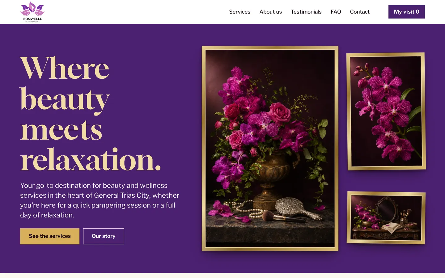
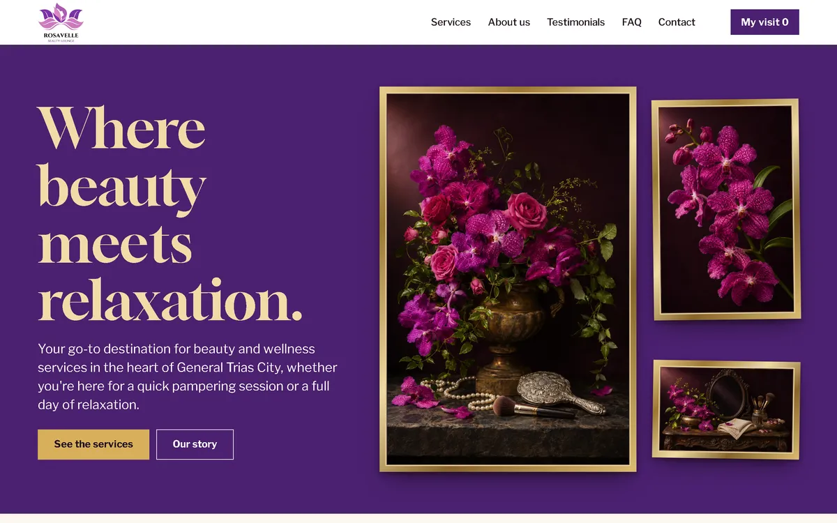
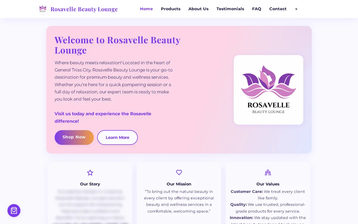
My redesign: before and after
The old site next to my design, at the same screen size.
Homepage
A pink welcome card became a gallery wall: a gold serif headline on deep purple beside framed still lifes of orchids, with buttons to see the services or read the story.
Services
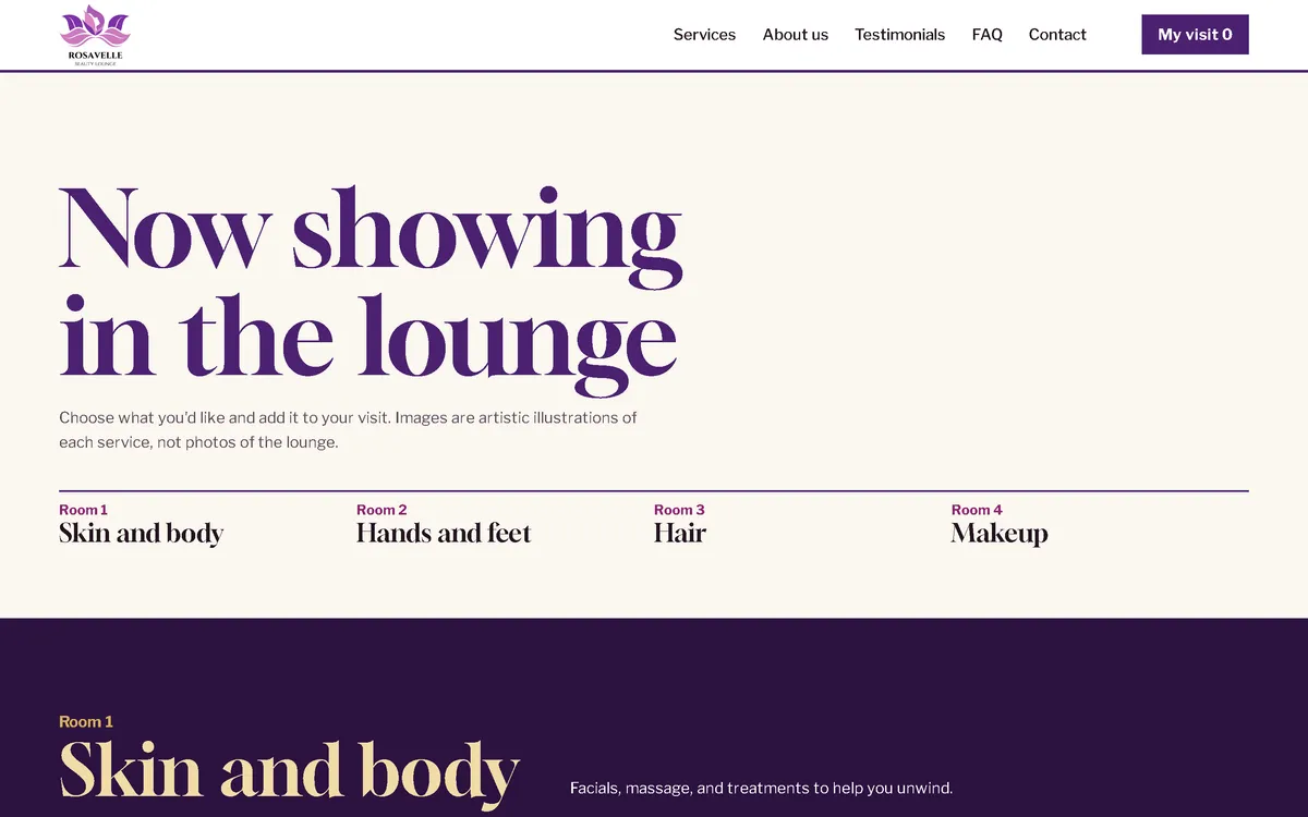
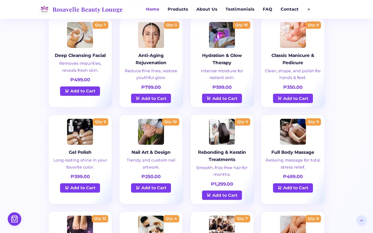
A grid of small cards became "Now showing in the lounge": the menu as an exhibition in four rooms, Skin and body, Hands and feet, Hair, and Makeup.
Policy section
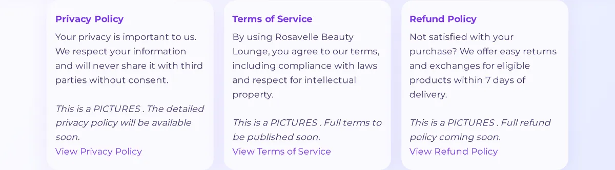
Light policy cards became a cream band with a one-line summary and a link to each full policy.

On a phone
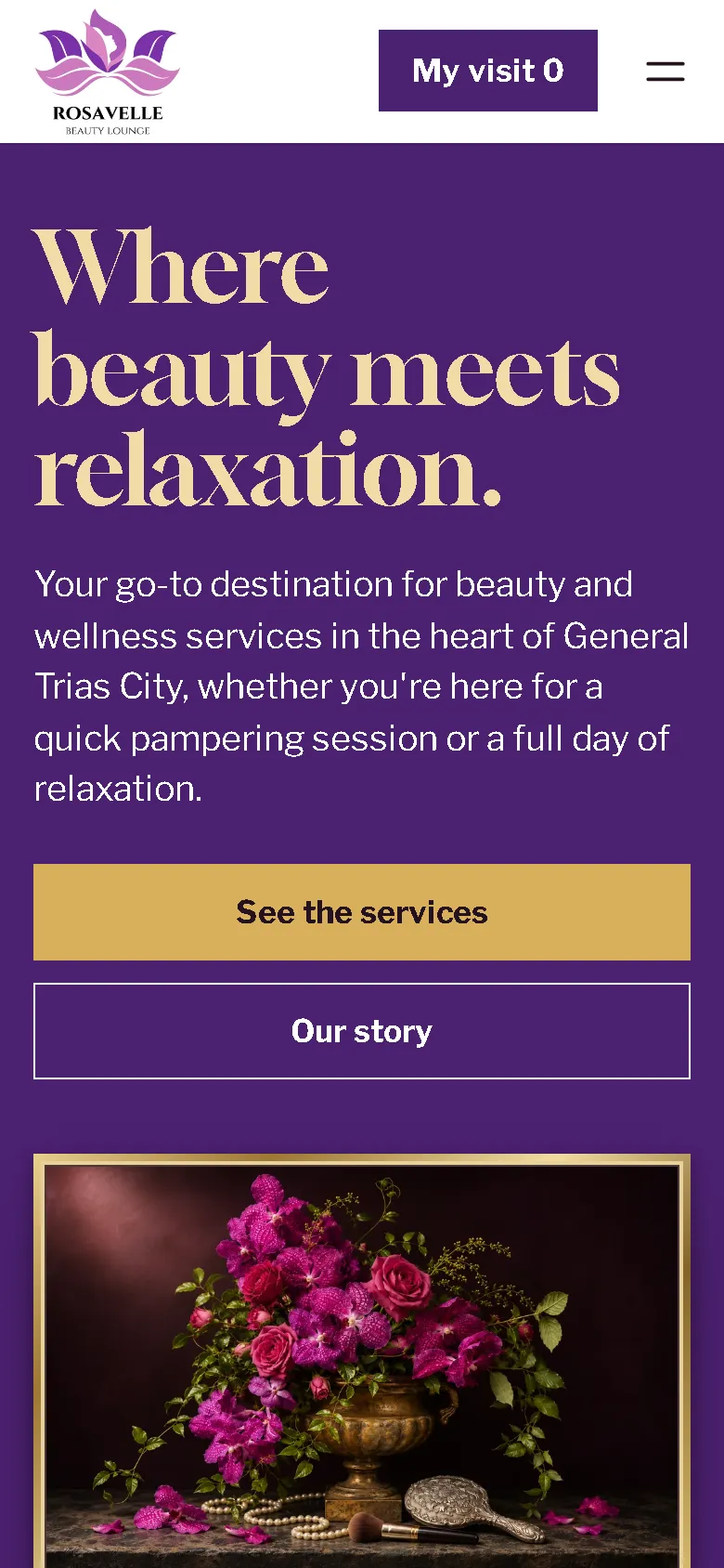
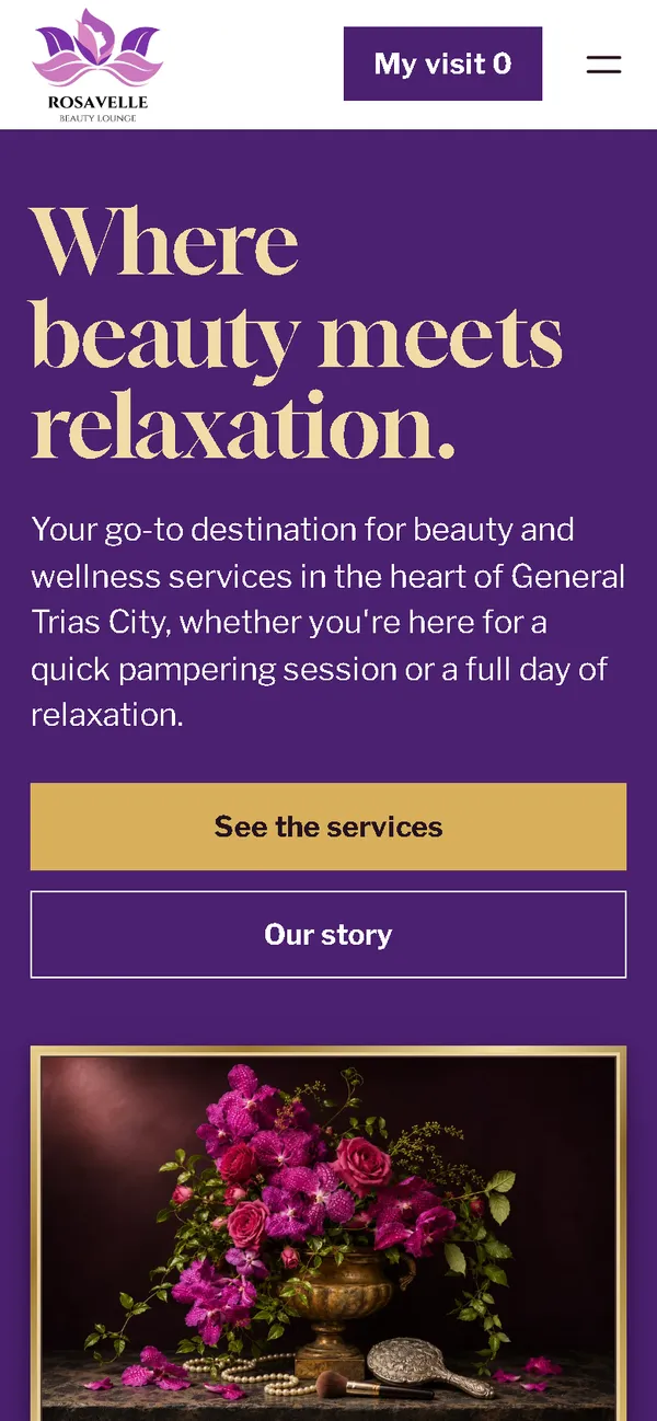
The old phone layout was 780 px wide on a 390 px screen. Now the headline, two full-width buttons, and a framed still life fit the screen, with the visit list always in the header.

Overview
Rosavelle Beauty Lounge offers facials, nails, hair, and makeup in General Trias City, Cavite. The new website treats the service menu like an exhibition: each treatment hangs in its own frame, and the visitor walks from room to room.
The problem
The old homepage downloaded 88.13 MB on every visit, 87.76 MB of it images, which took 71.0 seconds to load on a simulated 10 Mbps connection. On a 390 px phone screen its layout was 780 px wide, and it loaded fonts and icons from three outside hosts.
The solution
A rebuild with no framework, in deep purple, gold, and cream with a high-contrast serif. The fifteen services hang as framed still lifes in four rooms, and each room's frames light up as it scrolls into view. The cart becomes "My visit", the order page asks for a preferred day and time, and customer quotes come from the guest book. Images are compressed WebP files that load as the visitor scrolls, and the fonts ship with the site, so the homepage makes no third-party requests.
Screenshots
Captured from the real, live website.
My contribution
Designed and built the new site, produced the image set and compressed it for the web, rebuilt the visit list and request page, and measured the old and new versions with the same script.
What it does
- Service menu as an exhibition in four rooms: Skin and body, Hands and feet, Hair, and Makeup
- Fifteen services as framed still lifes, each with price and an add button
- Frames that light up as each room scrolls into view, without animation for visitors who prefer reduced motion
- Cart renamed "My visit", with quantity controls and a reminder that nothing is paid yet
- Request page with a preferred day and time instead of a delivery address
- Request sent as a pre-filled email that the customer sends, with the team confirming the schedule first
- Field checks on the request page, including Philippine mobile number formats
- Note in the menu that the images are illustrations, not photos of the lounge
- Visit list updates announced to screen readers and BeautySalon structured data
Technical challenges
A service menu, not a product shop
The old site sold treatments like parcels, with stock counts and delivery. The new flow speaks of a visit: you pick treatments, choose a preferred time, and the team confirms the appointment.
Requests with no backend
The site is static, so it can't book by itself. The request page checks the details and opens a complete pre-filled email for the customer to send, and it explains that the team confirms the schedule first.
Beauty images without faces or promises
Beauty pictures easily suggest results. The gallery uses still lifes of flowers, tools, and textiles with no people, and the menu states that the images are illustrations, so they set a mood without showing results.
Verified stack
- HTML
- CSS
- JavaScript
- WebP
- JSON-LD structured data
Facts from the code
- Homepage weight on load
- 88.13 → 1.22 MB
- On load, on a phone
- 88.13 → 1.05 MB
- After scrolling the whole page
- 88.13 → 2.01 MB
- Fully loaded, simulated 10 Mbps
- 71.0 → 0.80 s
- Phone layout width (390 px screen)
- 780 → 390 px
- Services on the menu
- 15
Outcomes
- Live at rosavelleglow.life.
- Measured with the same script: homepage on load down from 88.13 MB to 1.22 MB on desktop and 1.05 MB on phones.
- No failed requests or console errors on the new site during the capture run.
Lessons
- Services read better as a visit than as a cart of products.
- A strong metaphor can also organise the menu: rooms make fifteen services easy to scan.
- If images are illustrations, say so on the page.
About this case study
Client website, shown by name. Screenshots and measurements come from one capture script run on the old and new site, on a local server. The 10 Mbps figure is a simulated connection, not data from real visitors. The images are generated still-life illustrations with no people, and the gallery is a visual concept, not a real venue; the site says the images are illustrations. Service descriptions and customer quotes on the site are carried over from the old site. The founder's name in the old homepage screenshot is blurred.
Planning a new website, or is yours too slow?
Describe it in a few sentences. You'll get a reply within two business days with questions, a rough approach, and a price range in CHF.