Websites
Esther Moda Feminina: shop website
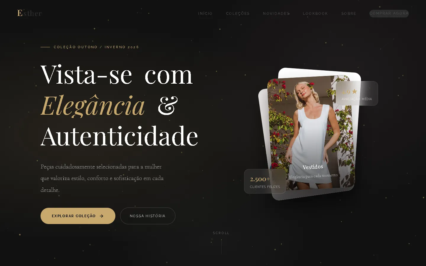
A shop website for a women's fashion shop in Brazil: a dark charcoal-and-gold hero with drifting gold particles, a large serif headline and a fanned stack of tilted photo cards, leading into warm cream sections with rounded product cards.
- Context
- Esther Moda Feminina, a women's fashion shop in São João de Meriti, Rio de Janeiro, Brazil.
- My role
- Design and frontend development
- Year
- 2026
Overview
Esther Moda Feminina sells women's clothing and accessories. The website presents the range on one page in Brazilian Portuguese, from a dark, gold-accented first screen to a cream product section.
The problem
A women's fashion shop needed its own website in Brazilian Portuguese with an elegant look that presents new arrivals and points visitors to the shop's contact details.
The solution
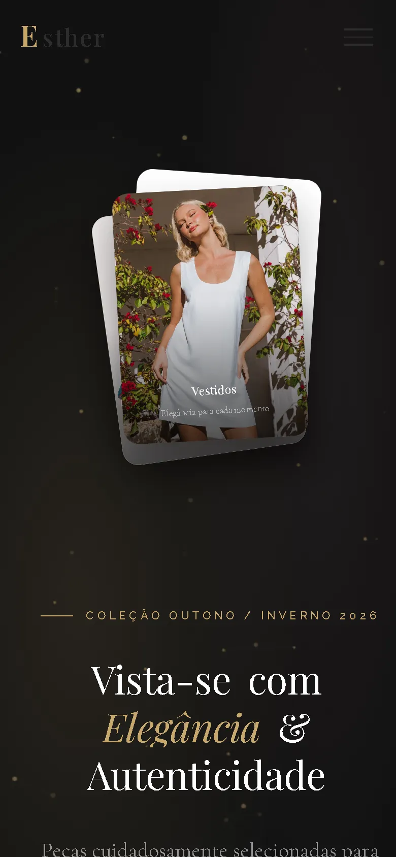
A single page in two moods: a charcoal hero with gold particles drawn on a canvas, a Playfair Display headline with a gold italic accent and tilted photo cards, then warm cream sections set in Raleway and Cormorant Garamond. The page runs from collections by category and new arrivals to a lookbook, an about section, a newsletter and the contact footer, with a monogram loader, a promo ticker and scroll-reveal animations.
Screenshots
Captured from the real, live website.
My contribution
Designed and built the website and published it on the client's domain.
What it does
- Dark hero with animated gold particles and a fanned stack of photo cards
- Collections by category
- New arrivals as rounded product cards with badges, prices and colour swatches
- Lookbook, about and newsletter sections
- Full-screen menu on phones
Technical challenges
Two moods on one page
The dark, gold-flecked hero sets an evening tone, while the product sections need to stay light and easy to scan. The page switches to warm cream below the hero and carries the gold accent through both parts.
Verified stack
- HTML
- CSS
- JavaScript
Facts from the code
- Language
- Brazilian Portuguese
- Products in the catalogue
- 6
- Ordering
- Through the contact section
Outcomes
- Live at esthermoda.shop.
Lessons
- A strong first screen can set the tone while the product section stays plain and readable.
About this case study
Client website, shown by name and live on its own domain. Screenshots were taken on the live site. Images are shown as published on the site; they are not necessarily photos of the shop or its products.
Planning a new website, or is yours too slow?
Describe it in a few sentences. You'll get a reply within two business days with questions, a rough approach, and a price range in CHF.