Websites
Marciavice Lifestyle Store: shop website
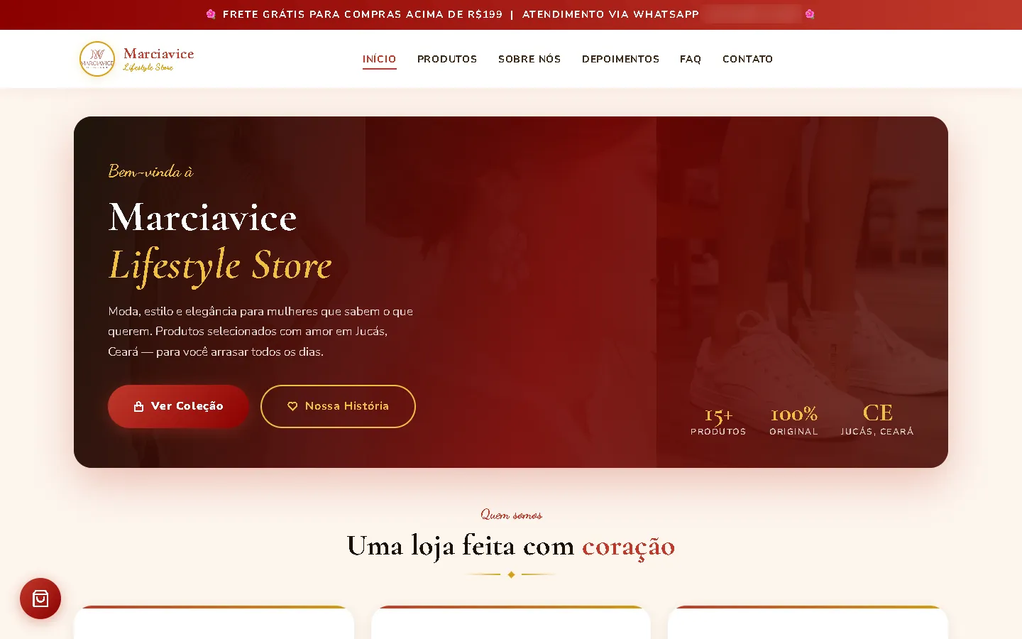
A shop website for a fashion and accessories shop in Brazil in deep crimson and gold on cream: a rounded dark-red hero card, a filterable product grid, a slide-in cart and an order page with a step indicator.
- Context
- Marciavice Lifestyle Store, a fashion and accessories shop in Jucás, Ceará, Brazil.
- My role
- Design and frontend development
- Year
- 2026
Overview
Marciavice Lifestyle Store sells women's, men's and children's clothing, shoes and accessories. The website brings the range together in one filterable catalogue with a cart and an order page.
The problem
A shop with several product lines needed a website in Brazilian Portuguese where customers can filter the range, build an order and review it at checkout.
The solution
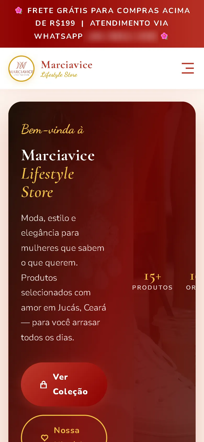
Crimson and gold on cream, pairing Cormorant Garamond with a Dancing Script accent and rounded Nunito body text. The hero is a rounded dark-red card over faded fashion photography, followed by an about section, an image mosaic, the shop with category filter chips, an FAQ, contact and policy sections. Items go into a slide-in cart with quantity steppers, and checkout continues to an order page with a Carrinho › Revisão › Confirmação step indicator.
Screenshots
Captured from the real, live website.
My contribution
Designed and built the website and published it on the client's domain.
What it does
- Fifteen products with category filter chips
- Slide-in cart with quantity steppers and a running total
- Order page with a three-step indicator, an itemised table and a customer form
- FAQ and policy sections
- Slide-in menu on phones
Technical challenges
Many lines in one grid
Women's, men's and children's clothing, shoes and accessories share one catalogue. Category chips above the grid let visitors show one line at a time.
Verified stack
- HTML
- CSS
- JavaScript
Facts from the code
- Language
- Brazilian Portuguese
- Products in the catalogue
- 15
- Ordering
- Cart and order summary
Outcomes
- Live at marciavice.online.
Lessons
- A simple step indicator makes a static checkout easier to follow.
About this case study
Client website, shown by name and live on its own domain. Screenshots were taken on the live site. Images are shown as published on the site; they are not necessarily photos of the shop or its products. A phone number in the announcement bar is blurred in the screenshots.
Planning a new website, or is yours too slow?
Describe it in a few sentences. You'll get a reply within two business days with questions, a rough approach, and a price range in CHF.