Websites
Glyzora Infinite Crest: boutique and bespoke tailoring redesign
A full redesign for a boutique with bespoke tailoring in the Philippines, built as the shop's dress box: a dusty-rose box whose lid lifts and tissue parts to reveal the hero photo, product cards as ribboned box tops, and a small box that drops into the cart. The new homepage also loads 0.60 MB instead of 88.33 MB.
- Context
- Glyzora Infinite Crest, a boutique for ready-to-wear, accessories and bespoke and bridal tailoring in San Pedro, Laguna, Philippines.
- My role
- Design, frontend development, and image production
- Year
- 2026
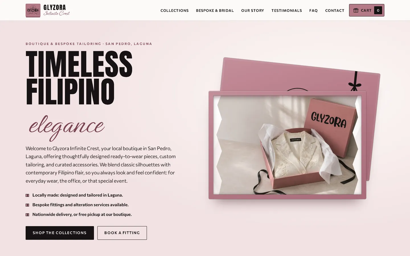
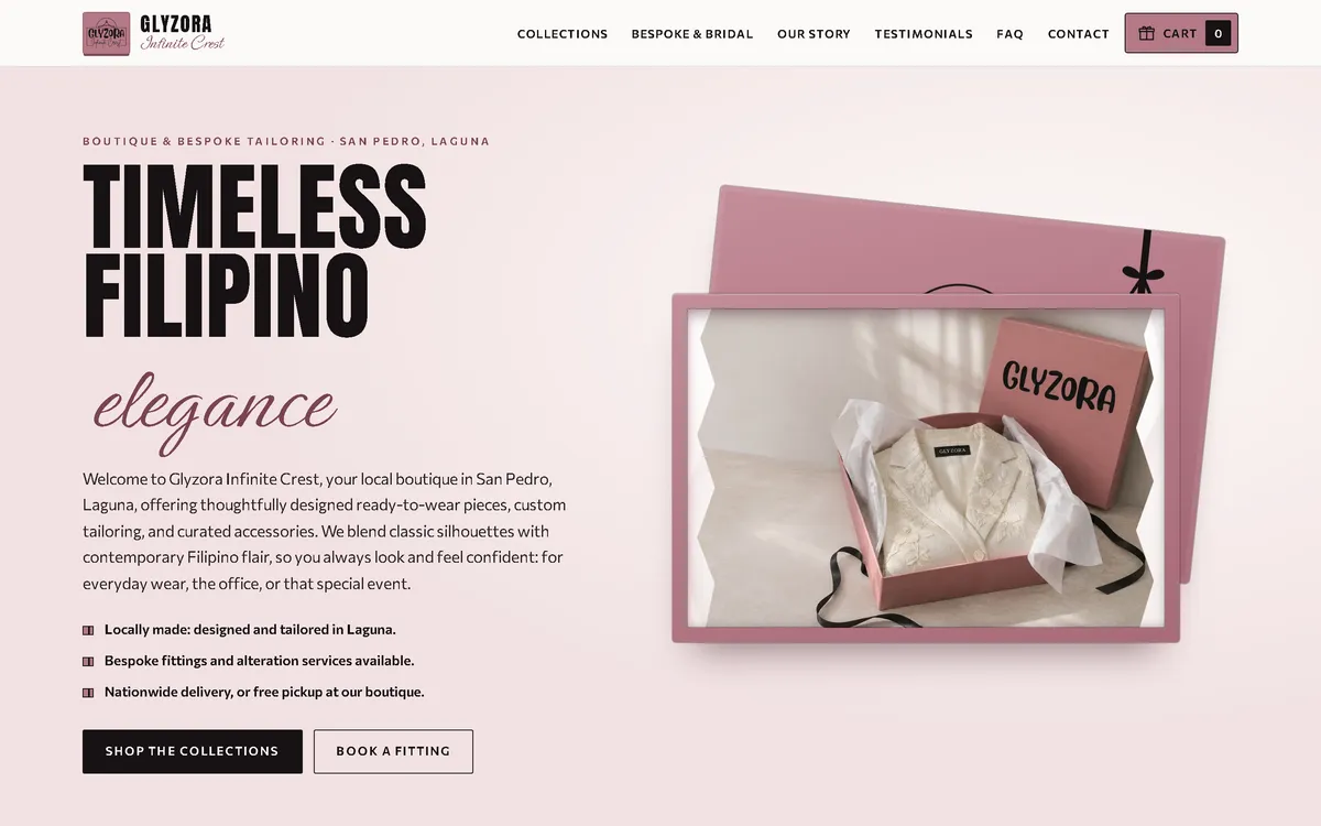
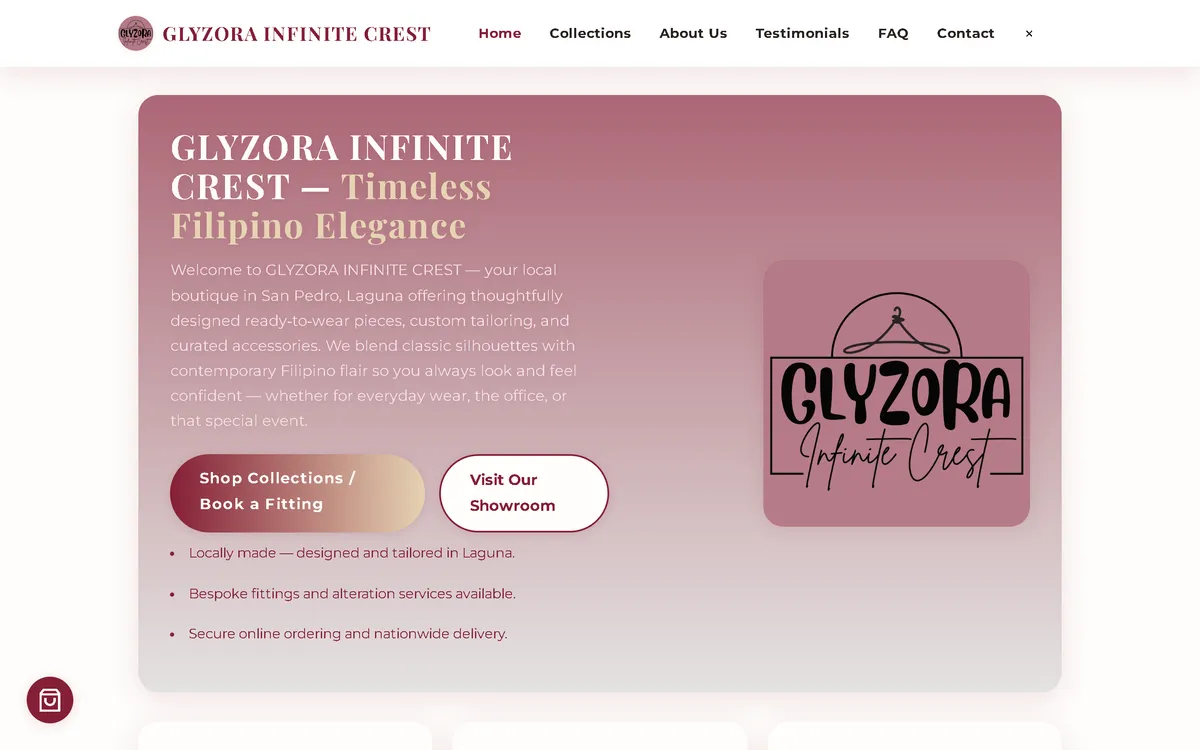
My redesign: before and after
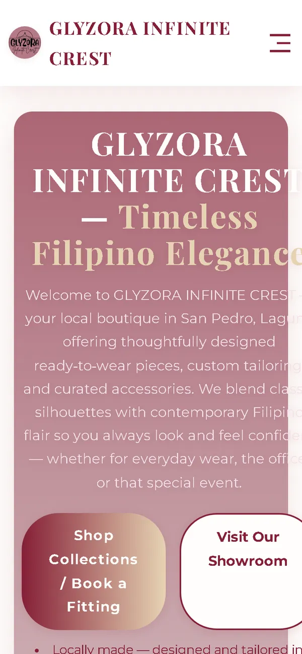
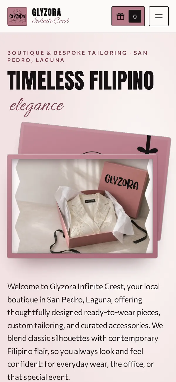
The old site next to my design, at the same screen size.
Homepage
A rose gradient card with the logo became a dress box: a condensed black headline with "elegance" in script, beside a dusty-rose box opened to show a garment in tissue paper and a black ribbon.
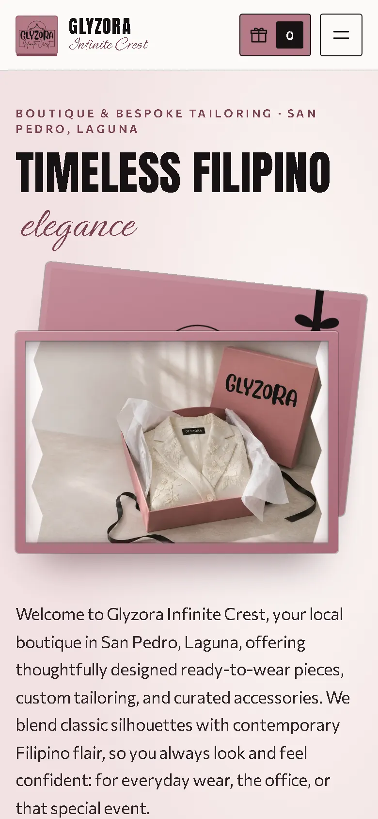
On a phone
The old phone layout was 780 px wide on a 390 px screen, with the headline and buttons cut off. Now the headline, the opened box and the text fit the screen, with the box-shaped cart always in the header.
Overview
Glyzora Infinite Crest sells ready-to-wear, office and evening pieces and accessories, and offers bespoke and bridal tailoring in San Pedro, Laguna. The new website is built around the moment a customer opens the box.
The problem
The old homepage downloaded 88.33 MB on every visit, which took 71.1 seconds to load on a simulated 10 Mbps connection. On a 390 px phone screen its layout was 780 px wide, it requested images that didn't exist, and it loaded fonts and icons from three outside hosts. It also promised secure online ordering and card payment through a link the shop doesn't have, and "trusted" claims nobody had confirmed.
The solution
A rebuild with no framework, in dusty rose and black, with a condensed display face, a script and a clean sans-serif. In the hero, the box lid lifts and the tissue parts to reveal the photo. Product cards are box tops with a black ribbon that lift on hover, and adding a piece drops a small ribboned box onto the box-shaped cart. Collections filter by ready-to-wear, office, evening, seasonal, accessories and bespoke, and the bespoke and bridal section explains the process on tissue-paper cards, with packages discussed rather than priced. At checkout, customers choose delivery or free pickup at the boutique, and pay on collection, by GCash, Maya or bank deposit. Images are compressed WebP files that load as the visitor scrolls, and the fonts ship with the site, so the homepage makes no third-party requests.
Screenshots
Captured from the real, live website.
My contribution
Designed and built the new site, produced the image set and compressed it for the web, built the box opening and the cart animation, rebuilt the checkout with pickup, removed the unconfirmed payment and trust claims, and measured the old and new versions with the same script.
What it does
- Hero box whose lid lifts and tissue parts to reveal the photo
- Product cards as ribboned box tops that lift on hover
- A small ribboned box drops onto the box-shaped cart when a piece is added
- Filters for ready-to-wear, office, evening, seasonal, accessories and bespoke
- Bespoke and bridal section with process cards and packages discussed, not priced
- Checkout with delivery or free boutique pickup; pickup hides the address field
- Unconfirmed online-payment, card and "trusted" claims removed
- Order sent as a pre-filled email that the customer sends, with the team confirming colour, size and availability first
- The three original customer quotes kept word for word
Technical challenges
A concept that does something
The box isn't only decoration. Lifting a lid previews the piece, and the small box landing in the cart confirms the choice, so the unboxing idea runs through the whole shopping flow.
Three clothing shops, three ideas
Two other clothing shops in the same region were redesigned in the same period, one with sketches and rails, one with fabric swatches. This one avoids both: no hangers, no rails, only the box and the moment of opening it.
Verified stack
- HTML
- CSS
- JavaScript
- WebP
- JSON-LD structured data
Facts from the code
- Homepage weight on load
- 88.33 → 0.60 MB
- On load, on a phone
- 88.32 → 0.46 MB
- After scrolling the whole page
- 88.33 → 0.77 MB
- Fully loaded, simulated 10 Mbps
- 71.1 → 0.67 s
- Phone layout width (390 px screen)
- 780 → 390 px
- Pieces in the shop
- 15
Outcomes
- Live at glyzorainfinite.site.
- Measured with the same script: homepage on load down from 88.33 MB to 0.60 MB on desktop and 0.46 MB on phones.
- No failed requests, console errors or third-party requests on the new site during the capture run.
Lessons
- The best concept is one that also works as an interface.
- Shops in the same trade deserve different ideas.
- Never promise a payment method the shop doesn't offer.
About this case study
Client website, shown by name. Screenshots and measurements come from one capture script run on the old and new site, on a local server. The 10 Mbps figure is a simulated connection, not data from real visitors. The product images are generated illustrations, each piece shown in or beside a box with the shop's name, with no other brands, and the shop says the photos are illustrations. Product descriptions, packages and the three customer quotes are carried over from the old site.
Planning a new website, or is yours too slow?
Describe it in a few sentences. You'll get a reply within two business days with questions, a rough approach, and a price range in CHF.