Websites
Mirivelle Golden Court: community store redesign
A full redesign for a community store in Batangas, Philippines, built around vintage seed packets: every product is a packet with a scalloped flap and a leaf frame from the logo, the range sits on four colour-coded racks, and adding an item makes a seedling sprout on the cart. The new homepage also loads 0.93 MB instead of 62.50 MB.
- Context
- Mirivelle Golden Court, a community store for groceries, ready-to-eat food, school supplies and household goods in Mataas na Kahoy, Batangas, Philippines.
- My role
- Design, frontend development, and image production
- Year
- 2026
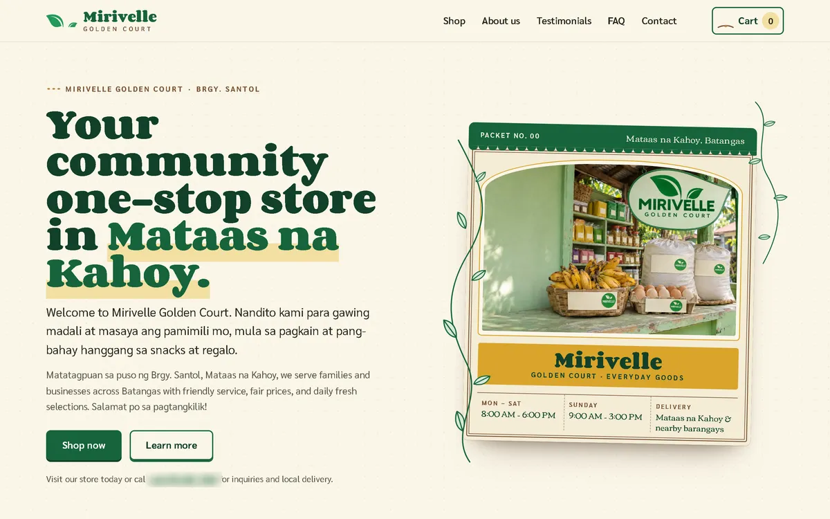
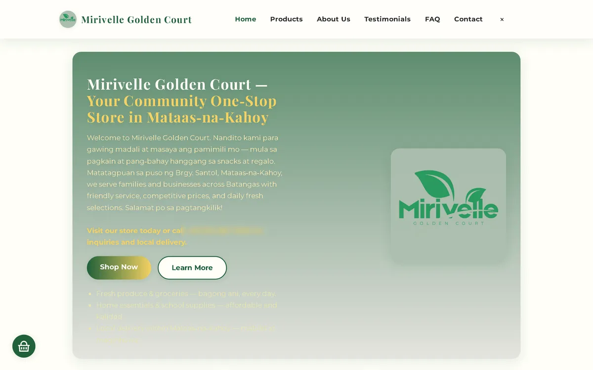
My redesign: before and after
The old site next to my design, at the same screen size.
Homepage
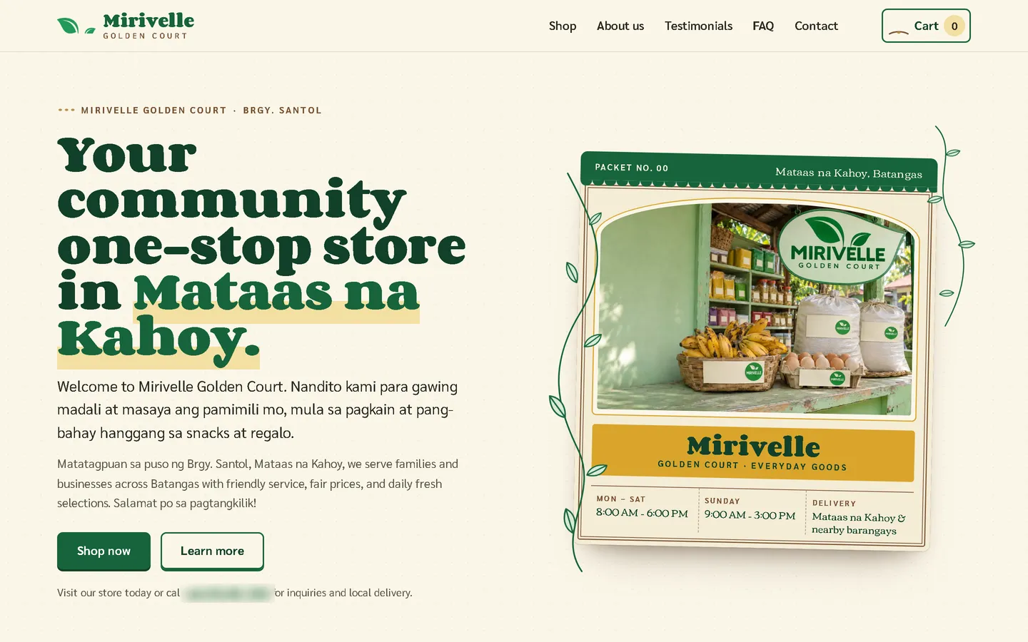
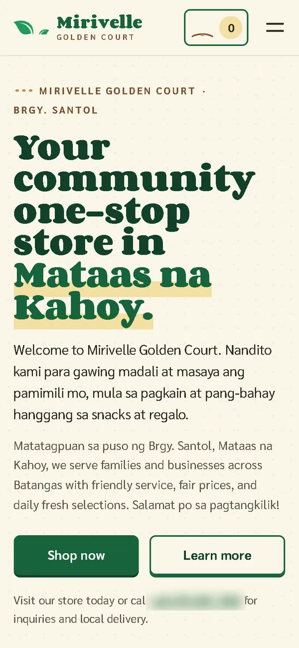
A green gradient card with the logo and pale yellow text that was hard to read became a seed packet: a heavy slab headline with a highlighter on "Mataas na Kahoy", beside a packet frame with vines, a photo of the store counter and the opening hours.
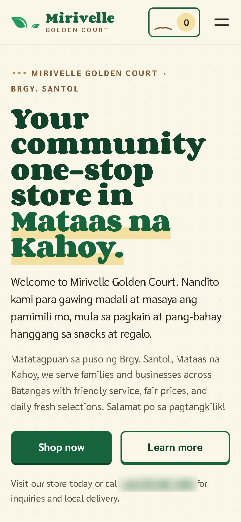
On a phone
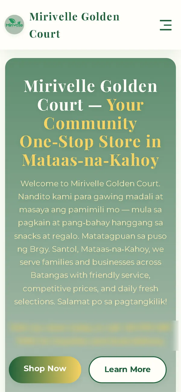
The old phone layout was 780 px wide on a 390 px screen, with a long block of centred text. Now the headline, the Taglish introduction and two buttons fit the screen, with the seedling cart always in the header.
Overview
Mirivelle Golden Court sells groceries, ready-to-eat food, school and office supplies and household goods in Barangay Santol, Mataas na Kahoy, Batangas. The new website borrows a familiar country-store object: the seed packet.
The problem
The old homepage downloaded 62.50 MB on every visit, which took 50.4 seconds to load on a simulated 10 Mbps connection. On a 390 px phone screen its layout was 780 px wide, its yellow text was barely readable, it requested images that didn't exist, and it loaded fonts and icons from three outside hosts. Its details also didn't agree: the tax number was labelled a business permit, the legal pages gave a different unit number, there were two extra email addresses on another domain, the founder's name was misspelled, and it announced card payments as "coming soon".
The solution
A rebuild with no framework, in deep green, cream and golden yellow, with a round slab serif and a clean sans-serif. Every product is a vintage seed packet: a scalloped "Packet No." flap, a leaf frame drawn from the logo, an arched photo, net weight or grade taken only from the product name, then price and an add button. Products sit on four colour-coded racks: pantry and fresh, ready-to-eat, school and office, home and cleaning. Adding an item "sows" it: the flap tips and a leaf sprouts on the cart button, which grows like a seedling. The shop's Taglish voice is kept. Images are compressed WebP files that load as the visitor scrolls, and the fonts ship with the site, so the homepage makes no third-party requests.
Screenshots
Captured from the real, live website.
My contribution
Designed and built the new site, produced the image set and compressed it for the web, built the seed-packet cards and the seedling cart, rebuilt the cart and order page, aligned the contact and legal details, and measured the old and new versions with the same script.
What it does
- Every product as a vintage seed packet with flap, leaf frame and arched photo
- Four colour-coded racks: pantry and fresh, ready-to-eat, school and office, home and cleaning
- Adding an item sprouts a leaf on the cart button, which grows like a seedling
- Hero packet frame with vines drawing in and an opening-hours table
- Product images with invented brand names, no real brands
- One email, one address and the tax number labelled correctly; the founder's name spelled correctly
- Card payments "coming soon" removed; payment as stated in the old FAQ
- Order sent as a pre-filled email that the customer sends, with the team confirming stock, delivery and the total first
- The shop's Taglish voice and the three original customer quotes kept word for word
Technical challenges
A concept that does something
The seed packet isn't only a look. Its flap, frame and details are the product card itself, and the seedling growing on the cart button shows the order growing.
Making the details agree
The old site gave different unit numbers, several email addresses and a mislabelled tax number. The new one shows one consistent set of details everywhere, taken from the client's own records.
Verified stack
- HTML
- CSS
- JavaScript
- SVG
- WebP
- JSON-LD structured data
Facts from the code
- Homepage weight on load
- 62.50 → 0.93 MB
- On load, on a phone
- 62.49 → 0.65 MB
- After scrolling the whole page
- 62.50 → 1.14 MB
- Fully loaded, simulated 10 Mbps
- 50.4 → 0.77 s
- Phone layout width (390 px screen)
- 780 → 390 px
- Products in the shop
- 15
Outcomes
- Live at mirivellegolden.site.
- Measured with the same script: homepage on load down from 62.50 MB to 0.93 MB on desktop and 0.65 MB on phones.
- No failed requests, console errors or third-party requests on the new site during the capture run.
Lessons
- The best concept is one that also works as an interface.
- Contact details must say the same thing on every page.
- If images are illustrations, say so on the page.
About this case study
Client website, shown by name. Screenshots and measurements come from one capture script run on the old and new site, on a local server. The 10 Mbps figure is a simulated connection, not data from real visitors. The product images are generated illustrations with invented brand names and no people, and the shop says the photos are illustrations. Product descriptions, delivery terms and the three customer quotes are carried over from the old site. In the screenshots, the phone number is blurred.
Planning a new website, or is yours too slow?
Describe it in a few sentences. You'll get a reply within two business days with questions, a rough approach, and a price range in CHF.