Websites
Jinkara Retail Outlet: outlet redesign
A full redesign for a neighbourhood outlet in the Philippines with a streetwear attitude: black and electric blue, a hero that unzips on arrival, and products presented as a drop. The new homepage also loads 0.69 MB instead of 106.44 MB.
- Context
- Jinkara Retail Outlet, a neighbourhood shop in Parañaque City, Philippines.
- My role
- Design, frontend development, and image production
- Year
- 2026
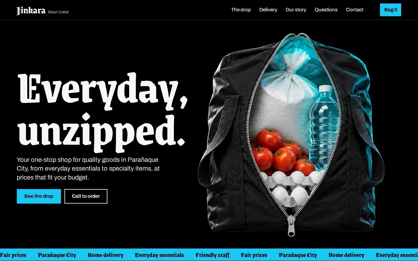
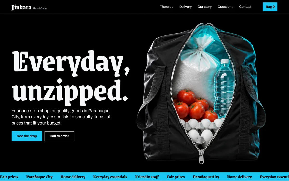
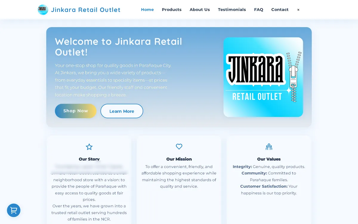
My redesign: before and after
The old site next to my design, at the same screen size.
Homepage
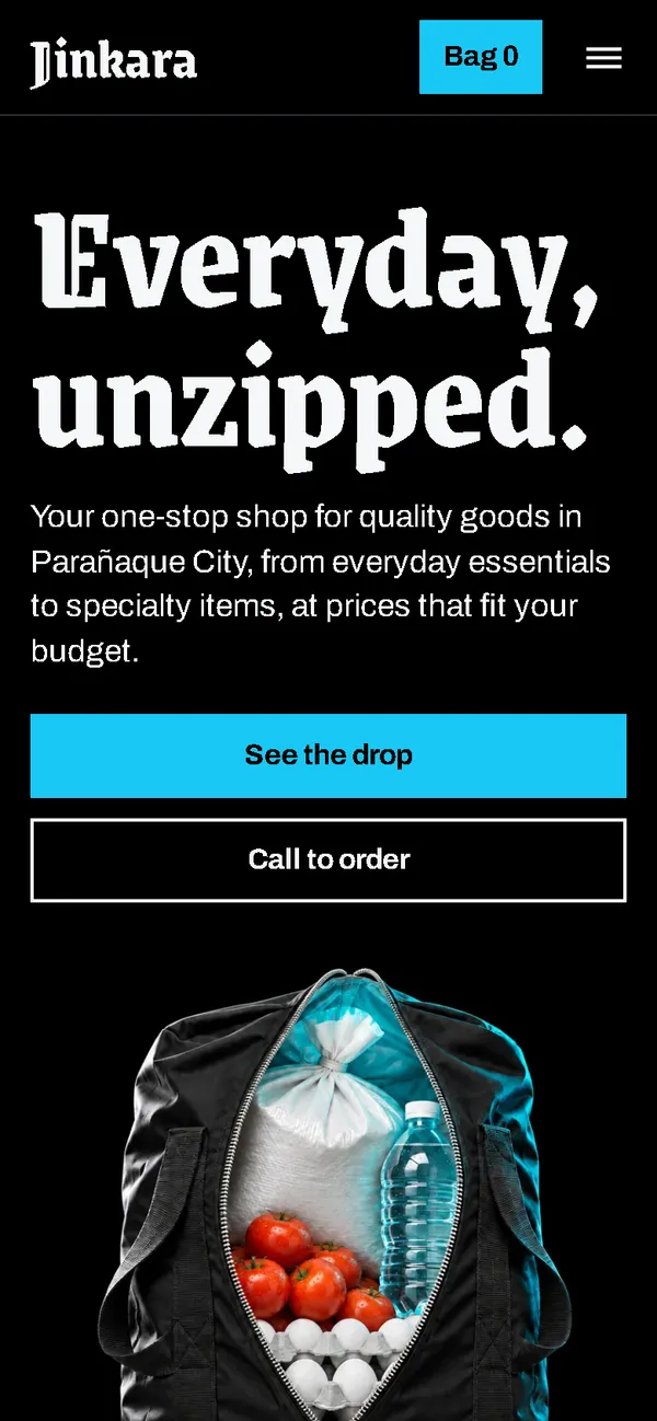
A pale blue welcome card became a black poster: "Everyday, unzipped." in heavy type next to a bag that opens on its groceries, with a scrolling strip in electric blue below.
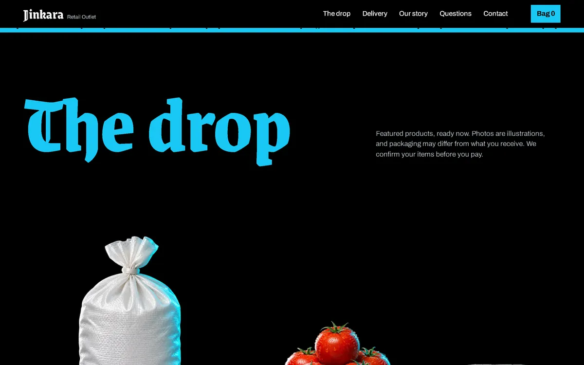
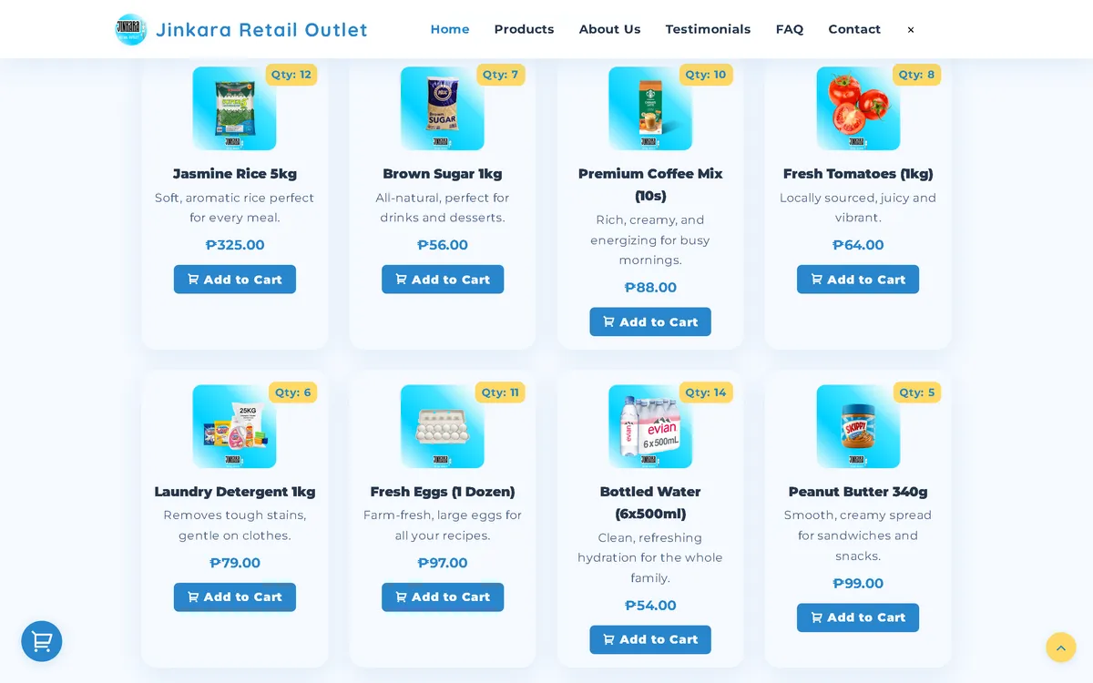
Products
A grid of light cards became "The drop": products on black, presented like a streetwear release, with the price and an add button on each item.
Policy section
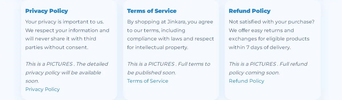
Light cards became one black band with bold headings and a clear link to each full policy.

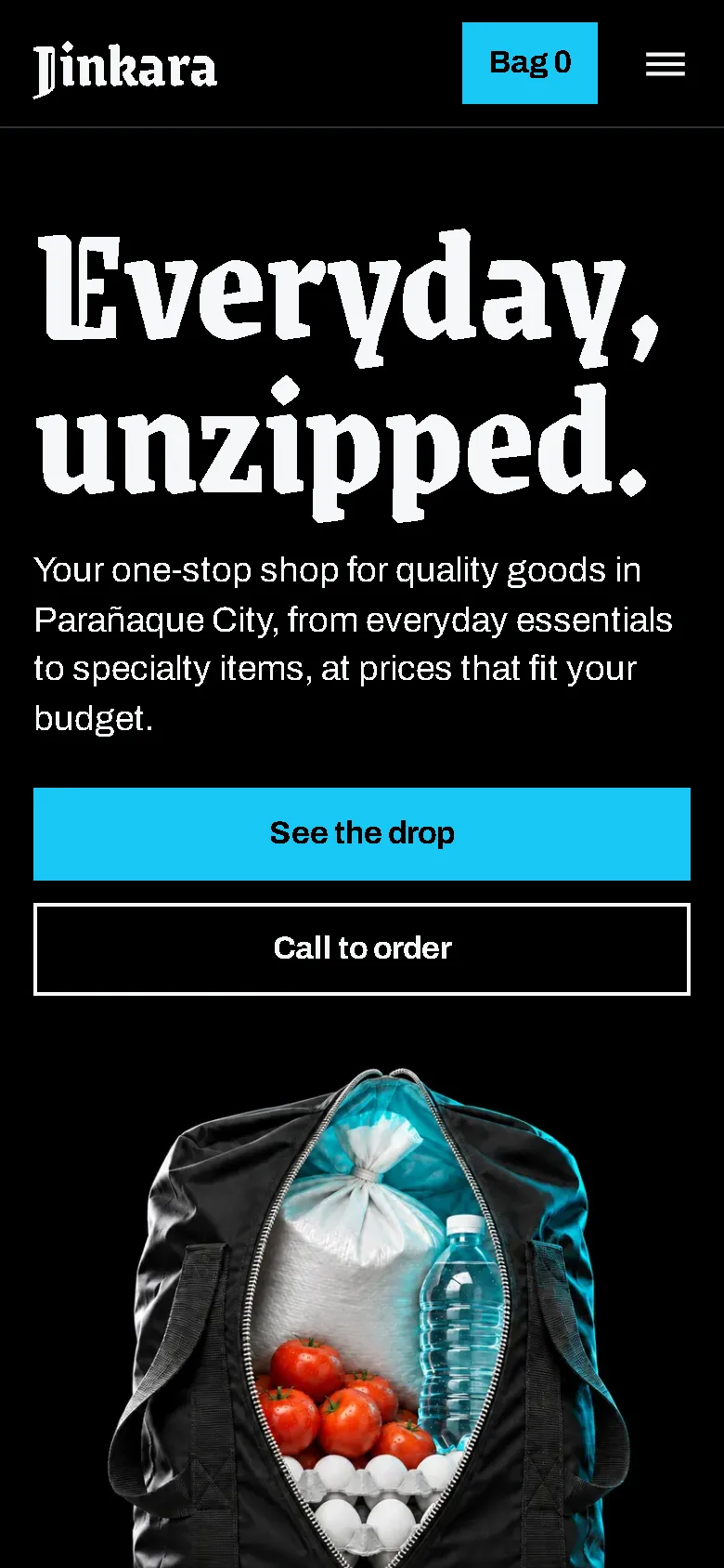
On a phone
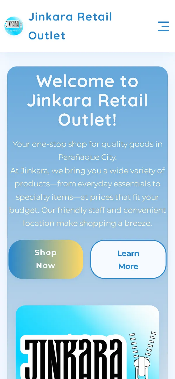
The headline and two full-width buttons come first on a tall screen, with the unzipped bag right below.
Overview
Jinkara Retail Outlet is a neighbourhood shop in Parañaque City that sells everyday essentials and specialty items. The new website gives an ordinary errand some attitude, borrowing the look of streetwear drops to make a grocery run feel current.
The problem
The old homepage downloaded 106.44 MB on every visit, 106.06 MB of it images, which took 85.8 seconds to load on a simulated 10 Mbps connection. On a 390 px phone screen its layout was 780 px wide, and its pale card template gave the shop no clear identity.
The solution
A rebuild with no framework built on one idea: everyday goods, unzipped. The hero opens like a zipper when the page loads, a ticker of the shop's promises runs below it, and the catalogue is styled as a drop. Images are compressed WebP files that load as the visitor scrolls, and the fonts ship with the site, so the homepage makes no third-party requests.
Screenshots
Captured from the real, live website.
My contribution
Designed and built the new site, produced the image set and compressed it for the web, rebuilt the bag and order page, and measured the old and new versions with the same script.
What it does
- Hero that unzips when the page loads, with reduced-motion support
- Scrolling ticker of the shop's promises below the hero
- Fifteen products styled as a streetwear drop on black
- Separate delivery and story sections built around night-time images
- Bag panel with quantity controls and a reminder that nothing is paid yet
- Order sent as a pre-filled email that the customer sends, with the team confirming items and delivery first
- Field checks on the order page, including Philippine mobile number formats
- Keyboard support in the bag and GroceryStore structured data
Technical challenges
Attitude without losing the shop
A streetwear look can easily hide what's actually for sale. Every product still shows its name, price, stock, and an add button, and the opening line says plainly what the shop sells and where.
Ordering with no backend
The site is static, so it can't place an order by itself. The order page checks the details and opens a complete pre-filled email for the customer to send, and it explains that the team confirms first.
A dark, image-led page that stays light
Large photos on black can get heavy fast. Compressed images, a separate hero for phones, and lazy loading keep the phone homepage at 0.61 MB on load and 0.98 MB after a full scroll.
Verified stack
- HTML
- CSS
- JavaScript
- WebP
- JSON-LD structured data
Facts from the code
- Homepage weight on load
- 106.44 → 0.69 MB
- On load, on a phone
- 106.43 → 0.61 MB
- After scrolling the whole page
- 106.44 → 1.00 MB
- Fully loaded, simulated 10 Mbps
- 85.8 → 0.50 s
- Phone layout width (390 px screen)
- 780 → 390 px
- Products in the catalogue
- 15
Outcomes
- Live at jinkarastore.site.
- Measured with the same script: homepage on load down from 106.44 MB to 0.69 MB on desktop and 0.61 MB on phones.
- No failed requests or console errors on the new homepage during the capture run.
Lessons
- A strong verb in the headline can carry a whole visual idea.
- Borrowing a look from another category can make an everyday shop stand out.
- If images are illustrations, say so on the page.
About this case study
Client website, shown by name. Screenshots and measurements come from one capture script run on the old and new site, on a local server. The 10 Mbps figure is a simulated connection, not data from real visitors. The product and scene images are generated illustrations with blank packaging, and the site says so. The founder's name is masked in the old homepage screenshot.
Planning a new website, or is yours too slow?
Describe it in a few sentences. You'll get a reply within two business days with questions, a rough approach, and a price range in CHF.