Websites
Kentrovia Prime Terrace: neighbourhood store redesign
A full redesign for a neighbourhood retail store in the Philippines, built around the queue board at the counter: an LED dot-matrix sign calls numbers before settling on the store's name, products are tear-off queue tickets stamped "in bag" when added, and the cart is a rolling LED counter. The new homepage also loads 0.47 MB instead of 55.55 MB.
- Context
- Kentrovia Prime Terrace, a neighbourhood retail store for groceries, home essentials and small electronics in Manuyo Uno, Las Piñas City, Philippines.
- My role
- Design, frontend development, and image production
- Year
- 2026
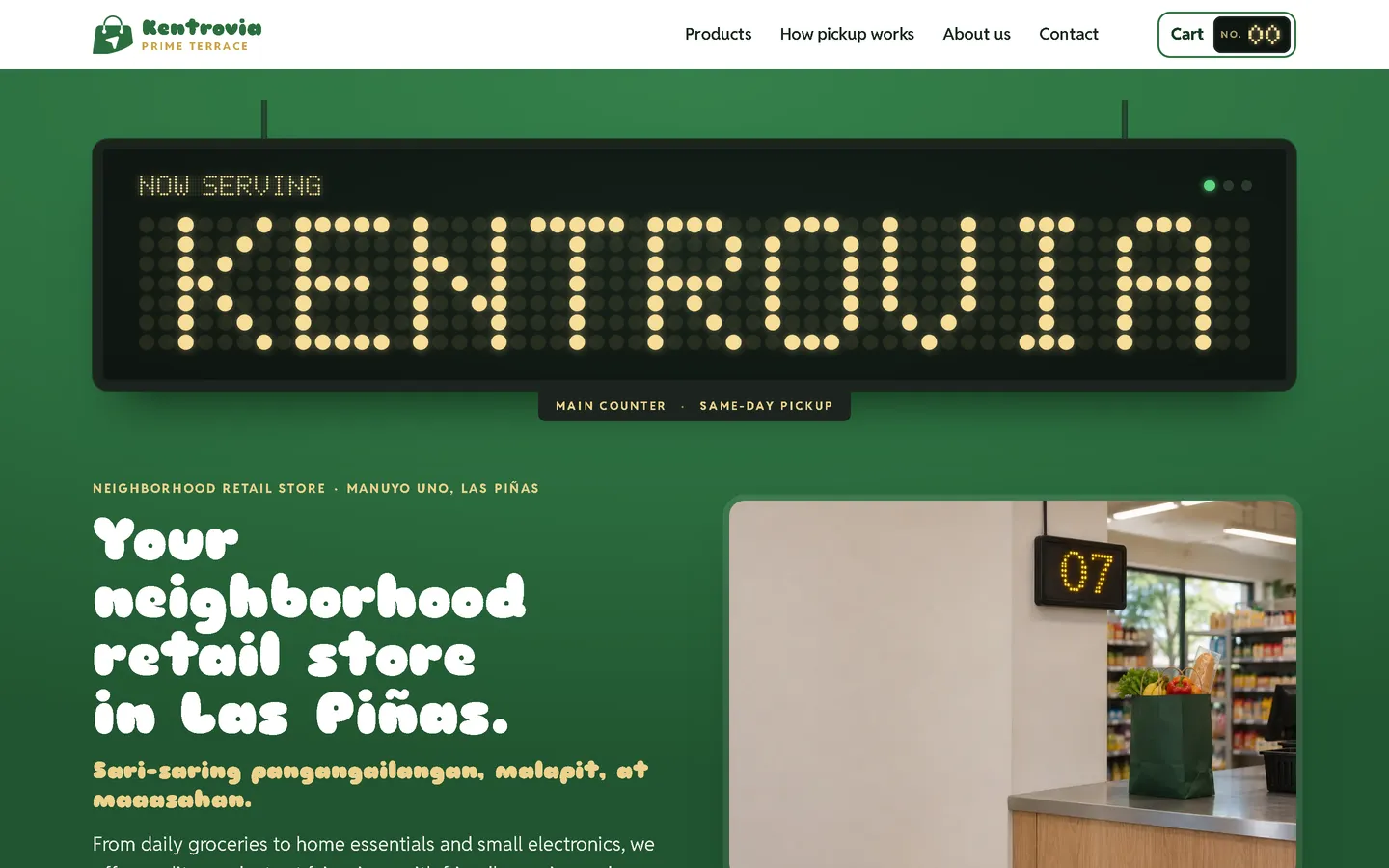
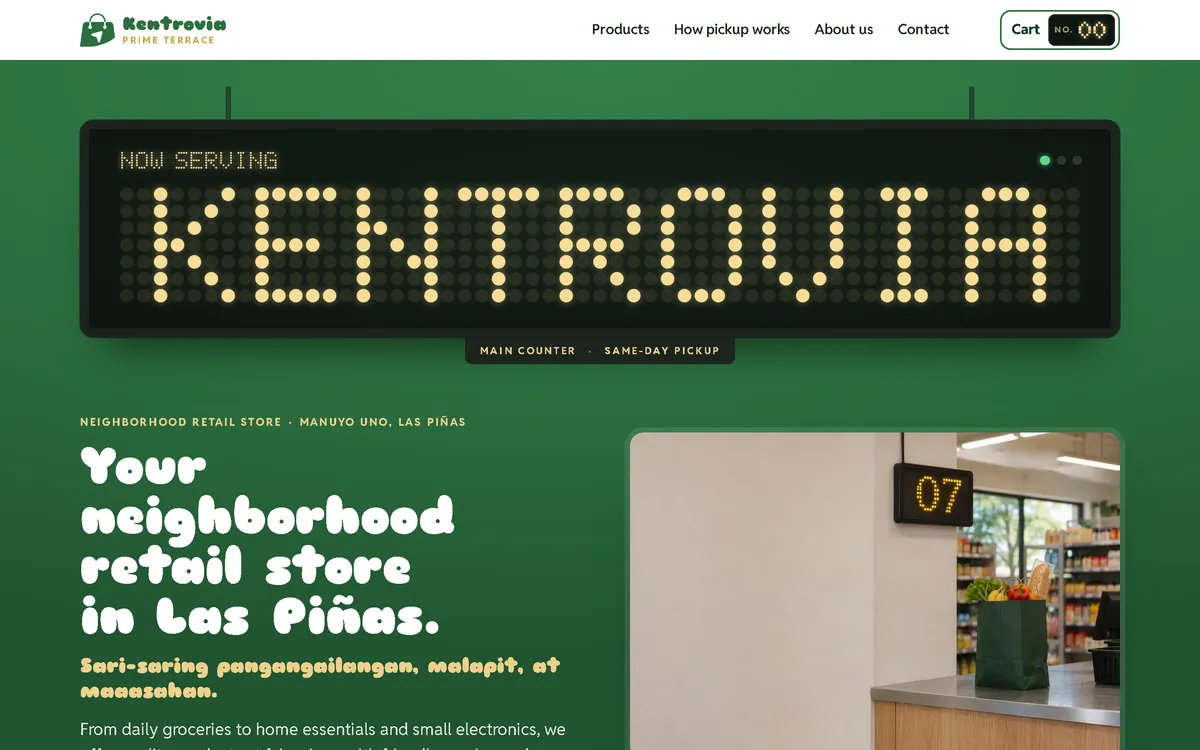
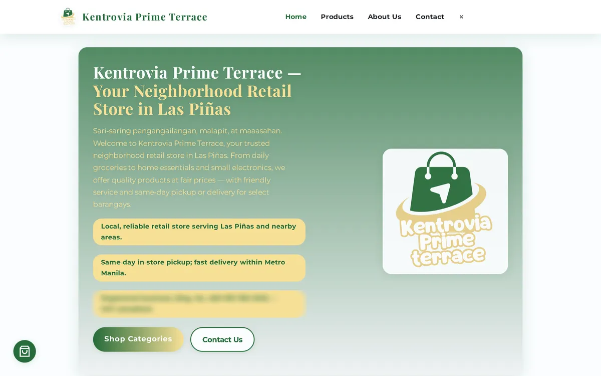
My redesign: before and after
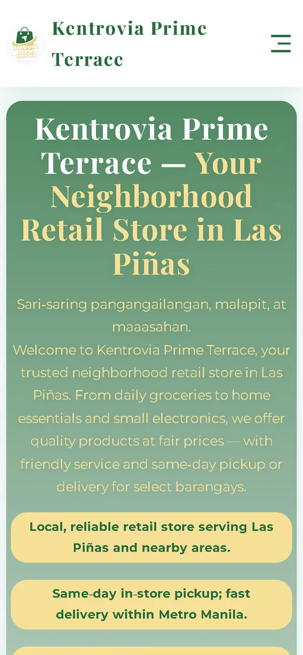
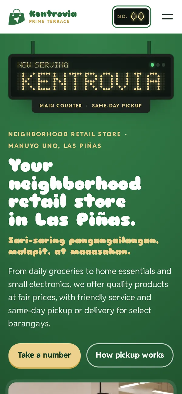
The old site next to my design, at the same screen size.
Homepage
A green gradient card with the logo and a badge calling the store "VAT-compliant" became a store counter: a near-black LED board spelling KENTROVIA under "Now serving", a playful bold headline, and a photo of the counter with its queue number.
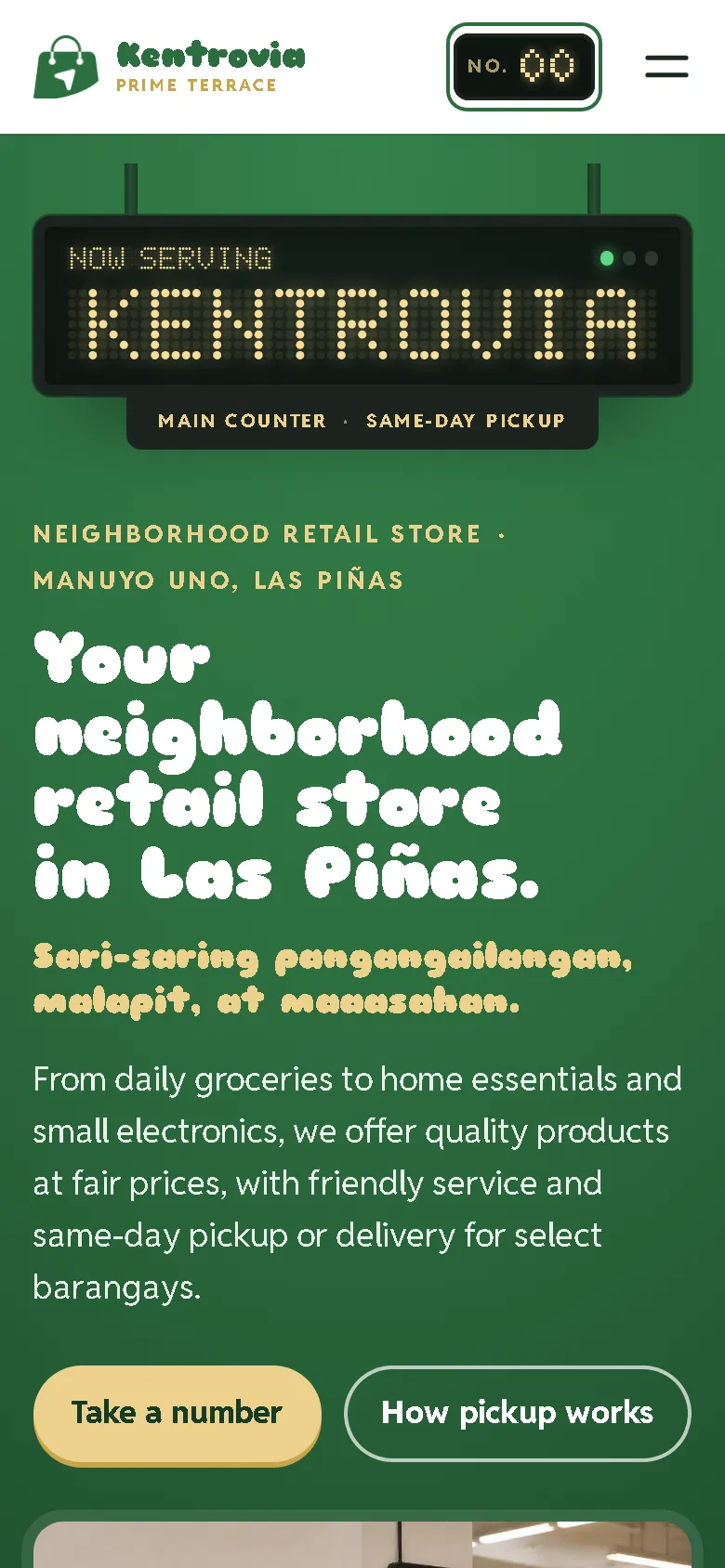
On a phone
The old phone layout was 780 px wide on a 390 px screen, with a long block of centred text. Now the LED board, the headline and two buttons fit the screen, with the LED cart counter always in the header.
Overview
Kentrovia Prime Terrace sells groceries, home essentials and small electronics in Manuyo Uno, Las Piñas City, with delivery or same-day pickup. The new website borrows what every customer waits in front of: the "now serving" board.
The problem
The old homepage downloaded 55.55 MB on every visit, which took 44.8 seconds to load on a simulated 10 Mbps connection. On a 390 px phone screen its layout was 780 px wide, and it loaded fonts, icons and a map from six outside hosts. It also called the store a registered, VAT-compliant business with the tax number as proof, promised promos and loyalty perks, linked social accounts nobody had confirmed, and claimed a vitamin would boost immunity.
The solution
A rebuild with no framework, in deep green, butter yellow and near-black, with a rounded display face, a clean sans-serif and a dot-matrix face. An LED board drawn in SVG calls queue numbers before settling on the store's name, and the cart in the header is an LED counter whose digits roll. Products are butter-yellow tear-off queue tickets numbered 01 to 15, stamped "in bag" when added, under the headline "Take a number". Customers choose delivery or same-day pickup; cash and card are only offered with pickup, and three ticket steps explain how pickup works. Images are compressed WebP files that load as the visitor scrolls, and the fonts ship with the site, so the homepage makes no third-party requests.
Screenshots
Captured from the real, live website.
My contribution
Designed and built the new site, produced the image set and compressed it for the web, built the LED board and counter and the ticket stamping, rebuilt the order page for delivery or pickup, removed the unconfirmed and health claims, and measured the old and new versions with the same script.
What it does
- LED dot-matrix board that calls queue numbers, then shows the store's name
- Rolling LED counter as the cart in the header
- Products as tear-off queue tickets, stamped "in bag" when added
- Delivery or same-day pickup; cash and card only with pickup
- "How pickup works" as three ticket steps
- Product images with invented brand names, no real brands
- VAT and registration claims, promos and loyalty perks, unconfirmed social links and an immunity claim removed
- No invented reviews: the old site had none, so the new one has none
- Order sent as a pre-filled email that the customer sends, with the team confirming availability and the total first
Technical challenges
A concept that does something
The queue board isn't only decoration. The ticket numbers order the products, the stamp confirms what is in the bag, and the counter in the header tells you how many items you have.
Promise only what the store can keep
The old site advertised compliance, promos, loyalty perks and a health benefit nobody had confirmed. They were removed, and only the tax number remains, shown as what it is.
Verified stack
- HTML
- CSS
- JavaScript
- SVG
- WebP
- JSON-LD structured data
Facts from the code
- Homepage weight on load
- 55.55 → 0.47 MB
- On load, on a phone
- 55.57 → 0.37 MB
- After scrolling the whole page
- 55.83 → 0.71 MB
- Fully loaded, simulated 10 Mbps
- 44.8 → 0.48 s
- Phone layout width (390 px screen)
- 780 → 390 px
- Products in the shop
- 15
Outcomes
- Live at kentroviaprime.online.
- Measured with the same script: homepage on load down from 55.55 MB to 0.47 MB on desktop and 0.37 MB on phones.
- No failed requests, console errors or third-party requests on the new site during the capture run.
Lessons
- The best concept is one that also works as an interface.
- Don't invent reviews to fill a section.
- Check every claim a site makes about rules and health.
About this case study
Client website, shown by name. Screenshots and measurements come from one capture script run on the old and new site, on a local server. The 10 Mbps figure is a simulated connection, not data from real visitors. The product images are generated illustrations with invented brand names and no people, and the shop says the photos are illustrations. Product descriptions and delivery terms are carried over from the old site; the old site had no customer reviews, and none were added. In the screenshots, the tax number on the old homepage and the phone number in the new phone menu are blurred.
Planning a new website, or is yours too slow?
Describe it in a few sentences. You'll get a reply within two business days with questions, a rough approach, and a price range in CHF.