Websites
Micharo Zenith Loft: real estate leasing redesign
A full redesign for a real estate leasing business in the Philippines, drawn as an architect's sheet: a faded loft plan behind the headline, a north arrow and a title block, and every unit shown as a photo beside its own floor plan, which draws itself in. Visitors build a shortlist and request a viewing. The new homepage also loads 0.55 MB instead of 61.78 MB.
- Context
- Micharo Zenith Loft, a leasing business for residential, office and retail spaces in Pasay City, Philippines.
- My role
- Design, frontend development, and image production
- Year
- 2026
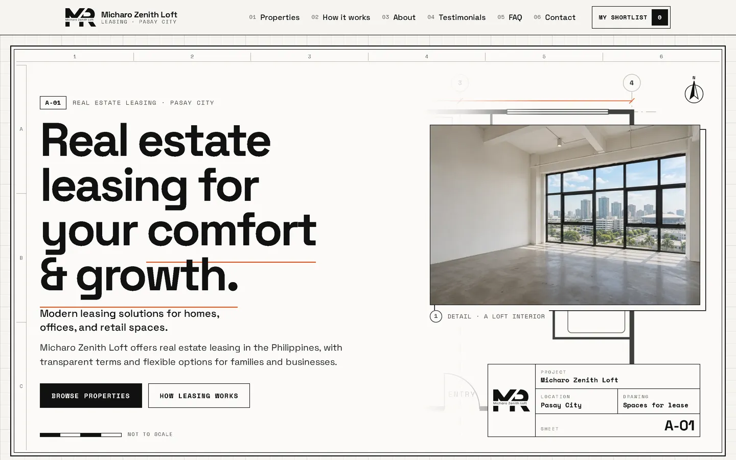
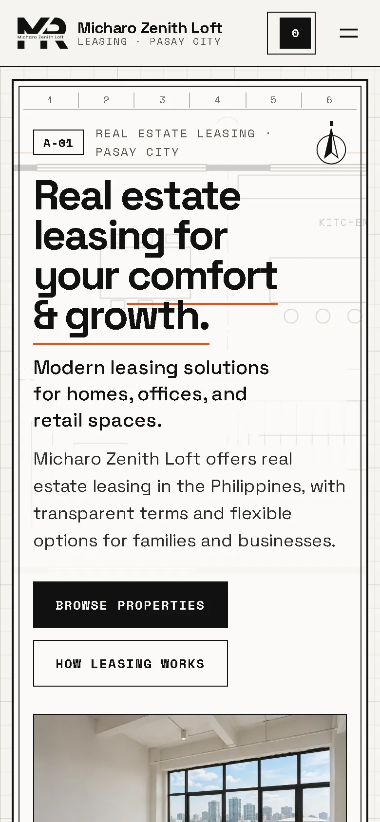
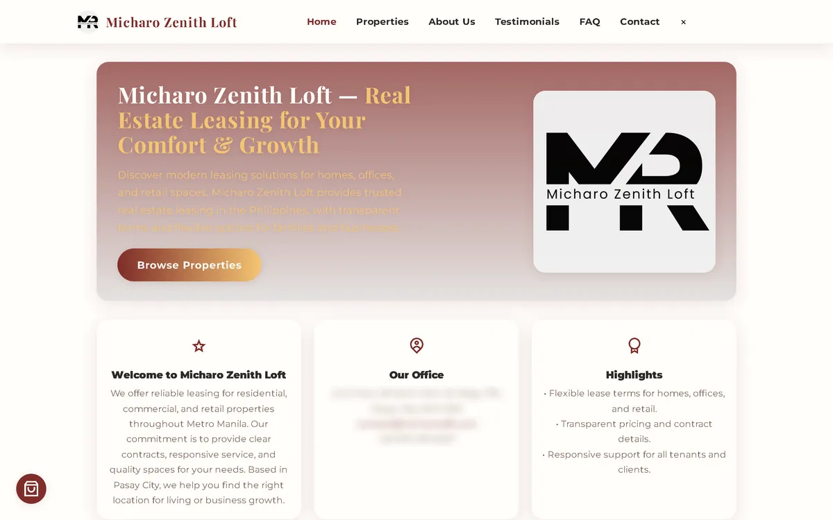
My redesign: before and after
The old site next to my design, at the same screen size.
Homepage
A mauve gradient card with pale yellow text that was hard to read became an architect's drawing sheet: a bold headline over a faded loft plan, a north arrow, a scale bar marked "not to scale" and a title block with the logo.
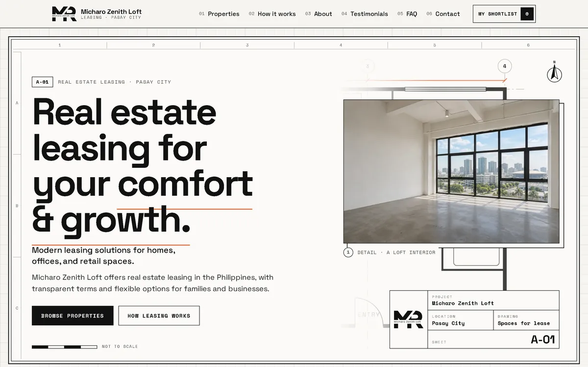
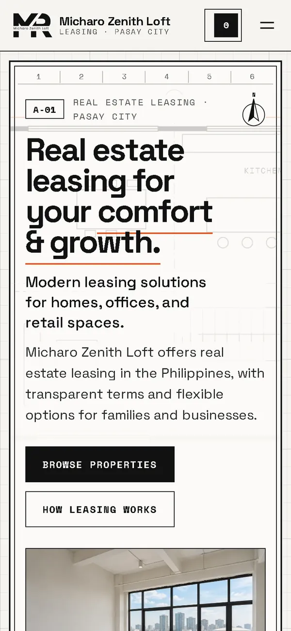
On a phone
The old phone layout was 780 px wide on a 390 px screen. Now the drawing frame, headline and two buttons fit the screen, with the shortlist always in the header.

Overview
Micharo Zenith Loft leases apartments, offices and retail spaces in Pasay City. People choosing a space think in layouts, so the new website is drawn like the plans an architect hands over.
The problem
The old homepage downloaded 61.78 MB on every visit, which took 49.8 seconds to load on a simulated 10 Mbps connection. On a 390 px phone screen its layout was 780 px wide, its intro text was pale yellow on mauve, it requested images that didn't exist, and it loaded fonts and icons from three outside hosts. It also listed registration and VAT numbers nobody had confirmed, unverified social media accounts, and a phone link that still pointed to an old number.
The solution
A rebuild with no framework, black on drafting paper with safety orange only for dimensions, set in a grotesque and a monospace face. The hero is a drawing sheet with a faded loft plan, a north arrow, a scale bar and a title block marked "Sheet A-01". Each unit card pairs a photo with a drawn floor plan labelled "indicative layout, not to scale"; floor areas appear only where the old data gave them. Visitors filter by residential, office and retail, add units to "My shortlist" and send a viewing request with a preferred day, time, move-in month and in-person or virtual viewing. Rents stay per unit and per month and are never added up, and nothing is paid online. Images are compressed WebP files that load as the visitor scrolls, and the fonts ship with the site, so the homepage makes no third-party requests.
Screenshots
Captured from the real, live website.
My contribution
Designed and built the new site, drew the floor plans, produced the image set and compressed it for the web, built the shortlist and the viewing request, removed the unconfirmed details and the outdated phone link, and measured the old and new versions with the same script.
What it does
- Hero as an architect's drawing sheet with loft plan, north arrow, scale bar and title block
- Each unit shown as a photo beside its own drawn floor plan, which draws itself in on hover or scroll
- Filters for residential, office and retail units
- "My shortlist" instead of a cart; rents shown per month, never summed
- Viewing request with preferred day and time, move-in month, and in-person or virtual viewing
- Floor areas shown only where the old site stated them
- Unconfirmed registration and VAT numbers, unverified social accounts and an outdated phone link removed
- Lease terms the old site didn't state shown as "please contact us", nothing invented
- The three original customer quotes kept word for word
Technical challenges
A concept that does something
The floor plans aren't decoration. Seeing the layout next to the photo is how people actually compare spaces, so the drawing style is also the most useful way to present the units.
Leasing is not shopping
Nobody rents an office in one click. The cart became a shortlist and the checkout a viewing request, and rents are never added up into a misleading total.
Verified stack
- HTML
- CSS
- JavaScript
- SVG
- WebP
- JSON-LD structured data
Facts from the code
- Homepage weight on load
- 61.78 → 0.55 MB
- On load, on a phone
- 61.77 → 0.33 MB
- After scrolling the whole page
- 61.78 → 0.72 MB
- Fully loaded, simulated 10 Mbps
- 49.8 → 0.51 s
- Phone layout width (390 px screen)
- 780 → 390 px
- Units listed
- 10
Outcomes
- Live at micharozenith.site.
- Measured with the same script: homepage on load down from 61.78 MB to 0.55 MB on desktop and 0.33 MB on phones.
- No failed requests, console errors or third-party requests on the new site during the capture run.
Lessons
- The best concept is one that also works as an interface.
- Match the flow to how people really decide, not to a shop template.
- If the data isn't there, say "contact us" instead of inventing it.
About this case study
Client website, shown by name. Screenshots and measurements come from one capture script run on the old and new site, on a local server. The 10 Mbps figure is a simulated connection, not data from real visitors. The listing photos are generated illustrations with no people, the floor plans are labelled indicative and not to scale, and the site says the photos are illustrations. Unit descriptions, rents and the three customer quotes are carried over from the old site; lease terms the old site didn't state read "please contact us". In the old homepage screenshot, the office address, email and phone number are blurred.
Planning a new website, or is yours too slow?
Describe it in a few sentences. You'll get a reply within two business days with questions, a rough approach, and a price range in CHF.