Websites
Stevianne Style Wardrobe: clothing shop redesign
A full redesign for a clothing shop in the Philippines, styled as a 1990s computer desktop: bubblegum pink windows with title bars, a chunky retro typeface, and a working mix-and-match window that puts an outfit together and adds it to the cart. The new homepage also loads 0.37 MB instead of 17.21 MB.
- Context
- Stevianne Style Wardrobe, a clothing shop in Muntinlupa City, Philippines.
- My role
- Design, frontend development, and image production
- Year
- 2026
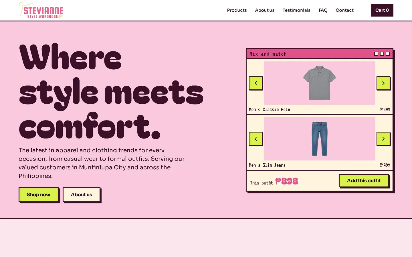
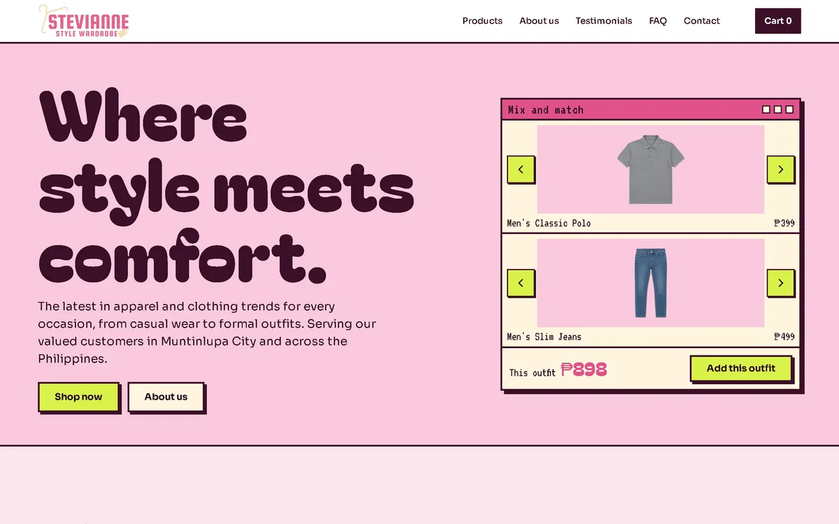
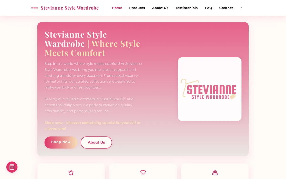
My redesign: before and after
The old site next to my design, at the same screen size.
Homepage
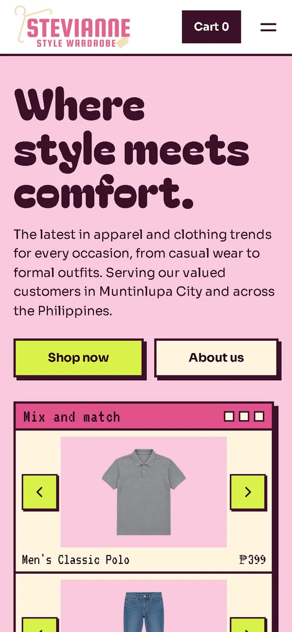
A pink gradient card with the logo became a retro desktop: a heavy rounded headline beside a "Mix and match" window where a polo and jeans can be swapped with arrow buttons.
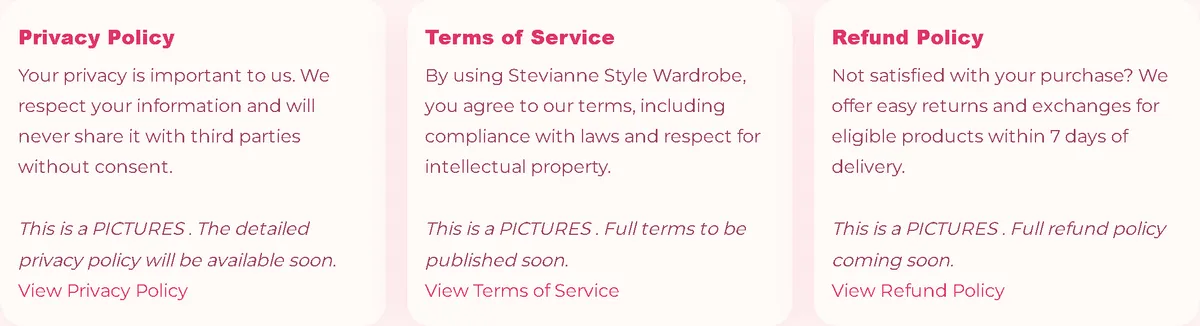
Policy section
Light policy cards became a pale pink band with a one-line summary and a link to each full policy.

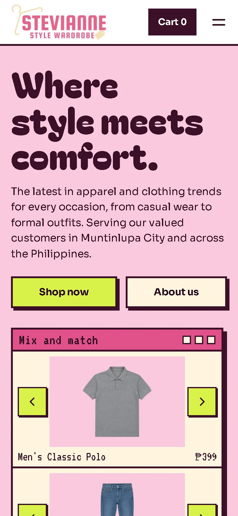
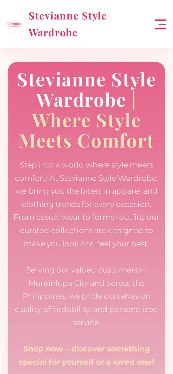
On a phone
The old phone layout was 780 px wide on a 390 px screen. Now the headline, two buttons, and the mix-and-match window fit the screen, with the cart always in the header.
Overview
Stevianne Style Wardrobe sells everyday clothing for women, men, and kids in Muntinlupa City. The new website borrows the look of an old computer desktop and turns the shop into something you can play with.
The problem
The old homepage downloaded 17.21 MB on every visit, 16.84 MB of it images, which took 14.0 seconds to load on a simulated 10 Mbps connection. On a 390 px phone screen its layout was 780 px wide, it loaded fonts and icons from three outside hosts, and its product photos carried watermarks.
The solution
A rebuild with no framework, in bubblegum pink, lime, and plum with a chunky rounded display face and monospace window labels. The ten products sit in three groups (Tops, Bottoms, Dresses), every garment photographed against the same pink at the same scale, and a mix-and-match window lets visitors combine a top and a bottom, see the outfit total, and add both to the cart. Images are compressed WebP files that load as the visitor scrolls, and the fonts ship with the site, so the homepage makes no third-party requests.
Screenshots
Captured from the real, live website.
My contribution
Designed and built the new site, produced the image set and compressed it for the web, built the outfit builder, rebuilt the cart and order page, and measured the old and new versions with the same script.
What it does
- Mix-and-match outfit builder: arrows change the top and bottom, the total updates, and one button adds both to the cart
- Ten products in three groups: Tops, Bottoms, and Dresses
- Every garment on the same pink background at the same scale
- Windows with title bars and controls as the layout system
- Cart with quantity controls and a reminder that nothing is paid yet
- Order sent as a pre-filled email that the customer sends, with the team confirming size, color, and availability first
- Field checks on the order page, including Philippine mobile number formats
- Note in the shop that the photos are illustrations and may differ from the piece
- Cart and outfit updates announced to screen readers, reduced-motion support, and ClothingStore structured data
Technical challenges
A concept you can use
The retro window is not only a frame. The mix-and-match builder is real interface: it changes garments, adds up the price, and puts the whole outfit into the cart in one step.
Ordering with no backend
The site is static, so it can't place an order by itself. The order page checks the details and opens a complete pre-filled email for the customer to send, and it explains that the team confirms size and availability first.
A consistent catalogue from mixed sources
The old photos had watermarks and different backgrounds. Every new garment sits on the same pink at the same height, so the ten products look like one collection, and the shop says the photos are illustrations.
Verified stack
- HTML
- CSS
- JavaScript
- WebP
- JSON-LD structured data
Facts from the code
- Homepage weight on load
- 17.21 → 0.37 MB
- On load, on a phone
- 17.20 → 0.32 MB
- After scrolling the whole page
- 17.21 → 0.43 MB
- Fully loaded, simulated 10 Mbps
- 14.0 → 0.53 s
- Phone layout width (390 px screen)
- 780 → 390 px
- Products in the shop
- 10
Outcomes
- Live at steviannewardrobe.shop.
- Measured with the same script: homepage on load down from 17.21 MB to 0.37 MB on desktop and 0.32 MB on phones.
- No failed requests or console errors on the new site during the capture run.
Lessons
- A playful concept works best when it also helps people decide.
- One background and one scale make a small range look curated.
- If images are illustrations, say so on the page.
About this case study
Client website, shown by name. Screenshots and measurements come from one capture script run on the old and new site, on a local server. The 10 Mbps figure is a simulated connection, not data from real visitors. The product images are generated illustrations with no people, and the retro computer look is a visual concept; the site says the photos are illustrations. Product descriptions and customer quotes on the site are carried over from the old site. The old product grid isn't shown because it pictured people, watermarks and a third-party logo.
Planning a new website, or is yours too slow?
Describe it in a few sentences. You'll get a reply within two business days with questions, a rough approach, and a price range in CHF.