Sites web
Avrelisse Crystal Harbor: skincare shop redesign
A full redesign for a skincare brand in the Philippines, built around texture: every product card shows a smear of its texture on beige stone, cream swirl, gel, oil drop, foam or grains, which spreads on hover, and the hero opens with five big swatches. The new homepage also loads 0.40 MB instead of 41.98 MB.
Les études de cas sont en anglais.
- Contexte
- Avrelisse Crystal Harbor, a skincare and beauty products brand in Las Piñas City, Philippines.
- Mon rôle
- Design, frontend development, and image production
- Année
- 2026
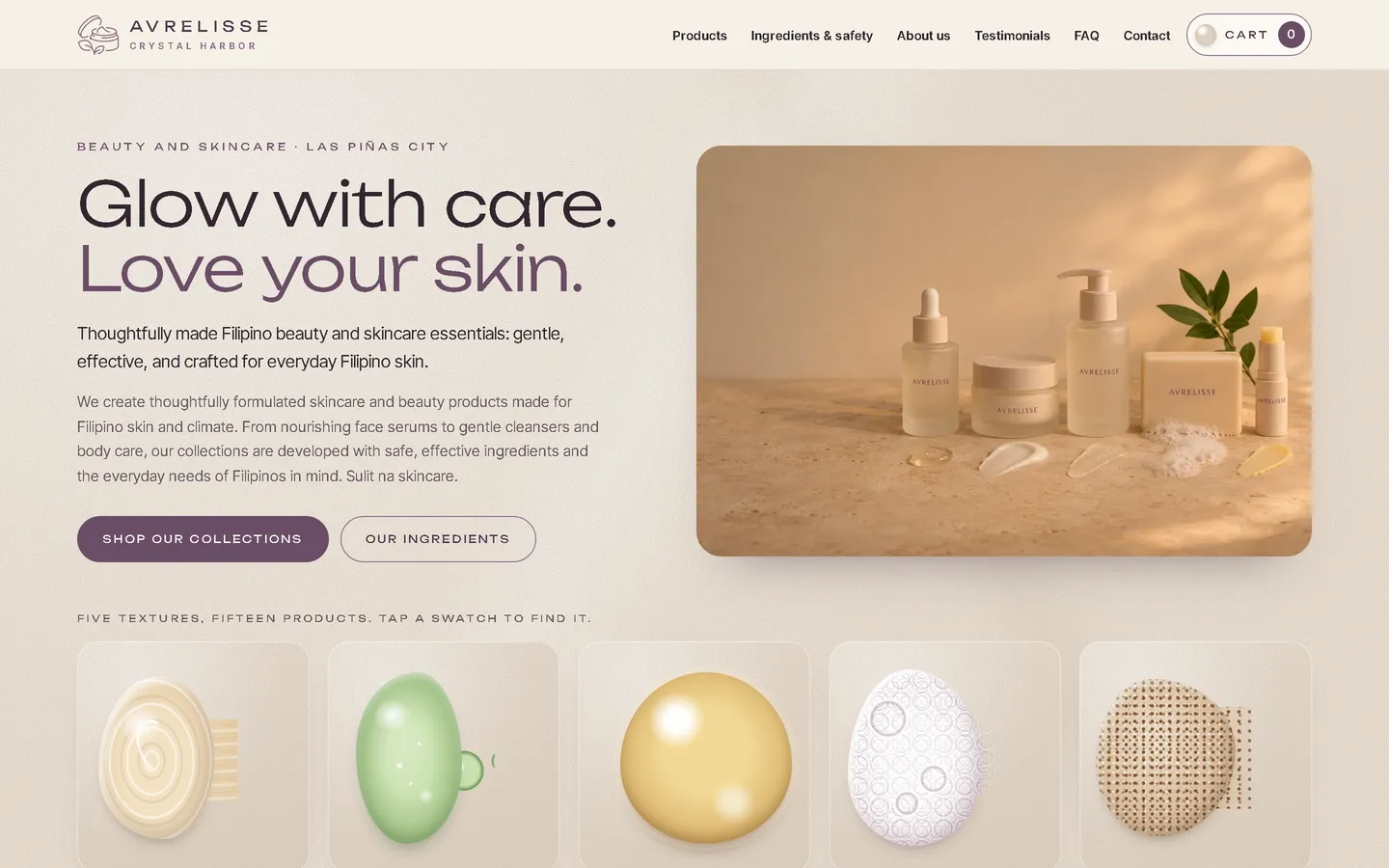

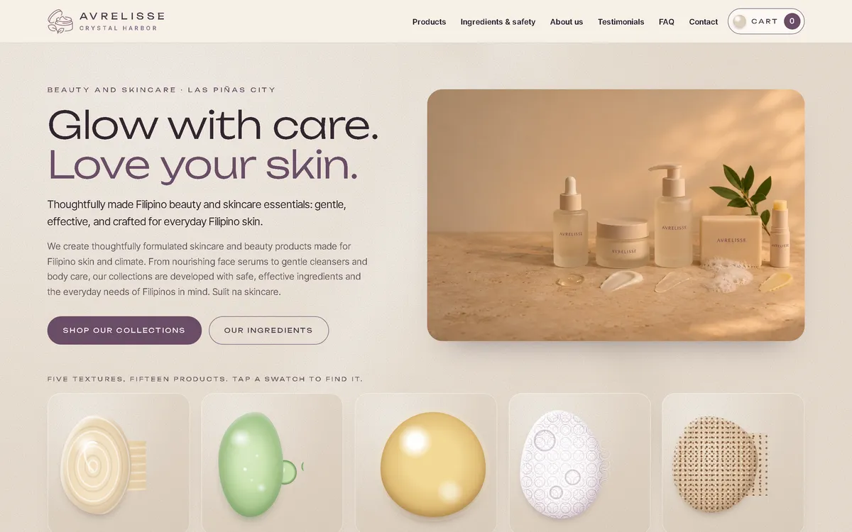
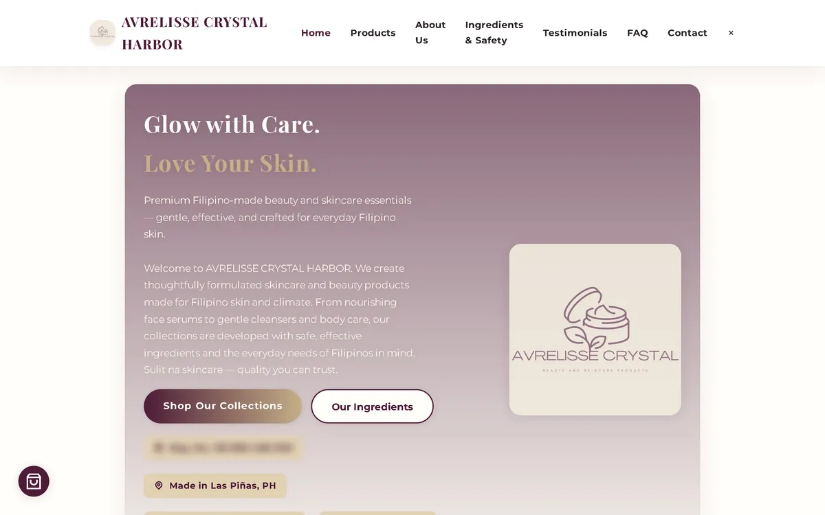
Ma refonte : avant et après
L'ancien site à côté de mon design, à la même taille d'écran.
Homepage
A mauve gradient card with the logo and a tax number shown as a registration badge became a warm stone first screen: a wide headline in plum, a photo of the range on limestone with texture smears, and a row of five big texture swatches below.
On a phone
The old phone layout was 780 px wide on a 390 px screen, with a long block of centred text. Now the headline, two buttons and the product photo fit the screen.


Aperçu
Avrelisse Crystal Harbor makes face, body and sun care and soaps in Las Piñas City. People choose skincare by how it feels, so the new website shows each product as its texture.
Le problème
The old homepage downloaded 41.98 MB on every visit, which took 33.9 seconds to load on a simulated 10 Mbps connection. On a 390 px phone screen its layout was 780 px wide, it requested images that didn't exist, and it loaded fonts, icons and a map from six outside hosts. Its content was also unfinished and risky: a placeholder "20XX" company timeline, an unconfirmed FDA and compliance claim, template taglines under the wrong products, medical and whitening claims, and extra email addresses on another domain.
La solution
A rebuild with no framework, in beige stone, plum and soft gold, with a wide display face and a clean sans-serif. Every product card carries a smear of its texture drawn in CSS, cream swirl, glossy gel, oil drop, foam, grains, mist dots or a matte soap bar, which spreads on hover, and the hero opens with five big swatches that lead to the products. Key-ingredient chips come from the old product notes, and an ingredients and safety section recommends a patch test. Images are compressed WebP files that load as the visitor scrolls, and the fonts ship with the site, so the homepage makes no third-party requests.
Captures d'écran
Capturées sur le véritable site, en ligne.
Ma contribution
Designed and built the new site, produced the image set and compressed it for the web, built the texture swatches, rebuilt the cart and order page, removed the placeholder timeline and the unconfirmed and medical claims, and measured the old and new versions with the same script.
Fonctionnalités
- Every product shown with a CSS smear of its texture that spreads on hover
- Hero row of five big texture swatches linking to the products
- Key-ingredient chips taken from the old product notes
- Ingredients and safety section with a patch-test card
- Placeholder "20XX" timeline, FDA and compliance claim, mismatched taglines and medical and whitening claims removed or softened
- One contact email instead of extra addresses on another domain
- Order sent as a pre-filled email that the customer sends, with the team confirming everything first
- The original customer quotes kept as on the old site
Défis techniques
A concept that does something
The swatches aren't only decoration. Seeing a product's texture is how people choose skincare, so the smear on each card is also the most useful thing to show.
Cleaning up unfinished content
The old site still had a template timeline with "20XX" dates, taglines meant for clothing under face serums, and claims nobody had confirmed. All of it was rewritten or removed, so every line on the page belongs to this brand.
Technologies vérifiées
- HTML
- CSS
- JavaScript
- WebP
- JSON-LD structured data
Faits tirés du code
- Homepage weight on load
- 41.98 → 0.40 MB
- On load, on a phone
- 41.98 → 0.33 MB
- After scrolling the whole page
- 42.86 → 0.61 MB
- Fully loaded, simulated 10 Mbps
- 33.9 → 0.52 s
- Phone layout width (390 px screen)
- 780 → 390 px
- Products in the shop
- 15
Résultats
- Live at avrelissecrystal.site.
- Measured with the same script: homepage on load down from 41.98 MB to 0.40 MB on desktop and 0.33 MB on phones.
- No failed requests, console errors or third-party requests on the new site during the capture run.
Enseignements
- The best concept is one that also works as an interface.
- Template leftovers cost trust; read every line before launch.
- In skincare, careful wording builds more trust than big promises.
À propos de cette étude de cas
Client website, shown by name. Screenshots and measurements come from one capture script run on the old and new site, on a local server. The 10 Mbps figure is a simulated connection, not data from real visitors. The product images are generated illustrations with labels drawn from the brand's own name and no people, and the shop says the photos are illustrations. Product descriptions and customer quotes are carried over from the old site; medical, whitening and compliance claims were removed or softened, and this case study makes no claim about product effects. In the old homepage screenshots, the tax number is blurred.
Vous prévoyez un nouveau site, ou le vôtre est trop lent ?
Décrivez votre projet en quelques phrases. Dans les deux jours ouvrables, vous recevez des questions, une première approche et une fourchette de prix en CHF.