Sites web
Michaelle Retail Mart: neighbourhood store redesign
A full redesign for a neighbourhood retail store in the Philippines, built around the woven bayong market bag: rounded navy type, banig tan weave, and a bag in the header that fills up as items go into the cart. Orders are for pickup in store. The new homepage also loads 1.32 MB instead of 46.63 MB.
Les études de cas sont en anglais.
- Contexte
- Michaelle Retail Mart, a neighbourhood retail store in Imus City, Cavite, Philippines.
- Mon rôle
- Design, frontend development, and image production
- Année
- 2026
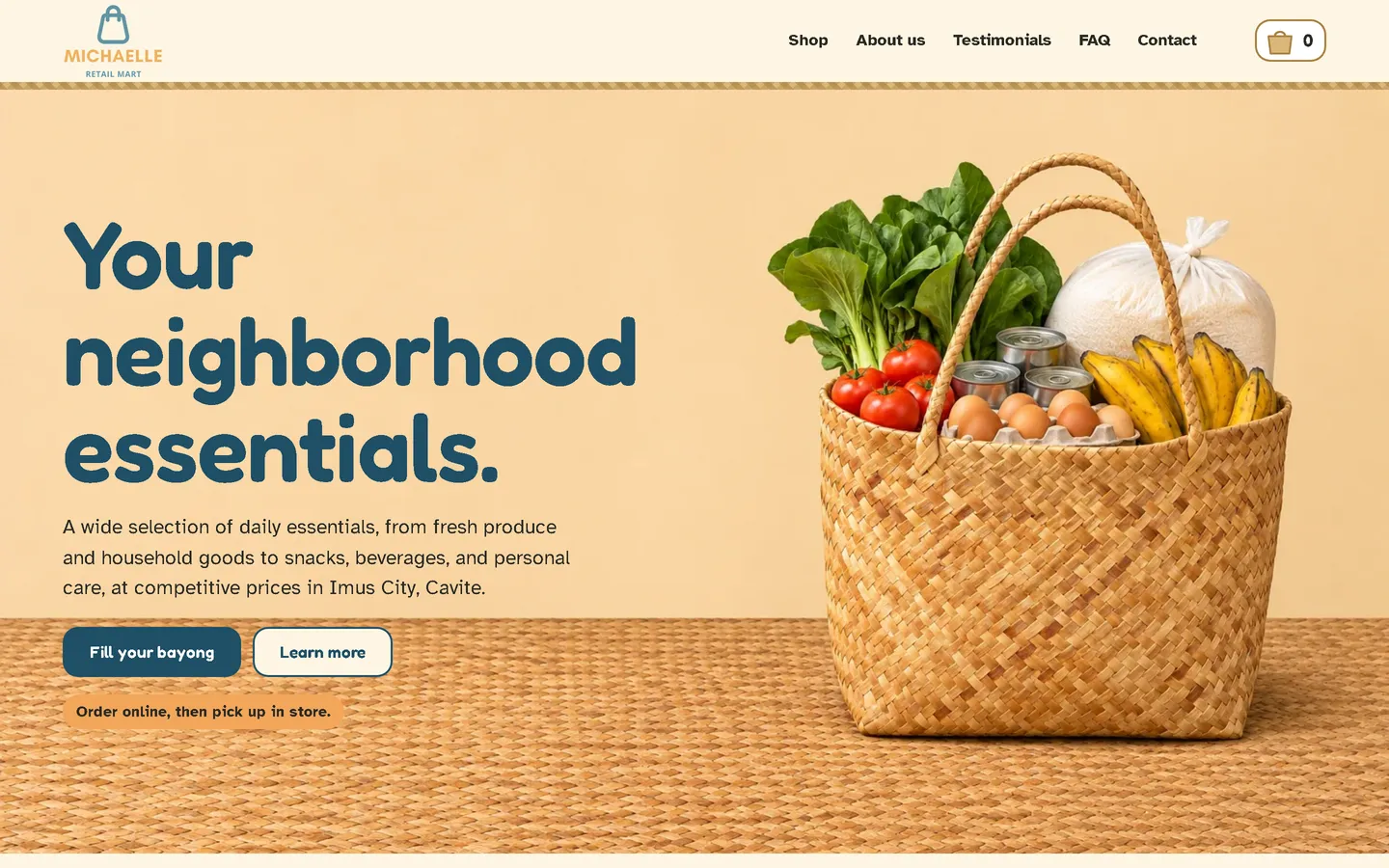
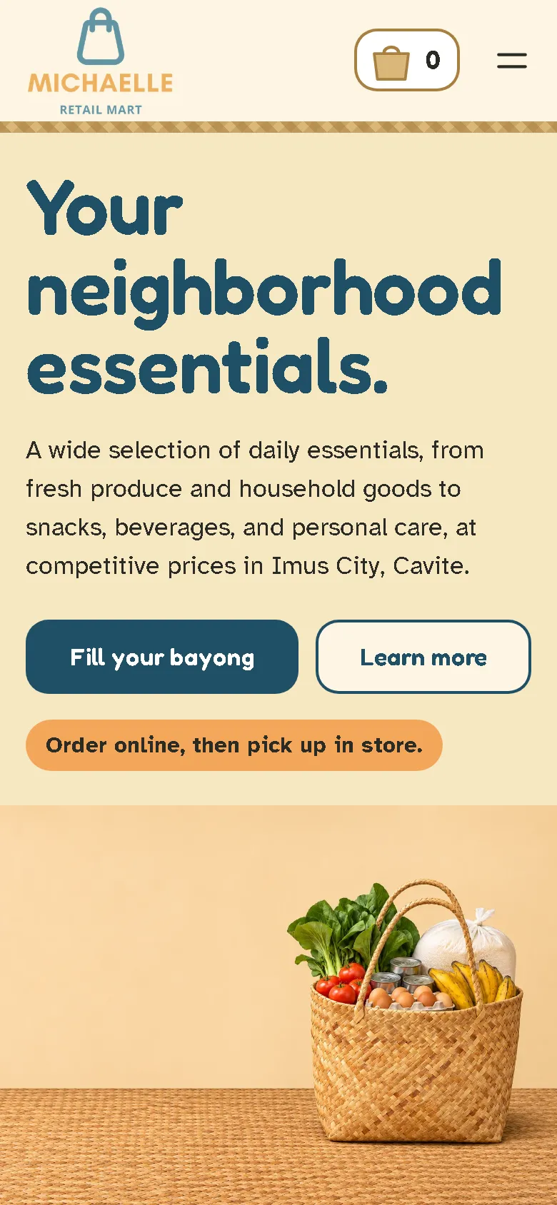
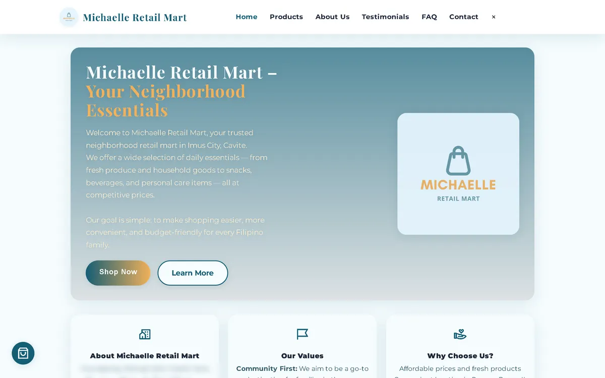
Ma refonte : avant et après
L'ancien site à côté de mon design, à la même taille d'écran.
Homepage
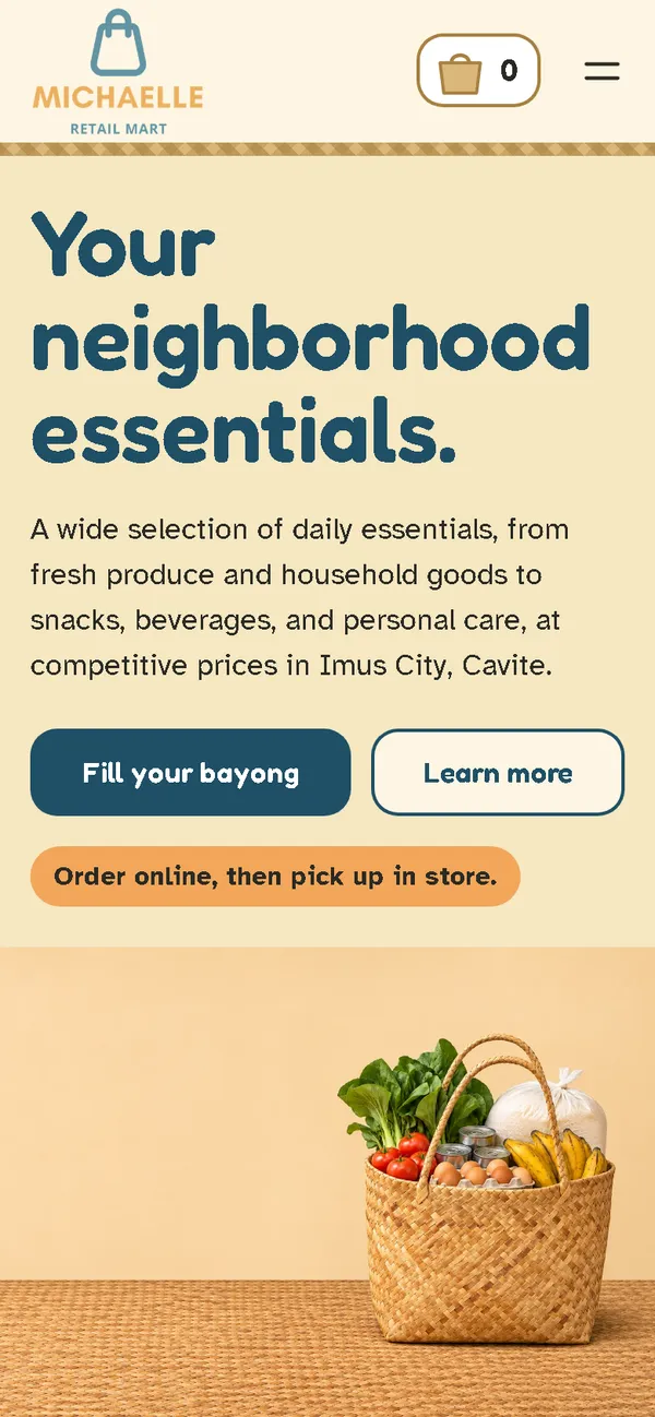
A blue-grey gradient card with a small bag logo became a market scene: a rounded navy headline beside a woven bayong full of vegetables, eggs and rice, on a banig mat.
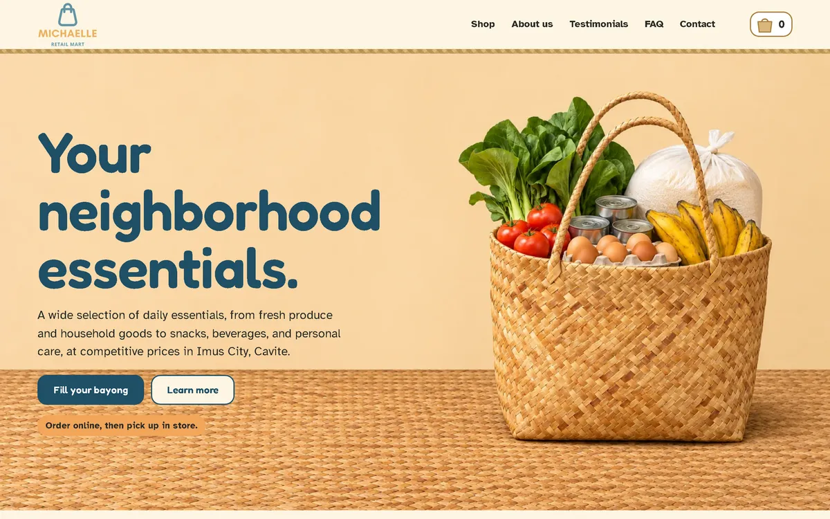
On a phone
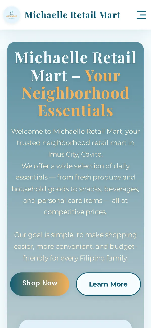
The old phone layout was 780 px wide on a 390 px screen. Now the headline, two buttons and the bayong fit the screen, with the bag-shaped cart always in the header.
Aperçu
Michaelle Retail Mart sells fresh produce, pantry goods, snacks and household essentials in Imus City, Cavite. The new website borrows the bag every Filipino market shopper knows: the woven bayong.
Le problème
The old homepage downloaded 46.63 MB on every visit, 46.26 MB of it images, which took 37.6 seconds to load on a simulated 10 Mbps connection. On a 390 px phone screen its layout was 780 px wide, it loaded fonts from Google, and its policy cards still showed placeholder text.
La solution
A rebuild with no framework, in navy, cream and banig tan, with a woven pattern and rounded, easy-to-read type. The cart icon in the header is a small bayong that fills up as items are added, the cart is called "My bayong", and the main button reads "Fill your bayong". Ordering is for pickup in store, with a preferred pickup time and payment on pickup. Images are compressed WebP files that load as the visitor scrolls, and the fonts ship with the site, so the homepage makes no third-party requests.
Captures d'écran
Capturées sur le véritable site, en ligne.
Ma contribution
Designed and built the new site, produced the image set and compressed it for the web, built the filling bayong cart, rebuilt the cart and order page for pickup, and measured the old and new versions with the same script.
Fonctionnalités
- Bayong cart icon in the header that fills up as items go into the cart
- Cart titled "My bayong" and order summary titled "Your bayong"
- Fifteen products grouped into sections such as Fresh, each shown on the same banig mat
- Product images with generic packaging, no brands
- Pickup ordering: preferred pickup day and time, with payment by cash, GCash, Maya or QR Ph on pickup
- Order sent as a pre-filled email that the customer sends, with the team confirming the order and pickup time first
- Field checks on the order page, including Philippine mobile number formats
- Note in the shop that the photos are illustrations and may differ from the product
- The two original customer quotes kept word for word
Défis techniques
A concept that does something
The bayong isn't only decoration. The bag in the header is the cart: it fills as products are added, so the concept doubles as feedback that something happened.
Pickup instead of delivery
The store hands orders over at the counter, so the order page asks for a preferred pickup time instead of an address and explains that nothing is paid until pickup. The static site opens a complete pre-filled email for the customer to send.
Technologies vérifiées
- HTML
- CSS
- JavaScript
- WebP
- JSON-LD structured data
Faits tirés du code
- Homepage weight on load
- 46.63 → 1.32 MB
- On load, on a phone
- 46.63 → 1.09 MB
- After scrolling the whole page
- 46.63 → 1.54 MB
- Fully loaded, simulated 10 Mbps
- 37.6 → 0.90 s
- Phone layout width (390 px screen)
- 780 → 390 px
- Products in the shop
- 15
Résultats
- Live at michaellemart.store.
- Measured with the same script: homepage on load down from 46.63 MB to 1.32 MB on desktop and 1.09 MB on phones.
- No failed requests, console errors or third-party requests on the new site during the capture run.
Enseignements
- The best concept is one that also works as an interface.
- Ask how the shop really hands over goods before designing the checkout.
- If images are illustrations, say so on the page.
À propos de cette étude de cas
Client website, shown by name. Screenshots and measurements come from one capture script run on the old and new site, on a local server. The 10 Mbps figure is a simulated connection, not data from real visitors. The product and scene images are generated illustrations with generic packaging, no brands and no people, and the shop says the photos are illustrations. Product descriptions, store hours and the two customer quotes on the site are carried over from the old site. In the old homepage screenshot, the founder's name is blurred.
Vous prévoyez un nouveau site, ou le vôtre est trop lent ?
Décrivez votre projet en quelques phrases. Dans les deux jours ouvrables, vous recevez des questions, une première approche et une fourchette de prix en CHF.