Sites web
Raviel Prime Market: grocery redesign
A full redesign for a neighbourhood grocery in Labason, Philippines: deep sea blue, a border striped in the colours of a vinta sail, and the catalogue as a price board with big, clear prices. The new homepage also loads 1.60 MB instead of 47.78 MB.
Les études de cas sont en anglais.
- Contexte
- Raviel Prime Market, a neighbourhood grocery in Labason, Zamboanga del Norte, Philippines.
- Mon rôle
- Design, frontend development, and image production
- Année
- 2026
Ma refonte : avant et après
L'ancien site à côté de mon design, à la même taille d'écran.
Homepage
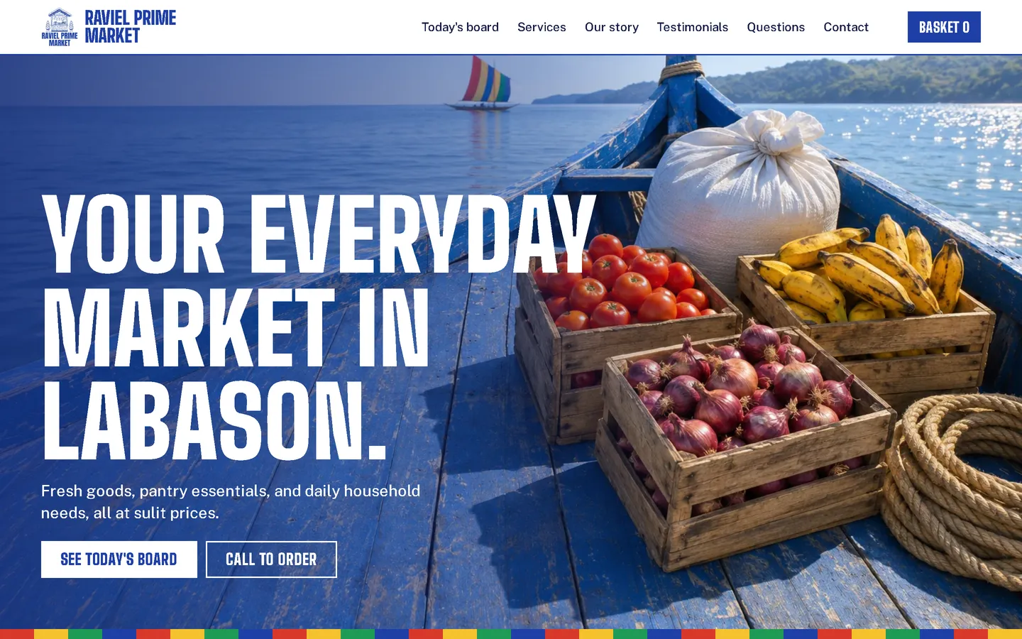
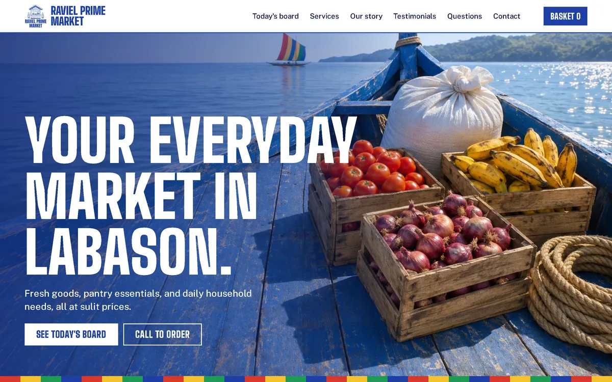
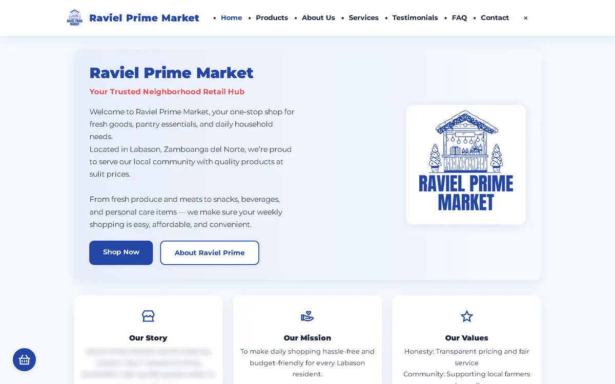
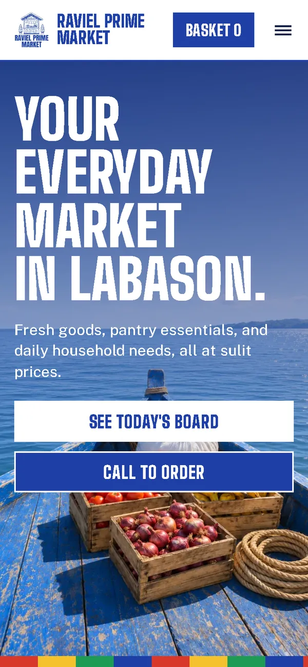
A pale welcome card became a bold first screen: a tall condensed headline over crates of produce on a boat at sea, two clear buttons, and a striped border in vinta-sail colours.
Products
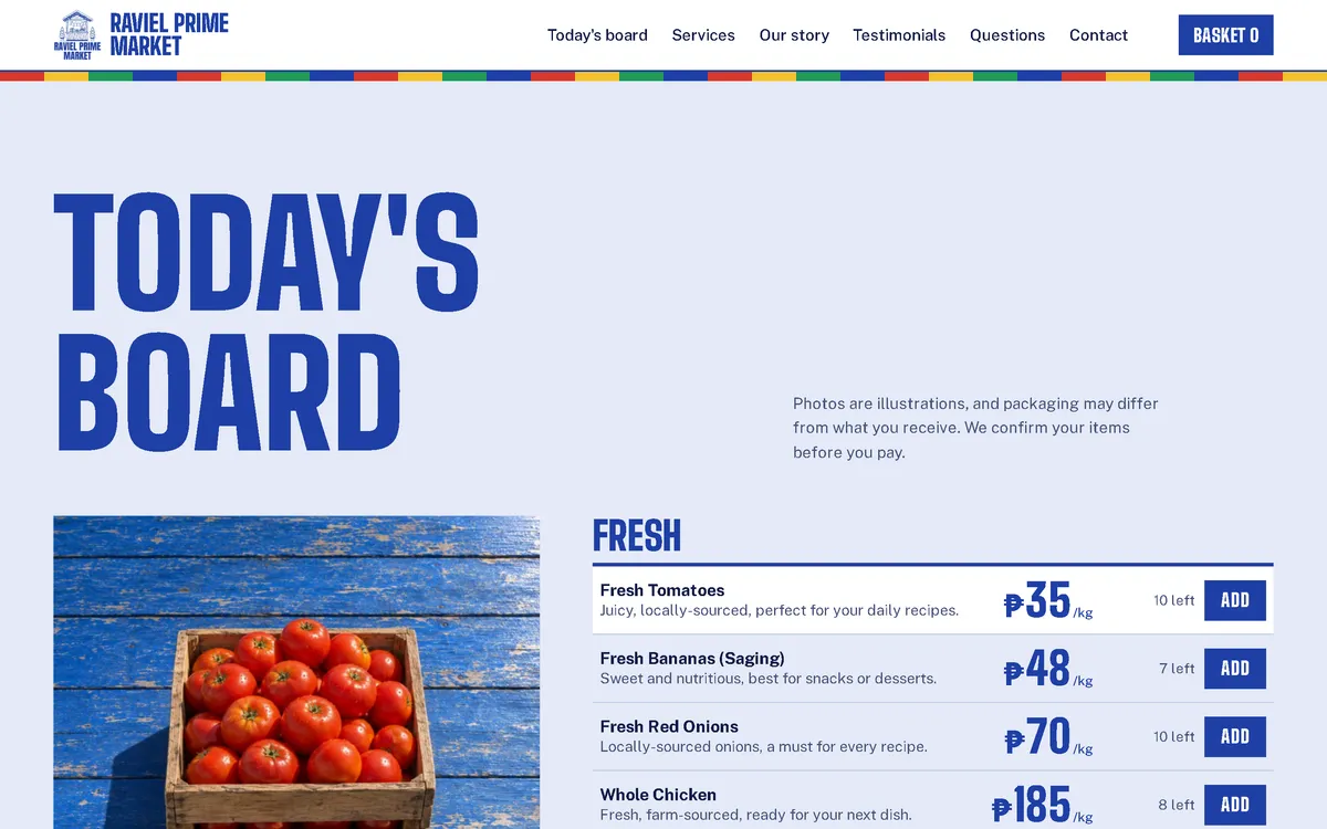
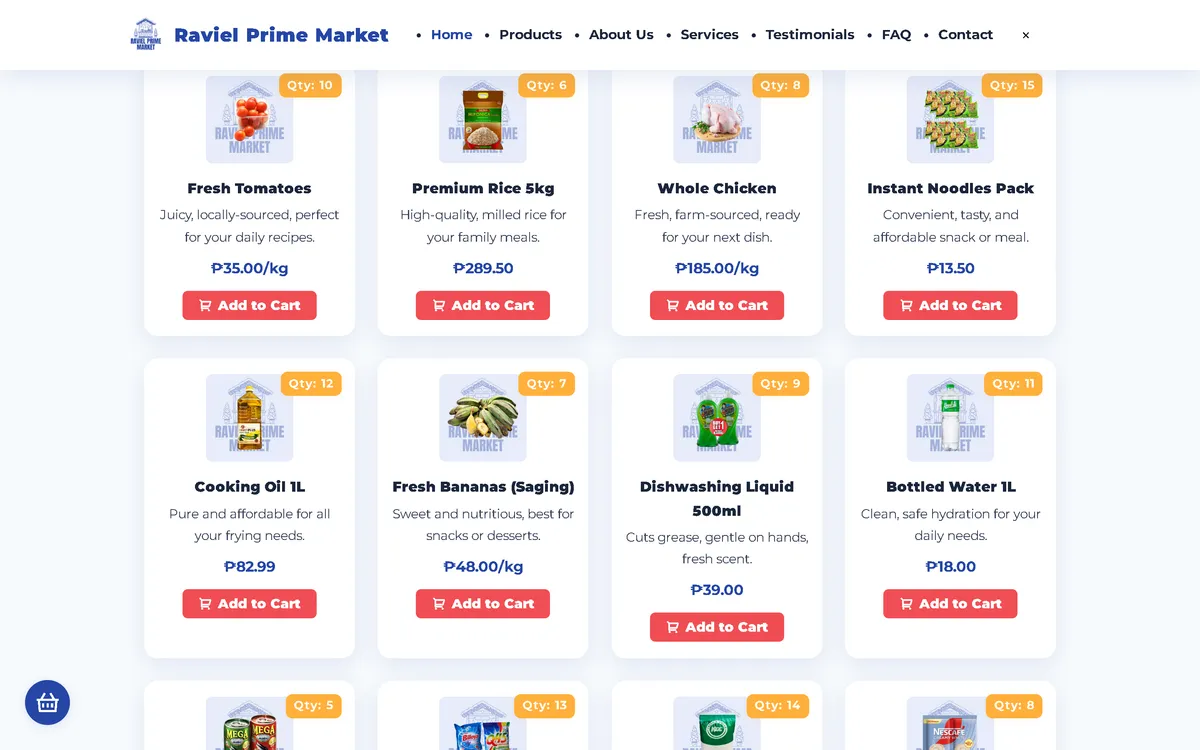
A grid of small product cards became "Today's board": a price list grouped as Fresh, Pantry, and Drinks and home, with big prices, stock, and an add button on every line.
Policy section
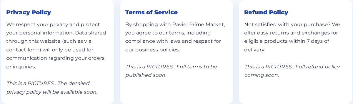
Light policy cards became a pale blue band with a one-line summary and a link to each full policy.

On a phone
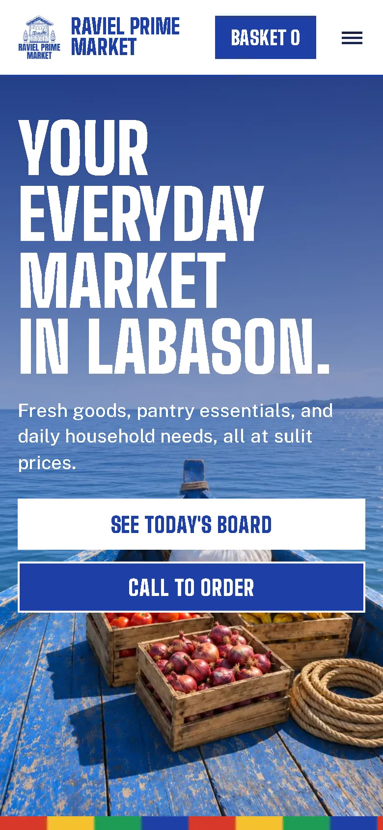
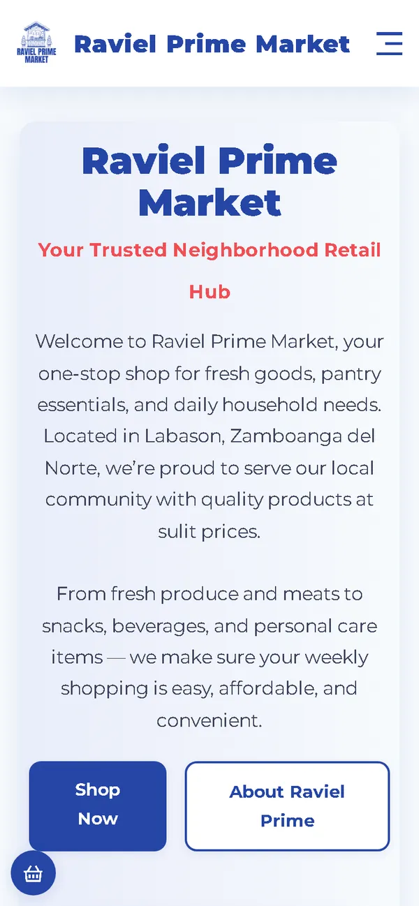
The headline and two full-width buttons sit over the boat scene, with the basket always in the header.
Aperçu
Raviel Prime Market sells fresh goods, pantry staples, and household items in Labason, Zamboanga del Norte. The new website takes its look from the coast around the town: sea blue, striped sails, and a market board you can read at a glance.
Le problème
The old homepage downloaded 47.78 MB on every visit, 47.44 MB of it images, which took 38.6 seconds to load on a simulated 10 Mbps connection. It also loaded fonts and icons from three outside hosts, and its card template made fifteen everyday products slow to compare.
La solution
A rebuild with no framework, in deep blue and white with a tall condensed display face and a striped border in vinta-sail colours. The catalogue becomes a price board in three groups, so prices can be compared line by line, and customer quotes appear under "Sabi ng mga suki". Images are compressed WebP files that load as the visitor scrolls, and the fonts ship with the site, so the homepage makes no third-party requests.
Captures d'écran
Capturées sur le véritable site, en ligne.
Ma contribution
Designed and built the new site, produced the image set and compressed it for the web, rebuilt the basket and order page, and measured the old and new versions with the same script.
Fonctionnalités
- Catalogue as a price board in three groups: Fresh, Pantry, and Drinks and home
- Big prices with units, stock left, and an add button on every line
- Striped border in vinta-sail colours that carries through the page
- Customer quotes under the Tagalog heading "Sabi ng mga suki"
- Basket with quantity controls and a reminder that nothing is paid yet
- Order sent as a pre-filled email that the customer sends, with the team confirming items and delivery first
- Field checks on the order page, including Philippine mobile number formats
- Note on the board that the photos are illustrations and packaging may differ
- Basket updates announced to screen readers, reduced-motion support, and GroceryStore structured data
Défis techniques
A price list, not a gallery
Groceries are bought by price. Turning cards into board lines puts each price in the same column, large enough to read at a glance, while the image beside each group keeps the page from feeling like a spreadsheet.
Ordering with no backend
The site is static, so it can't place an order by itself. The order page checks the details and opens a complete pre-filled email for the customer to send, and it explains that the team confirms first.
A big hero that stays light on phones
The boat scene is the largest image on the page. Phones get their own smaller version and the rest of the images load as the visitor scrolls, which keeps the phone homepage at 0.59 MB on load.
Technologies vérifiées
- HTML
- CSS
- JavaScript
- WebP
- JSON-LD structured data
Faits tirés du code
- Homepage weight on load
- 47.78 → 1.60 MB
- On load, on a phone
- 47.78 → 0.59 MB
- After scrolling the whole page
- 47.78 → 1.66 MB
- Fully loaded, simulated 10 Mbps
- 38.6 → 0.67 s
- Third-party hosts on load
- 3 → 0
- Products in the catalogue
- 15
Résultats
- Live at ravielmarket.site.
- Measured with the same script: homepage on load down from 47.78 MB to 1.60 MB on desktop and 0.59 MB on phones.
- No failed requests or console errors on the new site during the capture run.
Enseignements
- For everyday goods, a list that's easy to compare beats a grid of cards.
- A local colour reference can carry a whole visual identity.
- If images are illustrations, say so on the page.
À propos de cette étude de cas
Client website, shown by name. Screenshots and measurements come from one capture script run on the old and new site, on a local server. The 10 Mbps figure is a simulated connection, not data from real visitors. The product and scene images are generated illustrations with blank packaging, not photos of the store, and the site says so. Product descriptions, offers, and customer quotes on the site are carried over from the old site. The founder's name in the old homepage screenshot is blurred.
Vous prévoyez un nouveau site, ou le vôtre est trop lent ?
Décrivez votre projet en quelques phrases. Dans les deux jours ouvrables, vous recevez des questions, une première approche et une fourchette de prix en CHF.