Sites web
Serenique Interior Haven: shop redesign
A full redesign for a furniture shop in the Philippines, inspired by hand-painted Filipino shop signs. The new homepage also loads 1.23 MB instead of 47.49 MB.
Les études de cas sont en anglais.
- Contexte
- Serenique Interior Haven, a home furnishings shop and styling consultancy with a showroom in Cavite City, Philippines.
- Mon rôle
- Design, frontend development, and image production
- Année
- 2026
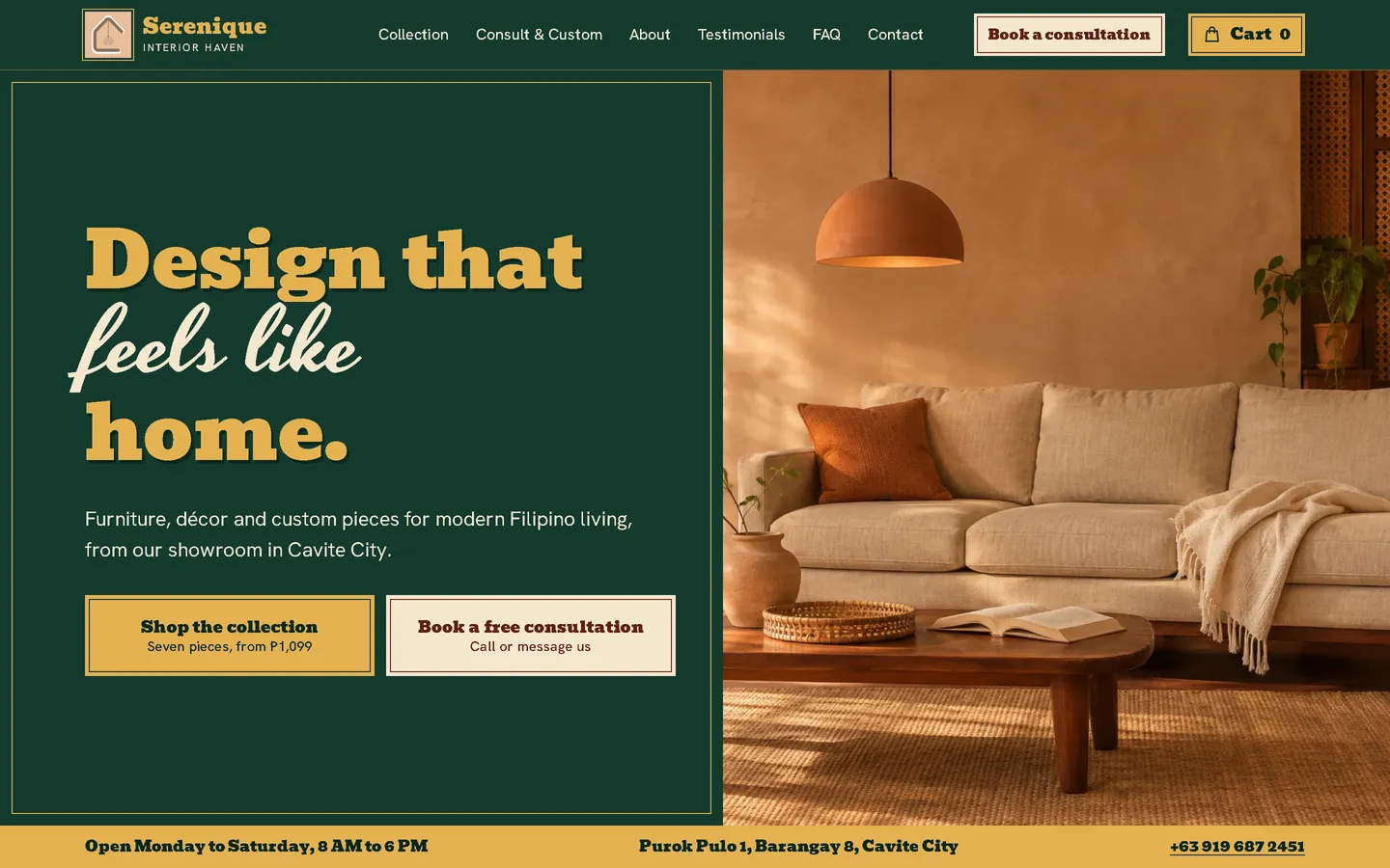

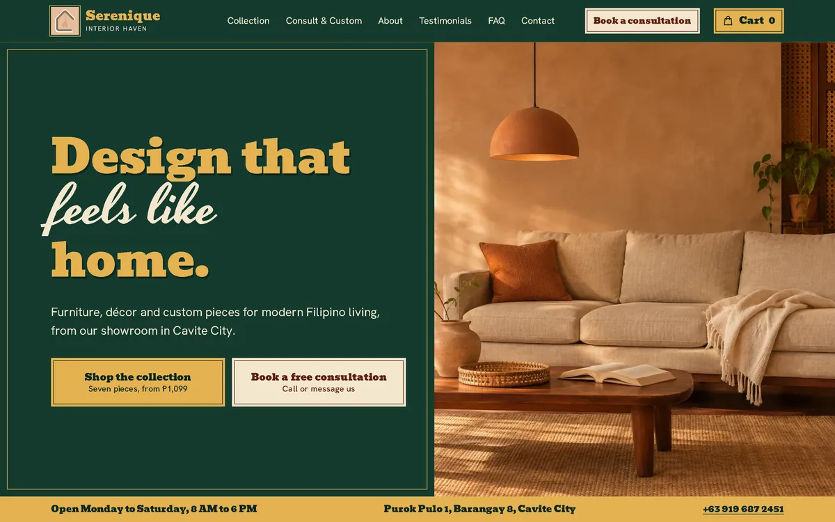
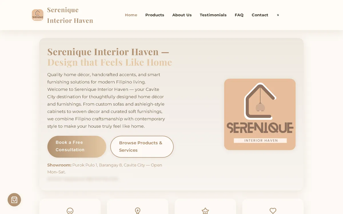
Ma refonte : avant et après
L'ancien site à côté de mon design, à la même taille d'écran.
Homepage
A pale, text-heavy first screen became a hand-painted shop board: a gilt headline on enamel green, two equal buttons for shopping and booking, and a warm room image.
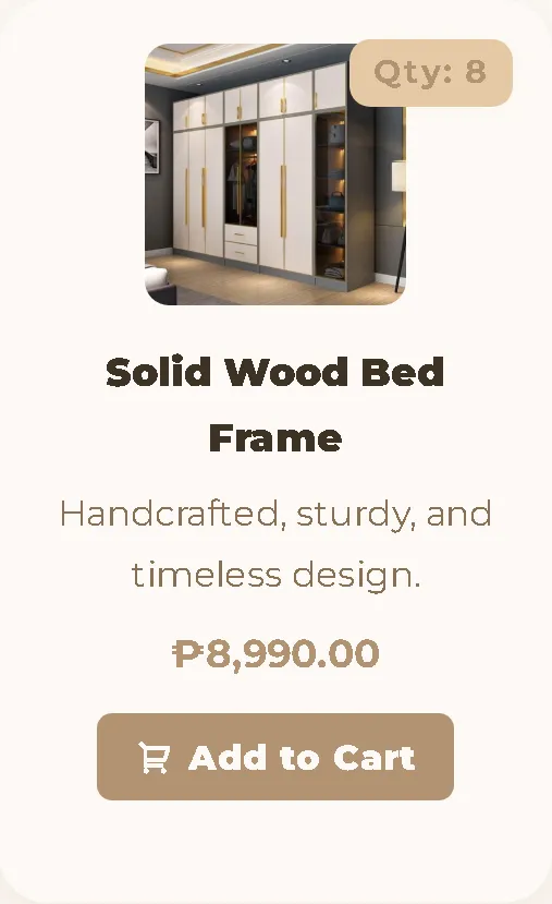
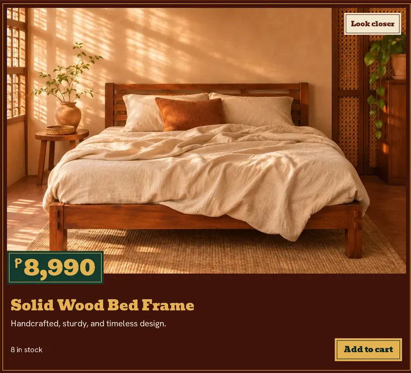
Product card
Small centred thumbnails became large framed boards with a room image, a bold price plaque, and a clear button. The new image set also matches every product name.
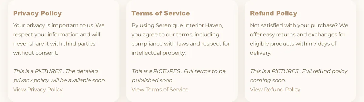
Policy section
Three plain cards became one quiet band in the site's green and gilt, with a clear link to each full policy.

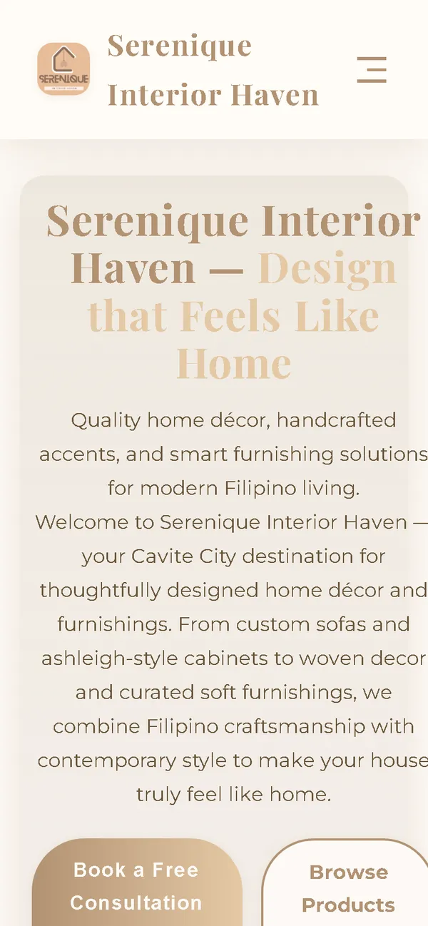
On a phone
The phone layout is built for one thumb: a big headline, two full-width buttons, and the room image right below.

Aperçu
Serenique Interior Haven sells furniture and décor and offers free styling consultations from its showroom in Cavite City. The website has to serve two kinds of visitor equally: people ready to buy a specific piece, and people who need help with a room.
Le problème
The old homepage downloaded 47.49 MB on every visit, 47.12 MB of it images, which took 38.3 seconds to load on a simulated 10 Mbps connection. Four of the seven products showed a picture of something else, the policy cards displayed placeholder text, the refund link was dead because of a typo in the file name, and the phone layout was twice as wide as the screen.
La solution
A rebuild with no framework and an identity borrowed from hand-painted Filipino shop signs: enamel green, gilt, and oxblood boards instead of the usual cream furniture template. Prices are large and on every piece, shopping and booking get equal space on the first screen, and images are compressed WebP files that load as the visitor scrolls.
Captures d'écran
Capturées sur le véritable site, en ligne.
Ma contribution
Designed and built the new site, produced the image set and compressed it for the web, rewrote the order flow, and measured the old and new versions with the same script.
Fonctionnalités
- Seven products with a matching room image, and a "Look closer" button that swaps to a material detail
- Cart with quantity controls that stays within the screen on phones and keeps its contents between pages
- Order page with field-by-field validation, including Philippine mobile number formats
- Order sent as a pre-filled email, with payment arranged only after the shop confirms the order
- Separate hero image for phones, and lazy loading for images further down the page
- Fonts hosted with the site, so the homepage needs no third-party requests
- Privacy, terms, and refund pages, all reachable and correctly linked
- Keyboard support in the cart, reduced-motion support, and FurnitureStore structured data
Défis techniques
Being honest about the images
The shop has no photos of its showroom or stock, so the new images are generated illustrations. The site states this directly above the products and promises to confirm the exact product and colour before payment.
A real order flow with no backend
The site is static, so nothing is stored on a server. The order page checks the details, builds a complete order as a pre-filled email, and explains the next step: the team confirms first, and payment follows.
Comparing fairly
One script captured both versions with the same browser, screen sizes, and steps, and records its own results. Local load times mostly reflect the test machine, so the comparison relies on bytes transferred and a simulated connection.
Technologies vérifiées
- HTML
- CSS
- JavaScript
- WebP
- JSON-LD structured data
Faits tirés du code
- Homepage weight on load
- 47.49 → 1.23 MB
- After scrolling the whole page
- 47.49 → 2.04 MB
- Fully loaded, simulated 10 Mbps
- 38.3 → 0.65 s
- Phone layout width (390 px screen)
- 780 → 390 px
- Failed homepage requests
- 1 → 0
- Products with a matching image
- 3 → 7 of 7
Résultats
- Live at sereniquehaven.site.
- Measured with the same script: homepage on load down from 47.49 MB to 1.23 MB on desktop and 0.90 MB on phones.
- No failed requests or console errors on the new homepage during the capture run.
Enseignements
- Check every product photo against its name. Customers will.
- Image weight is usually the fastest performance win on a small shop's website.
- If images are illustrations, say so on the page.
À propos de cette étude de cas
Client website, shown by name. Measurements come from one capture script run with identical settings on the old and new site, on a local server. The 10 Mbps figure is a simulated connection, not data from real visitors. The product and room images are generated illustrations, and the live site says so. The tax registration number is masked in the old homepage screenshot.
Vous prévoyez un nouveau site, ou le vôtre est trop lent ?
Décrivez votre projet en quelques phrases. Dans les deux jours ouvrables, vous recevez des questions, une première approche et une fourchette de prix en CHF.