Sites web
Luiara Estilo Brasil: shop website
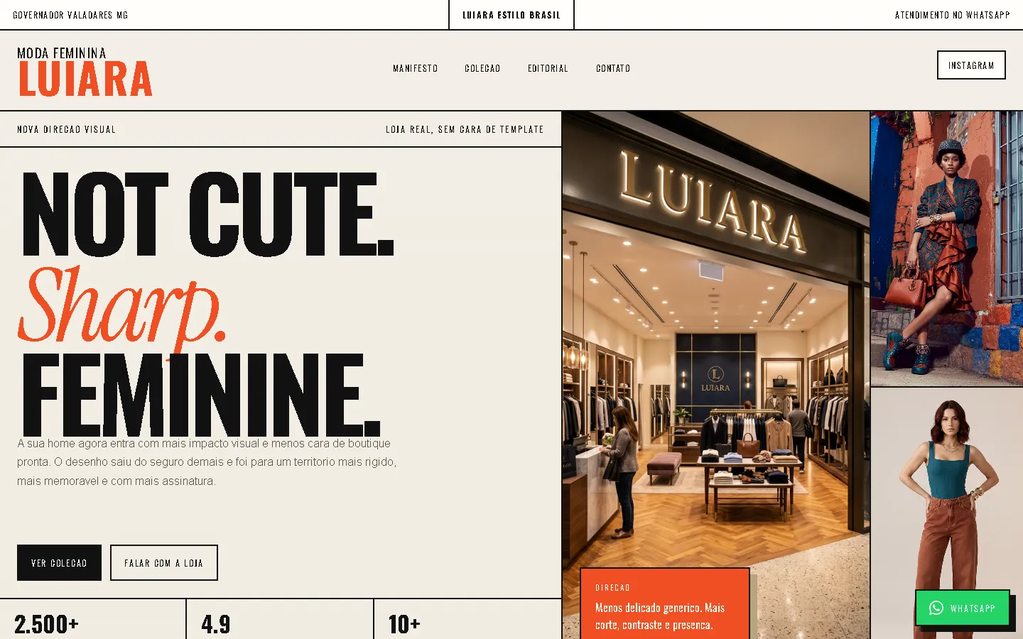
A shop website for a women's fashion shop in Brazil, laid out like an editorial campaign: hard-edged cream blocks split by heavy black rules, condensed capitals with serif italics, and a black "runway" band that presents three pieces side by side.
Les études de cas sont en anglais.
- Contexte
- Luiara Estilo Brasil, a women's fashion shop in Governador Valadares, Minas Gerais, Brazil.
- Mon rôle
- Design and frontend development
- Année
- 2026
Aperçu
Luiara Estilo Brasil sells women's clothing and accessories. The website presents a short selection in a sharp, editorial layout.
Le problème
A small fashion shop with a short selection needed a website in Brazilian Portuguese with a distinctive, poster-like look.
La solution
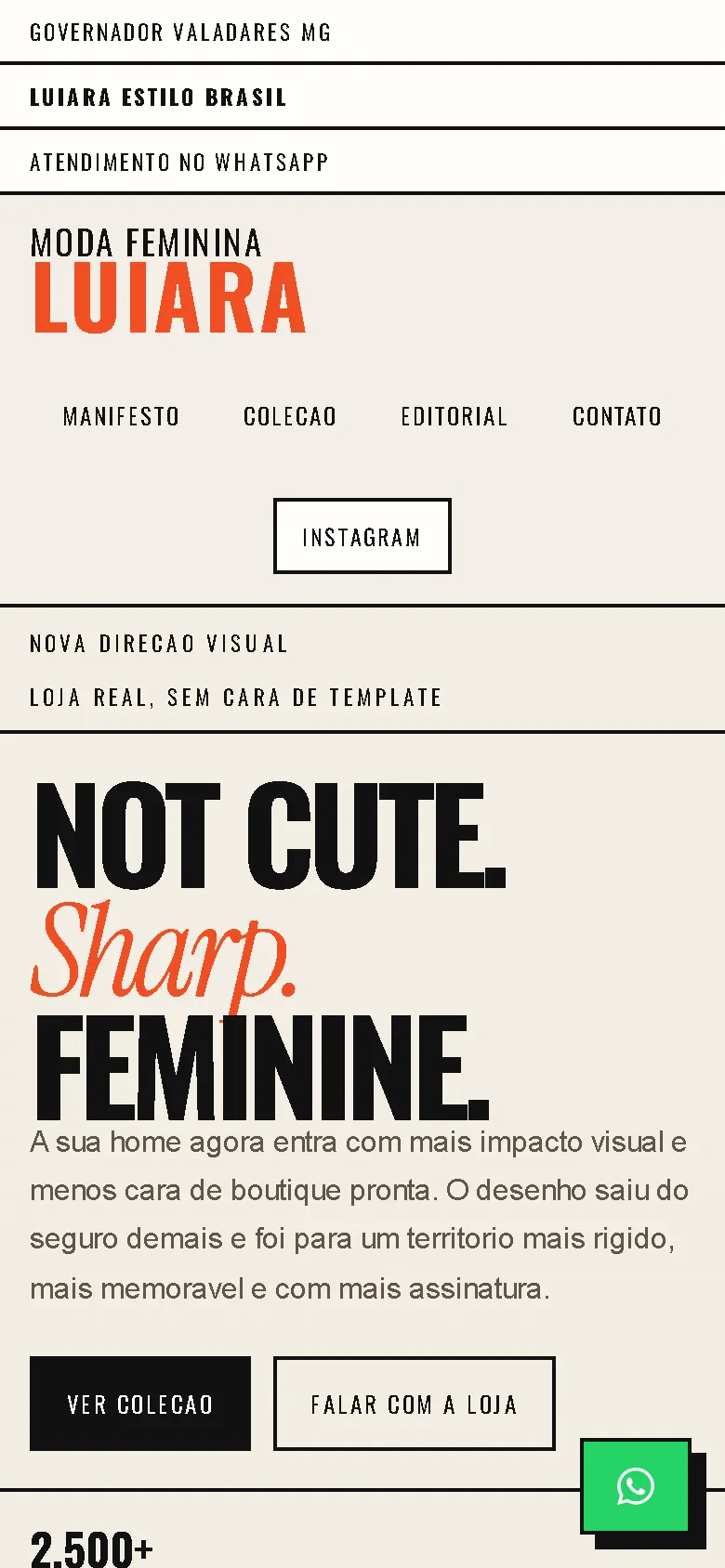
Warm cream with black rules and an orange-red accent, set in condensed Oswald capitals with Instrument Serif italics. The page is built from hard-edged blocks instead of rounded cards: an oversized "NOT CUTE. Sharp. FEMININE." headline beside a photo collage, a ticker, a manifesto, a black runway band with three pieces, an editorial image grid and the contact section. There is no burger menu; on phones the links wrap under the logo.
Captures d'écran
Capturées sur le véritable site, en ligne.
Ma contribution
Designed and built the website and published it on the client's domain.
Fonctionnalités
- Oversized condensed headline beside a photo collage
- Runway band presenting three pieces side by side
- Editorial image grid
- Navigation that stays visible on phones, without a burger menu
- Floating WhatsApp button
Défis techniques
Few products, strong presence
With only three pieces, a standard product grid would look empty. The runway band gives each piece a full-height block, so the short selection reads as a deliberate edit.
Technologies vérifiées
- HTML
- CSS
- JavaScript
Faits tirés du code
- Language
- Brazilian Portuguese
- Products in the catalogue
- 3
- Ordering
- WhatsApp and contact section
Résultats
- Live at luiaraestilobrasil.site.
Enseignements
- A small range can look intentional when the layout treats it as a curated set.
À propos de cette étude de cas
Client website, shown by name and live on its own domain. Screenshots were taken on the live site. Images are shown as published on the site; they are not necessarily photos of the shop or its products. Two names in a quote block are blurred in one screenshot.
Vous prévoyez un nouveau site, ou le vôtre est trop lent ?
Décrivez votre projet en quelques phrases. Dans les deux jours ouvrables, vous recevez des questions, une première approche et une fourchette de prix en CHF.