Sites web
Honira Care Center: healthcare website redesign
A full redesign for a healthcare center with a home health supplies shop in the Philippines: a calm teal and dark green site with a serif headline and a heartbeat line, services listed without promises, and a shop that tells visitors to ask a doctor or pharmacist. The new homepage also loads 0.52 MB instead of 30.51 MB.
Les études de cas sont en anglais.
- Contexte
- Honira Care Center, a healthcare center with a home health supplies shop in Caloocan City, Philippines.
- Mon rôle
- Design, frontend development, and image production
- Année
- 2026
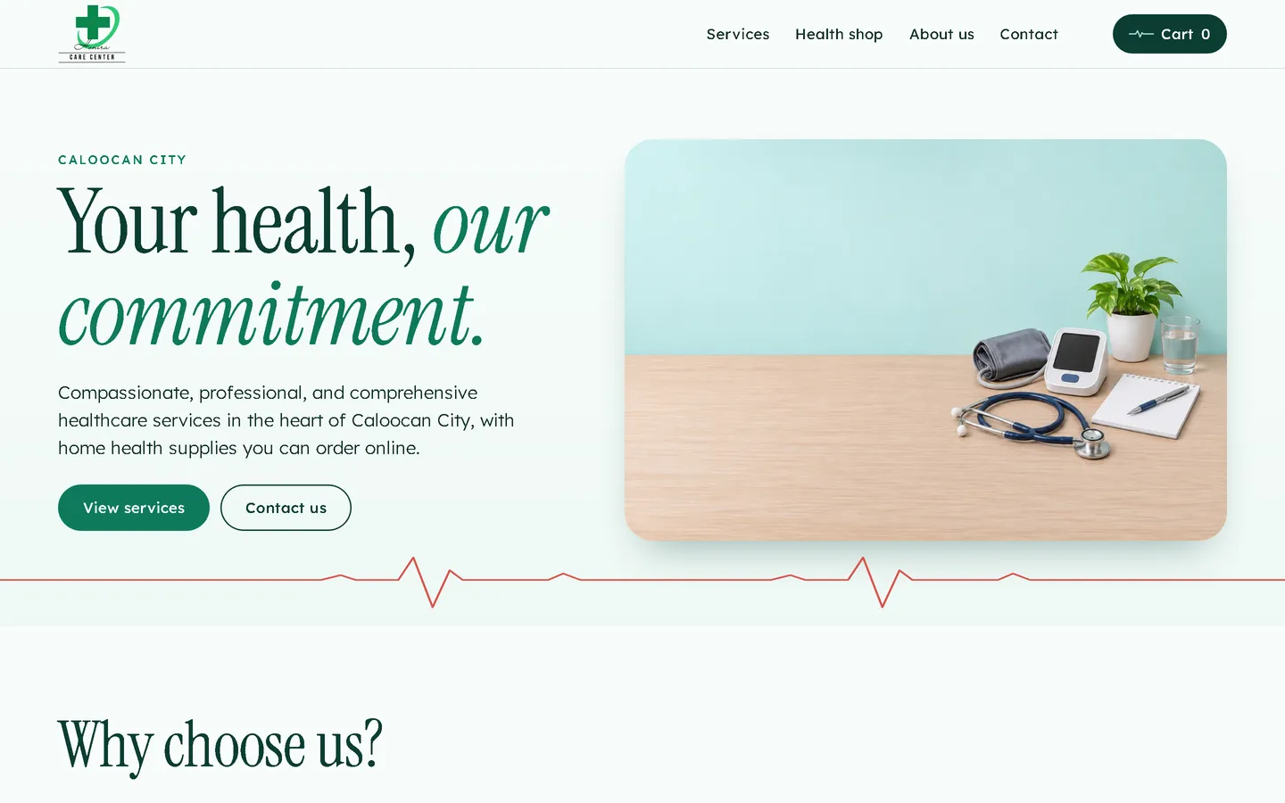
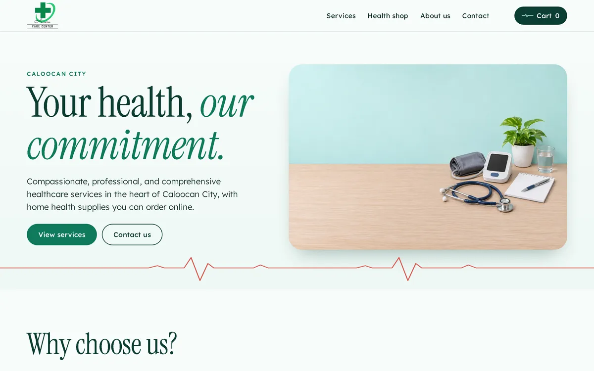
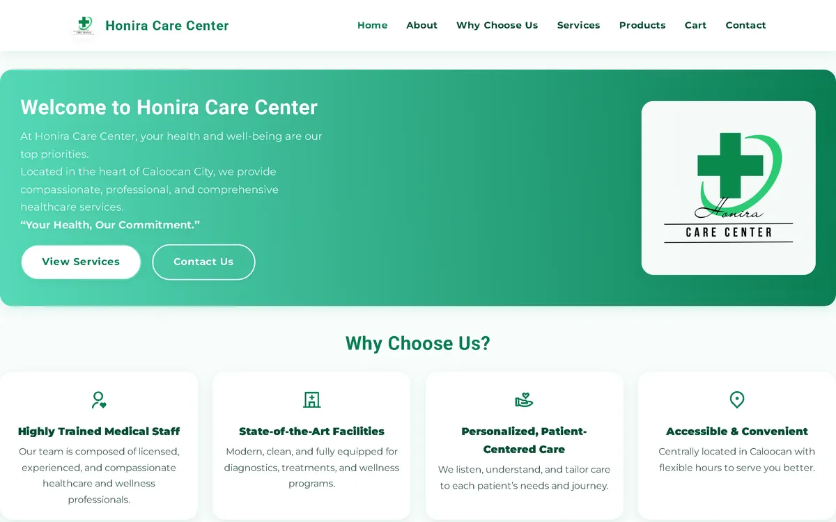
Ma refonte : avant et après
L'ancien site à côté de mon design, à la même taille d'écran.
Homepage
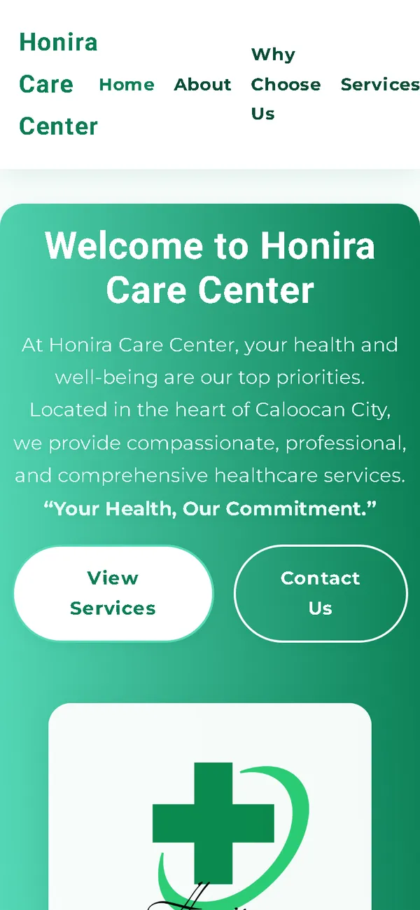
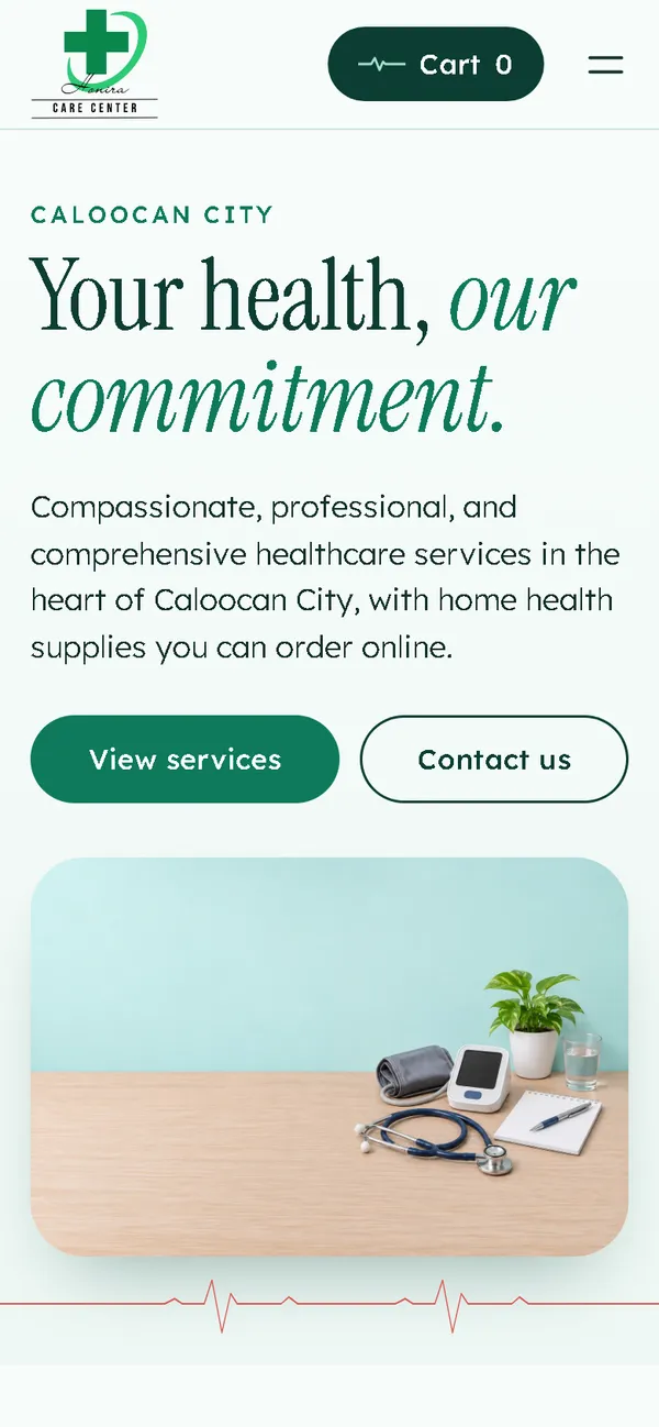
A bright green gradient card with the logo became a calm first screen: a large serif headline, a desk with a blood pressure monitor and stethoscope, and a heartbeat line across the page.
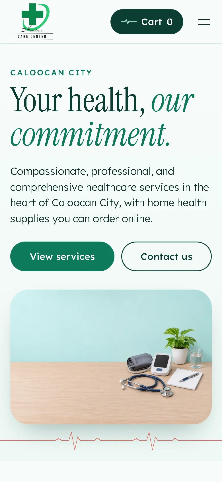
On a phone
On a 390 px screen the old layout was 634 px wide, with the menu spilling off the side. Now the headline, two buttons and the image fit the screen, with the cart and a menu button in the header.
Aperçu
Honira Care Center offers healthcare services and sells home health supplies in Caloocan City. A health website has to feel calm and trustworthy, so the redesign is quiet: teal, dark green and one heartbeat line.
Le problème
The old homepage downloaded 30.51 MB on every visit, mostly 3240 px PNG images, which took 24.4 seconds to load on a simulated 10 Mbps connection. On a 390 px phone screen the layout was 634 px wide, its product photos showed third-party brands, and it made claims the business could not back up.
La solution
A rebuild with no framework, in pale teal, dark green and a warm red accent, with a serif display face. A heartbeat line runs under the first screen, and the line in the cart button pulses when the cart changes. Services are listed without prices, with booking by call or message. The shop asks visitors to consult a doctor or pharmacist and to go to a hospital emergency room in an emergency. Images are compressed WebP files that load as the visitor scrolls, and the fonts ship with the site, so the homepage makes no third-party requests.
Captures d'écran
Capturées sur le véritable site, en ligne.
Ma contribution
Designed and built the new site, produced the image set and compressed it for the web, rebuilt the cart and order page, reviewed the copy for claims, and measured the old and new versions.
Fonctionnalités
- Heartbeat line under the first screen, echoed in the cart button when the cart changes
- Services listed without prices, booked by call or message
- Health shop grouped by use, with fifteen products
- Product images with blank packaging and blank device screens, replacing photos that showed other brands
- Note in the shop to consult a doctor or pharmacist, and to go to an emergency room in an emergency
- Two unconfirmed statements from the old site, a VAT registration line and a regulatory compliance line, removed
- Cart with quantity controls and a reminder that nothing is paid yet
- Order sent as a pre-filled email that the customer sends, with the team confirming availability, delivery and the total first
- Field checks on the order page, including Philippine mobile number formats
Défis techniques
Careful with health claims
On a health website, every sentence can read as a promise. Statements the business could not confirm were removed, product images show no brand, and the shop points visitors to a doctor or pharmacist instead of giving advice.
Ordering with no backend
The site is static, so it can't place an order by itself. The order page checks the details and opens a complete pre-filled email for the customer to send, and it explains that the team confirms first.
Technologies vérifiées
- HTML
- CSS
- JavaScript
- WebP
- JSON-LD structured data
Faits tirés du code
- Homepage weight on load
- 30.51 → 0.52 MB
- On load, on a phone
- 30.06 → 0.40 MB
- After scrolling the whole page
- 30.97 → 0.61 MB
- Fully loaded, simulated 10 Mbps
- 24.4 → 0.52 s
- Phone layout width (390 px screen)
- 634 → 390 px
- Products in the shop
- 15
Résultats
- Live at honirawellness.site.
- Homepage on load down from 30.51 MB to 0.52 MB on desktop and from 30.06 MB to 0.40 MB on phones.
- No failed requests or console errors on the new site during the capture run.
Enseignements
- In healthcare, calm design and careful wording build more trust than big promises.
- If images are illustrations, say so on the page.
À propos de cette étude de cas
Client website, shown by name. Screenshots of the new site come from a capture script on a local server; the old site was measured separately on a local server with the same settings, because the capture script could not finish on it. The 10 Mbps figure is a simulated connection, not data from real visitors. The product and scene images are generated illustrations with blank packaging and screens and no people, not photos of the center, its staff or its stock, and the shop says so. Descriptions of the services, staff and products on the site are carried over from the old site and have not been checked; this case study makes no medical, licensing or outcome claim. The old product grid isn't shown because it pictured third-party brands.
Vous prévoyez un nouveau site, ou le vôtre est trop lent ?
Décrivez votre projet en quelques phrases. Dans les deux jours ouvrables, vous recevez des questions, une première approche et une fourchette de prix en CHF.